Most casual viewers think Impressionism means any artwork that looks soft, blurry, or vaguely painted. If the figures aren’t sharply outlined and the colors feel dreamy or stylized, many people immediately label it “Impressionist.” This is common in museums, galleries, and even among amateur collectors. The assumption is: if it’s not photo-realistic but still looks like something, it must be from the Impressionist school.
This belief is reinforced by the way art is marketed to the general public. Art calendars, coffee table books, and even puzzles often feature hazy, light-filled scenes and label them “Impressionist,” even when they are not. Companies tend to group Monet with Van Gogh, O’Keeffe, and others for aesthetic similarity, not accuracy. Over time, this has led people to associate Impressionism with any loose brushwork or “soft focus.”
The “Blurry Painting” Stereotype and Why It Stuck
For many, “Impressionism” simply means “not realistic, but not abstract either.” This idea stuck because it’s easy to categorize, and it doesn’t require much background knowledge. The average museum visitor may recognize the look — shimmering water, blooming gardens, warm sunset hues — but not the movement or its meaning. These visual cues are taken as evidence, even if the painting comes from a completely different school.
The term itself invites misunderstanding. “Impressionism” sounds like a loose concept, not a formal movement with specific members, dates, and techniques. It feels descriptive rather than historical, which is why people use it broadly. But that leads to a problem: when everything is Impressionism, nothing is.
What Impressionism Actually Is
Impressionism was not just a style — it was a movement grounded in rebellion against the strict formalism of the French art establishment in the mid-19th century. It began in Paris in the 1870s, when a group of painters rejected the academic rules of the École des Beaux-Arts and the official Salon system. They wanted to paint modern life as it appeared to the eye, especially under natural light, and they often worked en plein air — directly outdoors. Their goal wasn’t to create perfect realism but to capture fleeting moments.
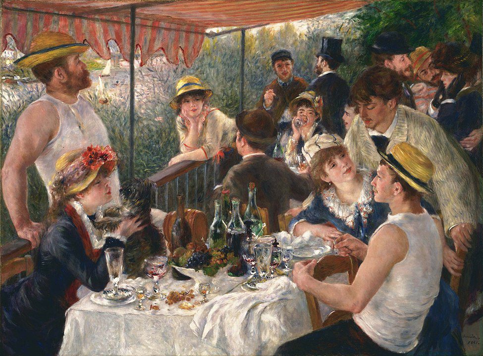
Among the most important figures in this movement was Claude Monet, born in Paris in 1840 and active until his death in 1926. He painted some of the movement’s defining works, including Impression, Sunrise in 1872 — from which the term “Impressionism” was later coined. Other central figures included Pierre-Auguste Renoir (1841–1919), Edgar Degas (1834–1917), Camille Pissarro (1830–1903), and Berthe Morisot (1841–1895), one of the few prominent women in the group. They often exhibited together, outside the traditional system, starting with their first joint exhibition in 1874.
From the 1870s Cafés of Paris to the Birth of a Movement
That 1874 exhibition was held at the studio of photographer Nadar and featured works that baffled critics but thrilled other artists. The show marked the official birth of the Impressionist movement, even if the artists involved didn’t all share the same goals. Some focused on city life, others on countryside scenes, but they were unified by a desire to break free from polished, posed compositions. Their loose, visible brushstrokes, bright palettes, and contemporary subjects created a new kind of visual language.
Many Impressionists were close friends and collaborators. Monet and Renoir painted together in La Grenouillère in 1869. Morisot studied under Corot and later married Eugène Manet, Édouard Manet’s brother, in 1874, which brought her into close artistic circles. These relationships helped spread ideas quickly across their community. By the 1880s, Impressionism had gained enough momentum to influence artists across Europe and beyond.
The Rise of the “Impressionist Look” in Popular Culture
After decades of criticism, the public eventually embraced Impressionism — but for its visual appeal more than its artistic philosophy. Once rejected as crude and unfinished, the style became one of the most reproduced and commercialized in the world. You can find Monet’s water lilies on coffee mugs, calendars, hotel art, and scarves. This saturation has helped create a visual shorthand: if it looks peaceful, colorful, and painterly, people assume it’s Impressionist.
This rise in popularity also came with a flattening of meaning. Much like how classical music is reduced to a few well-known symphonies, Impressionism was trimmed down to its most decorative features. Paintings from unrelated movements — so long as they shared soft lines or luminous color — were tossed into the same basket. Soon, the Impressionist label came to represent a feeling, not a technique or historical context.
From Fine Art to Wallpaper and Screensavers
This shift had significant cultural consequences. The term “Impressionist” became shorthand for pleasant, calming, and vaguely nostalgic art. It became a go-to aesthetic for public spaces: dental offices, hospital lobbies, spas. Monet’s Water Lilies became an icon of relaxation. The deeper social critiques and artistic innovations that drove the movement were lost in translation.
The art world has noted this trend with concern. In his 2004 book The Judgment of Paris, art historian Ross King noted that much of what makes Impressionism powerful — its rebellion, its experiments, its radicalism — has been sanitized. Instead of revolutionaries, the Impressionists are often mistaken for decorators. And in that confusion, the general public has begun to associate all soft, flowing brushwork with their movement — even when it’s not accurate.
Why the Public Confuses Styles So Easily
One major reason people mislabel non-realist painting as Impressionist is the lack of comprehensive art education in most school systems. Art history is often reduced to a few famous names, and the lessons rarely go beyond Western Europe between 1500 and 1900. When Impressionism is taught, it’s often presented alongside Post-Impressionism and Modernism, with little explanation of how the movements differ. As a result, many viewers have just one mental bucket for all loosely painted, colorful artworks.
Compounding this problem is the way we visually learn. People tend to form visual vocabularies early, based on repetition and association, not formal analysis. When you grow up seeing Monet next to Van Gogh in a children’s book or a museum brochure, it’s easy to assume they belong to the same style. Without guidance, viewers make broad generalizations: anything colorful and expressive must be “Impressionist.”
Gaps in Art Education and Visual Vocabulary
Another issue is how art is categorized online and in stores. Retailers and search engines often tag anything remotely “painterly” under the Impressionist label because it’s a familiar keyword. This kind of metadata confusion spreads misinformation faster than any textbook. An artist like John Singer Sargent, who was a realist and portraitist, might have his looser works mislabeled as Impressionist in digital marketplaces, simply to boost views.
Think of it like this: imagine someone calling every violin piece “Beethoven,” simply because it sounds classical. Without knowing about Mozart, Brahms, or Tchaikovsky, you default to the one name you recognize. That’s how many people approach art. They know “Impressionism,” so they apply it everywhere it seems to fit, even when it’s miles off the mark.
Artists Commonly Mistaken for Impressionists
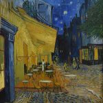
One of the most common misattributions in the art world is labeling Vincent van Gogh as an Impressionist. Born in 1853 in the Netherlands and dying tragically in 1890, Van Gogh was a Post-Impressionist whose thick, expressive brushstrokes and intense emotional palette set him apart. His work, especially paintings like Starry Night (1889) or The Bedroom (1888), has some stylistic similarities — namely visible brushwork and color play — but his purpose was psychological, not optical.
Another frequent confusion surrounds Georgia O’Keeffe, born in 1887 in Wisconsin and dying in 1986 in New Mexico. O’Keeffe’s flower close-ups and desert landscapes are often called “Impressionist” by casual viewers. In fact, she was a leading figure in American Modernism. Her simplified forms and bold colors have little to do with the fleeting light studies of the French Impressionists, and her work was far more symbolic and abstract.
Van Gogh, O’Keeffe, and Others in the “Wrong Club”
Edvard Munch, born in Norway in 1863 and best known for The Scream (1893), is another name thrown into the Impressionist mix. His emotionally charged works fall under Symbolism and Expressionism, not Impressionism. Munch’s goal was to paint the inner life, not the outer world — a radical departure from the optical effects prized by Monet or Renoir.
Other wrongly grouped artists include Henri Matisse (Fauvism), Paul Gauguin (Symbolism/Post-Impressionism), and even Frida Kahlo, whose deeply personal, symbolic art has nothing to do with Impressionism. The mistake often comes down to visual similarity or mood — but not technique, intention, or historical context. Just because a painting looks “soft” doesn’t make it Impressionist.
What Came After Impressionism — and Why It Matters
Impressionism had a direct influence on several movements that came after, but each took the basic ideas in entirely new directions. Starting in the 1880s, artists began to move beyond capturing surface impressions. Paul Cézanne, born in 1839 and dying in 1906, wanted to bring structure back into painting. He aimed to reduce natural forms to basic shapes, paving the way for Cubism.
Georges Seurat, born in 1859 and dead by 1891, developed Pointillism — a technique that applied color theory with scientific precision. His painting A Sunday Afternoon on the Island of La Grande Jatte (1884–1886) looks tidy compared to the fluidity of Monet, but it was rooted in the same desire to modernize painting. Paul Gauguin and Vincent van Gogh took the emotional route, focusing on feeling rather than visual accuracy.
Post-Impressionism, Expressionism, Fauvism, and More
Post-Impressionism is the umbrella under which much of this innovation falls. It wasn’t a unified movement, but a term coined to describe those who extended Impressionism in new, personal directions. It includes Cézanne, Gauguin, Van Gogh, and Toulouse-Lautrec, all of whom were active from the 1880s to early 1900s. While they shared roots with the Impressionists, they rejected the idea of painting only what the eye sees.
Later, Fauvism (led by Henri Matisse, 1869–1954) would push color into shocking territory, abandoning realism almost entirely. Around the same time, German Expressionism took hold, led by artists like Ernst Ludwig Kirchner (1880–1938), who painted the anxieties of modern life. None of these were Impressionists, but their visual boldness sometimes causes casual observers to confuse them with earlier works.
How to Actually Spot an Impressionist Painting
Despite the confusion, there are clear ways to identify a true Impressionist painting. The subject matter usually involves contemporary life — train stations, garden parties, dancers, picnics, city streets. The brushwork is quick and light, giving the impression of spontaneity. The artists often avoided black paint, preferring to mix colors to create shadows and form. Everything in the painting is meant to suggest movement and light, not fixed lines or deep space.
The setting is also a giveaway. Impressionists were pioneers of plein-air painting, capturing changing weather and natural light in real time. Monet’s Haystacks series (1890–1891), for example, shows the same scene in different lighting conditions. If you see repeated subjects with different atmospheres, that’s a clue. Look for shimmering surfaces, reflections, and color vibrations.
Key Visual Clues to Look For
Another major sign is the absence of historical, religious, or mythological subjects. Unlike the academic painters of the French Salon, Impressionists painted cafes, boating scenes, and bustling boulevards. Their work was grounded in the present, not the past. And while their technique looks relaxed, it was based on intense study of color theory and light behavior.
For great examples, check out collections at the Musée d’Orsay in Paris, The Metropolitan Museum of Art in New York, or The Art Institute of Chicago. These institutions house major works by Monet, Degas, Renoir, Morisot, and others. Once you’ve studied a few originals, you’ll quickly start spotting the difference between true Impressionism and its many look-alikes.
Key Takeaways
- Impressionism is often misused to label any loosely painted, colorful artwork.
- The movement began in 1874 with artists like Monet, Renoir, and Morisot in France.
- Artists like Van Gogh and O’Keeffe are often mislabeled as Impressionists despite major stylistic differences.
- Impressionism inspired many later movements, but each had distinct goals and methods.
- You can spot real Impressionist works by their brushwork, subject matter, and lighting effects.
FAQs
- Was Vincent van Gogh an Impressionist?
No. Van Gogh was a Post-Impressionist, focused more on emotional expression than optical accuracy. - Did Impressionism start in France?
Yes. The movement began in Paris in the 1870s and was largely centered around a group of French artists. - What is plein-air painting?
It means painting outdoors, directly observing natural light and atmosphere. - Is Georgia O’Keeffe an Impressionist?
No. O’Keeffe was an American Modernist whose work emphasized abstraction and symbolism. - How do I tell if a painting is truly Impressionist?
Look for modern subjects, visible brushstrokes, bright natural light, and a focus on color over detail.