The first human handprints pressed in ochre across stone walls are more than decoration: they are signals across tens of millennia that red was the first color with which people tried to make the invisible visible. Long before writing, long before farming, red was mined, ground, and spread across cave walls to conjure life, death, and mysteries that still resist certainty. When we look at those early pigments, we are not simply staring into the darkness of caves but into the darkness of time itself.
The ochre mines and the earliest pigments
The earliest known red pigments were made from ochre, a naturally occurring iron oxide that, when ground and mixed with animal fat or water, yielded a durable color. Archaeological finds from Blombos Cave in South Africa, dated to around 75,000 BC, include abraded ochre pieces stored in abalone shells, showing deliberate preparation and even recipes for pigment mixtures. This evidence suggests that humans were already treating color as a resource that needed knowledge, skill, and continuity, not just chance discovery.
The labor involved in producing red pigment underscores its value. Ochre had to be mined, sometimes deep underground, then transported and processed. In places like the Twin Rivers mines in Zambia, traces of ochre extraction have been dated back at least 300,000 years, which hints that even before Homo sapiens fully emerged, red was already part of the human imagination. The act of going underground to extract the earth’s red core would have had its own resonance: a descent into the underworld to retrieve a material that could be used to depict animals, bodies, and signs of power on the surface.
What stands out is not only the color’s availability but its persistence. Unlike organic dyes, ochre is stable, resisting both light and weathering. This stability means the red bisons of Altamira, the ochre horses of Lascaux, and the handprints of El Castillo still confront us with their raw presence, thousands of years after they were made. They endure not as faint traces but as vivid declarations, as if those long-dead hands still press against us.
Ritual, hunting, and survival symbolism
Why red? Anthropologists often point to its association with blood—the most obvious and dramatic natural pigment in human life. To paint an animal in red was to connect its image to the life-force itself, perhaps in the hope of ensuring success in the hunt. The bisons, deer, and horses rendered in ochre are not inert likenesses but charged images, almost alive with vitality and threat.
There is a striking paradox in this. The same color that signified life could also be used to signal death. Red was smeared on the bodies of the dead in burials found across Eurasia, suggesting a belief that the pigment had protective or transformative power in the passage from life to whatever came after. In burials at Sungir, in Russia, some 30,000 years old, skeletons were dusted with thousands of beads stained with red ochre, turning the graves into shimmering scarlet chambers.
The dual symbolism of red—life and death, vitality and danger—was already present in these prehistoric uses. One can imagine the flicker of torchlight in a cave, the painted bison glowing as if alive, or the handprint illuminated with sudden intensity. Red was never neutral; it demanded attention, recognition, and respect.
The ritual power of red extended beyond animals and burial. In some caves, abstract symbols and dots were painted with ochre in ways that suggest systems of communication, perhaps proto-writing. These red marks may have been tied to lunar cycles, clan identities, or initiatory rites. Whatever their precise meaning, they were deliberate attempts to externalize thought and connect it to the enduring presence of stone.
The endurance of red on stone walls
Perhaps the most astonishing aspect of red in prehistoric art is not only that it was chosen, but that it has lasted. Unlike charcoal or other pigments, which often fade or flake away, red ochre retains its intensity across tens of thousands of years. In Chauvet Cave, the lions and rhinos rendered in shades of ochre still possess a startling immediacy, as if drawn yesterday.
This endurance may itself have been part of the pigment’s meaning. Early humans may have noticed that red ochre, once applied, outlasted other materials. What better color to signify blood, life, and continuity than one that refused to disappear? It made images permanent in a way that memory alone could not guarantee.
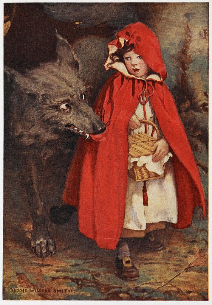
One micro-narrative brings this vividly to life. At El Castillo in northern Spain, a panel of red disks, some more than 40,000 years old, dots the cave wall. Among them is a stenciled hand, created by blowing red pigment around a palm pressed to stone. When scientists recently tested it, they found it may have been made by a woman—challenging long-held assumptions that men were the primary cave painters. That ghostly hand, crimson against limestone, is perhaps the earliest known self-portrait. It is not just pigment but presence, a human reaching across deep time to say: I was here.
Even today, when viewers enter those caves or study the reproductions, red continues to assert itself. The color bridges survival needs, symbolic systems, and aesthetic choices, collapsing the divide between the practical and the transcendent. It is as if red was the first agreement humans made with the world: that life needed to be marked, remembered, and made visible through color.
In the beginning, before the first alphabets, before the first cities, there was red on stone—an ember lit in darkness that has never gone out.
The Science of Red: Vision, Emotion, and the Human Eye
No other color strikes with quite the same immediacy as red. To understand why, we must leave mythology and art history for a moment and step inside the human eye, where the perception of color begins in a delicate interplay of light, cells, and brain chemistry. What artists intuited across centuries—that red commands attention, heightens emotion, and alters behavior—has a biological foundation as precise as any pigment recipe.
Cone cells and the perception of long wavelengths
Light enters the eye and strikes the retina, where three types of cone cells respond to different ranges of wavelength. The cones most sensitive to long wavelengths, around 560–580 nanometers, are the ones responsible for perceiving red. These cells are not isolated, but part of a comparative system: the brain registers red most strongly not simply because of one cone type, but because of the way signals from the long-wavelength cones differ from those of the medium- and short-wavelength cones.
This competitive signaling creates what neuroscientists call “opponent processing.” Red is experienced not in isolation but in opposition to green, which stimulates the medium-wavelength cones more strongly. The brain essentially treats the red-green channel as a balancing act, which means that when red dominates, it feels like a decisive victory: immediate, forceful, unignorable.
Artists have long exploited this perceptual fact. When Titian draped a figure in crimson against a field of cooler tones, the effect was not accidental—it was the exploitation of the retina’s most primitive contest. Even today, in digital screens calibrated with red, green, and blue subpixels, red tends to flare first, often overpowering blue and green in visual weight.
Psychological arousal and red’s effect on the body
The perception of red does not end with the eye. Once the brain registers red, it triggers physiological responses linked to heightened arousal. Studies show that red can increase heart rate, blood pressure, and even respiration. These reactions are subtle in everyday life but become magnified in charged contexts—on a battlefield, in a theater, or in front of a painting where a sudden flash of red interrupts a more subdued palette.
Researchers at the University of Rochester, for instance, found that athletes wearing red uniforms won more often in Olympic combat sports than those in blue—a phenomenon attributed not only to psychological intimidation of the opponent but also to the wearers’ own heightened aggression and confidence. Similarly, in controlled experiments, subjects exposed to red before tests performed worse on intellectual tasks but better on physical ones, as if the body prepared for fight rather than reflection.
This helps explain why red has often been linked to danger and passion in cultural symbolism. The physiological arousal it creates blurs the boundary between attraction and alarm. In art, that ambiguity makes red uniquely versatile: the same pigment can suggest erotic intensity or mortal peril, depending on its context. A scarlet dress may seduce, while a scarlet wound horrifies, but both rest on the same biological circuitry.
Why artists exploit red’s visual dominance
From a compositional perspective, red is the color most likely to seize and hold a viewer’s gaze. This is partly due to the way our visual system prioritizes high-contrast stimuli for survival, and partly because red wavelengths are refracted differently by the eye’s lens. Red does not focus on the retina as neatly as blue or green, which creates a slight visual “vibration” when red sits next to cooler hues. Painters from medieval manuscript illuminators to modern abstractionists have used this optical effect to create intensity and motion within otherwise static images.
Three features make red especially potent in art:
- Contrast dominance: Even a small patch of red will overpower larger areas of muted color.
- Depth illusion: Red tends to appear closer than cool colors, pulling it forward in a composition.
- Persistence: After prolonged viewing, red leaves strong afterimages, making it linger in perception.
These qualities give red an almost performative role in visual culture. It does not just sit on the surface of the canvas; it leaps forward, demands recognition, and persists in memory long after the eye has moved on.
An anecdote from Mark Rothko’s work illustrates this perfectly. Visitors to his red-dominated canvases often describe physical sensations: warmth, unease, even dizziness. Some leave galleries visibly shaken. These are not poetic exaggerations but physiological reactions to saturated fields of red that overwhelm the visual system and, by extension, the body.
Red’s scientific story, then, is inseparable from its artistic one. The cones of the retina, the arousal of the nervous system, and the peculiar quirks of optics all conspire to make red not just a color but an experience. It is the biological reason why cave painters chose it, why emperors wore it, and why modern advertisers still rely on it. If art history gives us the narrative of red, science explains why we were destined to notice it in the first place.
Ancient Egypt: Red Between Life and Chaos
Few civilizations orchestrated color with the precision of the ancient Egyptians. For them, pigments were not only aesthetic choices but active agents in a cosmic order where every hue carried meaning. Red, known as desher, occupied a paradoxical position: it could signify life, energy, and celebration, yet also chaos, destruction, and the burning heat of the desert. To stand before the walls of an Egyptian tomb, awash in hues of red, is to witness a civilization that both revered and feared the color’s force.
Red ochre in tomb painting and cosmetics
The Egyptians worked with multiple sources of red pigment. The most common was red ochre, ground from hematite, which they used for painting both wall reliefs and bodies. Tomb murals show laborers with reddish-brown skin tones, while noblewomen are often depicted with lighter, yellow-ochre hues, a visual code distinguishing class and gender. Red was also used to paint clothing, decorative motifs, and hieroglyphic signs associated with life and vitality.
But red was not limited to the walls of tombs and temples. It was also ground into fine powder for cosmetics. Women and men alike applied red pigments as rouge on their cheeks or as lip color, anticipating by millennia the same practices that continue today. Excavations have uncovered cosmetic palettes still stained with traces of red, a reminder that beauty and ritual were inseparable in Egyptian daily life.
What is striking is the continuity of red across both sacred and domestic spheres. The same pigment that adorned a noblewoman’s lips could also enliven the face of Osiris carved on a coffin. This overlap suggests that Egyptians saw no firm boundary between adornment and devotion, between everyday enhancement and eternal preparation.
The dual nature of red: vitality and danger
If Egyptian art often shows red as a color of vitality, it also makes clear that the same pigment carried danger. The desert itself, called the “Red Land” (deshret), was the domain of Set, the god of storms, chaos, and violence. To paint something red could invoke life, but it could also draw down destructive forces.
Texts from magical papyri warn against the misuse of red ink. Red hieroglyphs sometimes marked dangerous words, curses, or the names of enemies. In funerary texts, passages written in red carried heightened power, either protective or threatening. This practice echoes our own modern use of red ink to signal warning or urgency, but for the Egyptians it was bound to the fabric of cosmic balance.
A revealing example lies in the figure of Sekhmet, the lion-headed goddess of war and plague. Often depicted with a body clothed in blazing red, she embodied both protection and terror. In myth, when she rampaged too violently, Ra tricked her into drinking beer dyed red with ochre, mistaking it for blood. Drunken and pacified, she spared humanity. Here, red is simultaneously the medium of destruction and its antidote, the trigger and the cure.
Pharaohs, gods, and protective amulets
Red’s ambivalence did not prevent it from being a color of royal and divine display. Pharaohs wore red crowns, the deshret, symbolizing Lower Egypt, which when combined with the white crown of Upper Egypt created the unified double crown of kingship. The crown’s redness bound the pharaoh not only to earthly power but also to the life-giving energy of the Nile flood, which renewed the land each year.
Amulets made of red stones, such as carnelian, were placed with the dead to ensure vitality in the afterlife. The Book of the Dead specifically prescribes a carnelian amulet in the form of an ankh to be laid on the neck of the deceased, declaring, “The blood of Isis, the power of Isis, the magic of Isis, the words of power of Isis shall be the protection of this great one.” Here, red’s likeness to blood turned it into a safeguard against the dissolution of death.
In monumental art, red pigments were used to highlight divine presence. The sun god Ra, whose daily journey across the sky sustained creation, was often depicted in red and gold, the twin hues of fire. The rising and setting sun bathed the horizon in red, reminding Egyptians that renewal and danger, birth and death, could not be separated.
A small scene from a painted tomb in Thebes captures this interplay. A nobleman reclines at a banquet, his skin painted in warm reddish-brown tones. Before him, musicians and dancers move in garments touched with streaks of red. Above them, protective hieroglyphs inscribed in red ink hover with unseen potency. The entire composition is suffused with a hue that is celebratory, sensual, and sacred all at once.
Egyptians did not resolve red’s contradictions. They lived with them. The color could bless or destroy, preserve or erase. That ambivalence, rather than being an obstacle, made red indispensable. To paint in red was to acknowledge the unstable power running through both human and divine existence.
The story of red in Egypt is thus a story of a culture attuned to duality. In the red of ochre, carnelian, and crowns, Egyptians found both life and chaos, order and its undoing. To embrace red was to stand at the edge of power itself.
Mesopotamia and the Near East: Clay, Blood, and Power
If Egypt shaped red into a color of divine duality, Mesopotamia gave it a grittier, more immediate charge. The river valleys of the Tigris and Euphrates—where city-states rose and fell in cycles of conquest—were soaked with associations of clay, blood, and fire. Red in this world was less about cosmic balance and more about the blunt realities of war, ritual sacrifice, and royal spectacle. The art of Mesopotamia, from temple walls to cylinder seals, made red a language of both domination and devotion.
Pigments from earth and minerals
The basic pigments available in Mesopotamia echoed those of Egypt: red ochre derived from hematite, along with occasional use of cinnabar when trade allowed. Excavations at Ur and Mari reveal traces of ochre mixed into plaster reliefs and brick facings, used to enliven depictions of warriors, gods, and mythological beasts. In ziggurats—the massive temple towers that punctuated Mesopotamian skylines—brick was often glazed with deep reds and oranges. These fiery tones transformed monumental architecture into glowing beacons when struck by the desert sun.
Clay itself carried an intrinsic red potential. When baked, it took on shades of orange-red that formed the literal building blocks of cities. A king’s palace was not merely decorated with red; it was made of it. The entire urban fabric radiated a reddish hue, as if the land itself conspired to reflect blood and fire back to its inhabitants.
Even the ubiquitous cylinder seals—tiny carved stones rolled across wet clay to imprint images—sometimes contained red stones like jasper or carnelian. These seals, worn as personal emblems, marked ownership and authority, embedding the color of vitality and aggression into the very act of administration.
Red in temple decoration and myth
In Mesopotamian myth, red was linked closely to creation and sacrifice. One of the oldest stories, the Enuma Elish, describes the gods shaping humanity from the blood of the slain god Kingu. This origin myth encodes a fundamental idea: human life is indebted to divine bloodshed, and red is the permanent reminder of that transaction.
Temples often incorporated this symbolism in their painted reliefs and cult statues. The goddess Ishtar, associated with love, war, and fertility, was frequently adorned with red stones or garments. Her dual nature—nurturing and destructive—mirrored the color’s own polarity. To enter her temple was to encounter a visual world where red marked both erotic allure and martial ferocity.
Rituals amplified this connection. Sacrificial animals, their blood spilled before altars, created moments where literal redness met painted representations of gods. Archaeologists at sites like Mari have uncovered altars stained with both pigment and organic residue, evidence that art, ritual, and sacrifice were entangled in the same chromatic vocabulary.
Kingship, warfare, and sacred fire
Red also became the color of kingship and its violent foundations. Victory steles, like the famous Stele of Naram-Sin now in the Louvre, depict rulers towering above defeated enemies. Though the surviving reliefs are largely bare stone today, traces of pigment suggest that warriors’ cloaks and weapons were once painted in vivid hues, with red emphasizing both triumph and slaughter.
The battlefield itself was imagined as a red space. In hymns to gods like Ninurta, blood is described as flooding the earth “like a river of red clay.” This conflation of blood and soil is not metaphor alone: Mesopotamian armies often fought over fertile land, where the color of the earth and the blood spilled upon it became indistinguishable.
Fire too played a role. In rituals dedicated to Marduk or Shamash, offerings were burned, releasing both smoke and a crimson glow. Flames themselves became a divine signature, with red embers symbolizing both purification and destruction. Kings used these spectacles to reinforce their sacred mandate: power was not merely political but elemental, bound to fire and blood.
A vivid micro-narrative survives from the Neo-Assyrian period. Palace reliefs from Nineveh depict lions wounded in royal hunts, their bodies pierced by arrows, blood streaming in painted red rivulets. These hunts were not mere sport but staged dramas of domination, with the king as master of chaos. The lions’ blood, rendered in pigment, became a symbolic proxy for the blood of enemies, underscoring royal might.
To the Mesopotamians, red was never neutral decoration. It was a medium of force, binding the world of clay cities to the myths of divine blood and the brutal spectacles of war. The color saturated their world in a way that was both material and metaphysical: pressed into bricks, daubed on altars, staining the soil of battlefields.
Where Egyptians balanced red between life and chaos, Mesopotamians leaned into its violence, making it the color of power wrested from gods, animals, and men. In their art and architecture, red was not only seen but enacted—burned in fire, spilled in sacrifice, and baked into the clay of the first cities.
Classical Greece: The Aesthetics of Terracotta and Vermilion
When the Greek world began to shape its visual culture, red was never just one color among others. It marked bodies, garments, and pottery with a sharpness that made it indispensable to Greek aesthetics. From the terracotta glow of vase painting to the imported luxury of vermilion, red carried connotations of vigor, erotic allure, and heroic energy. Unlike Egypt and Mesopotamia, where red was tied closely to gods and cosmic order, in Greece it became deeply entwined with the human form, athletic and sensual.
The red-figure and black-figure vase tradition
Perhaps the most iconic use of red in Greek art lies in pottery. Beginning around the 7th century BC, potters of Corinth and later Athens developed the black-figure technique, where figures were painted in black slip against the natural reddish color of fired clay. By the late 6th century BC, the red-figure technique reversed this scheme: the background was painted black, and the figures were left in the clay’s own red tone, which could then be detailed with fine brushstrokes.
This reversal was not just technical but conceptual. Red-figure pottery allowed for greater fluidity and realism in depicting the human body. Muscles, drapery folds, and even emotional expressions could be rendered with subtle linework that black-figure lacked. The reddish color of the clay became the “skin” of heroes, athletes, and gods, making the very material of the pot into a surrogate body.
Athenian vases from the 5th century BC, now in collections like the British Museum and the Met, show this clearly. Scenes of athletes oiling themselves after training, warriors adjusting armor, or symposiasts reclining at a banquet all gain immediacy from the clay’s red surface. The color was not applied but inherent, a natural material transformed into living flesh.
Red as heroic energy and erotic allure
In Greek thought, red was not as morally ambivalent as in Egypt. It often carried more direct associations: energy, heat, desire, and sometimes danger. In vase painting, red-figure bodies suggest athletic vigor and erotic beauty. Many symposium vases show scenes of flirtation, courtship, and revelry where the glowing clay surface heightens the sense of physical immediacy.
In sculpture, traces of red pigment have been detected on marble statues. Hair, lips, and garments were often highlighted with red, part of the now well-documented practice of polychromy. Though centuries of weathering have stripped most color from Greek marble, scientific analysis has confirmed the presence of cinnabar and red ochres on works like the Peplos Kore from the Acropolis Museum in Athens. For ancient viewers, statues did not stand in pale whiteness but in vibrant color, with red adding lifelike warmth or striking emphasis.
Red also appeared in wall paintings, though fewer survive. The painted panels from the Tomb of the Diver at Paestum (c. 470 BC), though technically South Italian Greek rather than Athenian, show reclining figures at a symposium with reddish-brown flesh tones, consistent with the use of red pigments to suggest vitality.
Imported pigments and their prestige
Beyond the clay-red of pottery and local ochres, Greece also accessed more expensive pigments. Vermilion, made from cinnabar, was imported from Spain and Asia Minor, and prized for its brilliant hue. Because cinnabar was costly and sometimes toxic to handle, its use was often reserved for high-status objects, cult images, or painting of exceptional importance.
Textual sources reinforce its prestige. The philosopher Theophrastus, writing in the 4th century BC in his treatise On Stones, describes cinnabar and its uses, noting both its brilliance and its dangers. Pliny the Elder, writing later in Rome but relying on Greek knowledge, echoed this respect for cinnabar as a pigment of power and expense.
Artists and architects used these pigments strategically. In temples, red could frame friezes or highlight architectural moldings, contributing to the polychrome appearance of sanctuaries. On statues of gods, red added vibrancy to lips or drapery, setting them apart from mortal figures. The color’s rarity only amplified its impact, ensuring that when vermilion appeared, it signified importance.
The Greeks thus cultivated a dual practice of red: one democratic, rooted in the terracotta clay that defined daily life and utilitarian objects; the other aristocratic, embodied in costly vermilion that set divine or heroic subjects apart. Both practices depended on the eye’s attraction to red, but they functioned within very different social and symbolic registers.
In Greece, red fused matter and body, clay and flesh, pigment and passion. Whether in the enduring glow of a red-figure amphora or the faint traces of cinnabar on marble lips, it brought vitality into art in ways that were both sensual and heroic. If Egypt made red a cosmic balance and Mesopotamia made it a mark of power, Greece made it unmistakably human.
Rome: The Theater of Imperial Crimson
In Rome, red became the stage color of empire. Where Greece had used it to animate clay bodies and adorn marble gods, Rome transformed it into a language of power, spectacle, and excess. From the crimson of military standards to the frescoes of Pompeii and the purple-red robes of emperors, red saturated Roman life in a way that fused politics, luxury, and theatrical display. The Romans did not merely admire red; they mobilized it.
Red in frescoes and mosaics of Pompeii
The eruption of Vesuvius in AD 79 preserved entire houses in Pompeii and Herculaneum, offering a unique glimpse of Roman interior decoration. Among the most striking are the red walls of Pompeian frescoes, painted with vivid pigments that still glow despite nearly two millennia underground. The so-called “Pompeian red” was created from iron oxide ochres mixed with lime plaster, producing a deep, matte tone that covered whole walls or framed architectural illusions.
These red walls were not just background color but immersive environments. In the Villa of the Mysteries at Pompeii, life-sized figures enact enigmatic Dionysian rituals against a brilliant red backdrop. The intensity of the color amplifies the drama, turning the room itself into a stage set. Elsewhere, red panels form the basis for trompe-l’œil architecture, where painted columns, doorways, and vistas open onto imagined spaces.
Mosaics, too, used red stones and glass tesserae to outline figures or dramatize scenes. In the Alexander Mosaic from the House of the Faun at Pompeii, red highlights appear in garments, blood, and battle flags, punctuating the tumult of combat. The material durability of tesserae meant that red here was not a painted illusion but a literal embedding of color into the fabric of the floor.
Purple and red in the politics of power
In Roman culture, purple and red were closely connected, both visually and symbolically. The most prestigious dye, Tyrian purple, was extracted from murex shellfish along the Phoenician coast. Because the process was labor-intensive and the dye costly, Roman law restricted its use to the elite, especially emperors. In practice, the deep purple often appeared as a reddish-purple, further linking it to the broader family of crimson tones.
The imperial toga picta—worn by emperors during triumphs—was dyed entirely in Tyrian purple, making it the ultimate garment of power. Generals celebrating military victories also wore it temporarily, underscoring the martial roots of red’s authority. Writers like Suetonius describe how emperors guarded this privilege jealously; under certain reigns, unauthorized use of purple could even be punishable by death.
Red thus became both a social marker and a political weapon. To appear in crimson or purple was to declare dominion, wealth, and divine favor. To deny others the right to wear it reinforced hierarchies. The color’s costliness meant that it was not only seen but smelled—the stench of rotting murex clung to the dyeing process, a pungent reminder of its rarity.
Military standards, triumphs, and spectacle
If the toga picta embodied red in its most exclusive form, the Roman military made it its most public. The legionary standards, the signa carried into battle, often featured red flags or cloth. These standards served as focal points of loyalty and morale, their crimson fabric signaling unity and resolve in the chaos of combat.
Triumphal processions through Rome itself were awash in red. Soldiers wore red-dyed cloaks, generals painted their faces red with cinnabar to resemble Jupiter, and sacrificial animals decorated with crimson ribbons were paraded through the streets. Red was not just the color of war but of its theatrical aftermath, staged for the entire city to witness.
This theatrical use of red extended to the amphitheater. Gladiators sometimes wore red tunics, and the blood spilled in combat was itself a spectacle. Roman writers remarked on the visual impact of arenas stained red, a visceral reminder that the empire’s entertainments were inseparable from violence.
The combination of military red, imperial purple, and domestic frescoes created a cultural environment where red was omnipresent yet stratified. It could envelop an entire villa wall, shimmer in a senator’s garment, or flutter above an army on campaign. In every case, it declared Roman authority—over nature, over enemies, and over spectacle itself.
If Greece made red a color of vitality and the body, Rome inflated it into an empire-wide performance. In frescoes, garments, and triumphs, red was not only decoration but the very fabric of Roman theater, a spectacle of power that still radiates from their ruins.
Red in Christian Iconography of the Middle Ages
As Christianity spread across Europe, red carried forward its associations with life, blood, and power but was reshaped within a new spiritual framework. Where in Rome it had proclaimed imperial authority and martial triumph, in the Christian Middle Ages it became bound to sacrifice, martyrdom, and the visual language of salvation. Manuscripts, frescoes, and stained glass all employed red not simply for emphasis but as a theological code, guiding the faithful toward meanings embedded in color.
The blood of Christ and martyrdom
At the heart of Christian iconography stood the Crucifixion, and with it, the blood of Christ. In paintings, illuminated manuscripts, and later stained glass, the red of Christ’s wounds was not incidental but central: it signified redemption, the pouring out of divine life for humanity’s salvation. Artists rendered drops of blood with deliberate clarity, sometimes stylized, sometimes naturalistic, ensuring that the viewer could not miss their significance.
Martyrdom scenes extended this motif. The deaths of saints, often accompanied by streams of painted red, were not depictions of defeat but of victory through suffering. Frescoes in Roman catacombs from the 3rd and 4th centuries already hint at this symbolic role, with later medieval art expanding it dramatically. Blood in these works was not a detail of violence; it was a theological marker, a visual shorthand for sanctity achieved through sacrifice.
The Eucharist further reinforced this symbolism. The chalice of red wine, representing Christ’s blood, became a focal point of liturgical art. In many manuscript illuminations, the moment of consecration is surrounded by glowing reds that echo the sacramental wine. For medieval viewers, the color linked ritual to image, devotion to sight.
Mary’s robes and theological color codes
Red was also central to depictions of the Virgin Mary, though with shifting emphasis depending on region and period. In Byzantine art, Mary often appeared in a deep red or crimson mantle, symbolizing her humanity and connection to earthly existence. Christ, by contrast, was often robed in blue, signifying divinity. This inversion of later Western conventions underscored theological distinctions encoded in color.
In Western medieval painting, especially from the Gothic period onward, Mary was more often shown in blue robes lined with red, a combination that united human and divine. The interplay of red and blue thus became a visual theology: blue as heavenly, red as earthly and sacrificial. Mary’s inner garment of red symbolized her humanity, concealed beneath the outer blue of divine grace.
These color codes extended beyond Mary to other figures. Apostles, martyrs, and angels were often differentiated by garment colors, with red consistently reserved for roles involving sacrifice, authority, or divine energy. In stained glass, where light transformed pigments into luminous presence, red panels glowed with particular force. Cathedrals such as Chartres and Sainte-Chapelle are filled with windows where red glass frames biblical scenes, making theological truths radiate in literal colored light.
Red in illuminated manuscripts
The medieval manuscript tradition provides some of the clearest evidence of how red was systematically integrated into Christian visual culture. Scribes used red ink—called rubrication—to highlight important passages, headings, or sacred names. The very word “rubric” derives from the Latin ruber, meaning red. This practice made red a textual guide as well as a visual one, signaling divine or liturgical significance at a glance.
In illuminated initials, red was combined with gold to create dazzling effects. Psalters, gospels, and books of hours often feature elaborate letters where red outlines entwined with vegetal motifs or zoomorphic designs. The contrast of red and blue inks in alternating verses created visual rhythm, helping readers both navigate and meditate on the text.
Pigment analysis of manuscripts shows a range of reds in use: red lead (minium), vermilion derived from cinnabar, and organic dyes like madder. Each had different qualities—vermilion was brilliant but costly, minium tended to darken over time, and madder gave warmer, softer tones. The choice of pigment was thus both economic and symbolic, embedding layers of meaning into the very material of devotion.
Taken together, these uses of red in Christian art of the Middle Ages reveal a color that was not decorative flourish but theological necessity. It marked blood as salvation, clothed the Virgin in layered meanings, and lit up manuscripts with signals of sacred importance. In churches and cathedrals, red glowed from glass, shimmered in paint, and guided worshippers in word and image.
Where Rome had made red a theater of earthly power, Christianity turned it into a theater of sacrifice and transcendence. The color spoke directly to the faithful, a visual homily that proclaimed both the cost of salvation and the hope of eternal life.
The Alchemy of Vermilion in Medieval Europe and China
By the Middle Ages, red was no longer just an earthy pigment dug from ochre deposits; it had become a substance of fascination and even danger. The brilliant red of vermilion, derived from cinnabar (mercury sulfide), was both prized and feared across cultures. In Europe and China alike, the pursuit, preparation, and use of this pigment carried alchemical overtones. Red was no longer only a color—it was an element of transformation, bound to ideas of power, medicine, and mystery.
The global circulation of cinnabar
Cinnabar deposits were found in several regions, most notably in Spain (at Almadén), in Anatolia, and in China. Mining the mineral was perilous, as cinnabar releases toxic mercury vapor when heated. Yet despite its dangers, demand for the pigment was constant because its color was unmatched: a deep, glowing red that held its brilliance in both light and shadow.
In medieval Europe, vermilion became the preferred red for manuscript illumination. Its vividness made it stand out against gold leaf and deep blues like ultramarine. It was costly, often imported, and so was reserved for important passages, initials, or miniature scenes. Contracts between scribes and patrons sometimes specified the use of vermilion for headings, underlining its prestige.
In China, cinnabar was not only used for painting but also carved into lacquerware and ritual objects. Its association with longevity and immortality was especially strong. Taoist alchemists believed cinnabar could be transformed into elixirs of eternal life—a belief that proved tragically lethal, as mercury poisoning claimed many seekers of immortality. Despite the danger, cinnabar retained a sacred aura, linked to both life-preserving and life-destroying powers.
Monastic workshops and recipe books
In Europe, monastic scriptoria became centers for both the artistic and technical handling of vermilion. Recipe books such as Theophilus Presbyter’s On Divers Arts (12th century) describe methods for making synthetic vermilion, also known as “artificial cinnabar,” by combining mercury and sulfur under heat. The instructions read as much like alchemy as craft, with repeated warnings about the volatility of the materials.
The pigment’s expense and difficulty of preparation meant it was carefully rationed. In some manuscripts, vermilion alternates with cheaper reds like minium (red lead) or organic dyes, creating a visual hierarchy of importance within the text. The very sight of vermilion ink signaled that the words carried heightened significance, whether in scripture, law, or ritual.
Workshops also understood the pigment’s instability. Vermilion could darken or blacken if improperly prepared or exposed to certain conditions. Manuscript pages today sometimes show passages where once-brilliant red headings have turned a dull brownish tone, silent witnesses to the fragile alchemy of medieval materials.
Symbolic resonance across East and West
The symbolism attached to vermilion in the Middle Ages reveals striking parallels between Europe and China, despite the vast cultural distance. In both traditions, vermilion was bound to concepts of transformation and the threshold between life and death.
- In Europe, it was the color of Christ’s blood, painted with unmatched brilliance in crucifixion scenes and martyrdom cycles. Vermilion made suffering radiant, its unnatural glow underscoring the supernatural nature of sacrifice.
- In China, cinnabar’s brilliance linked it to cosmic order, renewal, and immortality. It appeared in Daoist temples, on talismans, and in imperial ceremonies, carrying associations of vitality and cosmic harmony.
- In both worlds, the handling of cinnabar or vermilion was dangerous, reinforcing its aura of power. The pigment was not just rare but risky, and that very risk made it precious.
The cross-cultural story of vermilion is one of convergence: distant civilizations, each working with the same mineral, arrived at similar conclusions—that this red was more than pigment. It was a substance of potency, sitting uneasily between art and alchemy, beauty and peril.
In the shimmering initials of a European psalter and the glossy red of a Chinese lacquer box, vermilion declared itself as both matter and mystery. To look upon it was to see not only color but the residue of fire, transformation, and the human will to wrestle with dangerous beauty.
Renaissance Splendor: Draperies, Flesh, and Sacred Fire
The Renaissance was an age of rediscovery and expansion, and red flourished as never before. With new trade routes, improved pigment technologies, and changing artistic ideals, painters wielded red with dazzling versatility. It clothed saints and courtesans, lit the flesh of nudes, and filled altarpieces with theatrical fire. No other period demonstrated so fully how red could move between sacred devotion and worldly splendor.
Titian and the Venetian mastery of red
If one name is synonymous with Renaissance red, it is Titian. Working in Venice in the 16th century, he perfected the layering of translucent oil glazes that gave his reds unprecedented depth. Using pigments like vermilion, red lake derived from cochineal or kermes, and occasionally minium, he created draperies that seemed to burn with inner light.
In works such as the Assumption of the Virgin (1516–18, Basilica di Santa Maria Gloriosa dei Frari, Venice), the Virgin’s robe is a sweeping expanse of scarlet that dominates the vast canvas. The color does more than decorate: it carries theological meaning, identifying Mary with passion and sacrifice, while also commanding the viewer’s gaze from every corner of the church. The pigment here is not passive but active, a force that propels the composition upward.
Venice’s humid climate and maritime trade connections gave painters privileged access to imported dyes and pigments, especially cochineal red brought from the New World after the Spanish conquest of Mexico. The brilliant dye, extracted from crushed insects, quickly outshone older European sources like kermes. Venetian workshops transformed this exotic commodity into lakes—pigments precipitated onto a substrate—giving artists luminous, transparent reds ideal for glazing.
The economics of pigments: cochineal and kermes
The Renaissance saw red pigments bound to global economies. Kermes, derived from insects gathered from Mediterranean oak trees, had been Europe’s premier source of scarlet since antiquity. But by the early 16th century, cochineal, produced from insects cultivated on prickly pear cacti in Mexico, entered European markets. Its intensity and stability made it a sensation, quickly eclipsing kermes as the preferred luxury red.
The trade in cochineal was controlled by Spain, which turned it into one of the most valuable commodities of its empire. In Florence, Venice, and Antwerp, merchants distributed it to dyers and painters, weaving it into textiles as well as paintings. A merchant’s robe dyed in cochineal red carried not only status but global resonance—it was color as empire, wealth, and novelty all at once.
In art, this meant that red was no longer only mineral but increasingly organic, tied to the labor of cultivation and trade across continents. The economic weight of red pigments elevated their symbolic impact. A patron commissioning a painting with abundant red knew that the color itself was an index of expense and prestige.
Drapery, drama, and divine presence
Painters across Europe seized the expressive possibilities of red drapery. Draped fabrics provided opportunities to display virtuosity, with folds catching light and shadow in ways that made the pigment shimmer. In altarpieces, red garments often distinguished Christ, Mary, or central saints, ensuring their visibility in the crowded visual field of church interiors.
Red also became a tool of drama. Caravaggio, though more closely tied to the Baroque, inherited Renaissance strategies of using red as a compositional anchor. In his Judith Beheading Holofernes (c. 1599, Rome), the blood is painted with visceral red that erupts against the dark background, a theatrical inheritance of earlier Renaissance explorations of the color’s intensity.
In portraits, red conveyed status, sensuality, or intellectual fire. Raphael’s Portrait of Cardinal Bibbiena (c. 1516, Uffizi) swathes the sitter in red robes that signal both rank and personality. In secular works, red garments often carried erotic charge, amplifying the allure of figures whose sensuality was otherwise contained within social decorum.
The Renaissance, then, positioned red as both sacred and secular, theological and sensual. It clothed the Virgin in radiant devotion, adorned merchants and nobles with global luxury, and illuminated canvases with technical brilliance.
In this period, red was not only color but commerce, not only pigment but performance. It became the hue of splendor itself—capable of igniting both sacred fire in altarpieces and worldly passion in portraits.
The Baroque: Scarlet Theatrics and Blooded Realism
If the Renaissance gave red splendor, the Baroque gave it drama. From the 17th century onward, red became a tool of heightened emotion, theatrical contrast, and political authority. Painters exploited its intensity to push viewers into the scene—whether through the luxurious folds of a cardinal’s robe, the spray of martyr’s blood, or the velvet drapery framing an altar. In the Baroque age, red was no longer content to glow quietly; it demanded to blaze.
Rubens, Caravaggio, and emotional intensity
Peter Paul Rubens, the great Flemish painter, filled his canvases with turbulent movement, swelling bodies, and vibrant reds. His altarpieces often swirled with crimson garments that unified sprawling compositions. In The Descent from the Cross (1612–14, Antwerp Cathedral), the deep red of Mary’s robe balances the pallor of Christ’s body, intensifying the emotional charge. Rubens’ handling of pigments—layered glazes of vermilion and organic red lakes—made the fabric shimmer with warmth, so that red seemed almost to breathe.
Caravaggio took a different approach. His chiaroscuro—the stark contrasts of light and dark—made red all the more striking when it appeared. In The Supper at Emmaus (1601, National Gallery, London), a disciple’s crimson cloak leaps forward from the shadowed background, anchoring the composition and heightening the shock of Christ’s revelation. Caravaggio’s reds were seldom expansive; instead, they flared suddenly, intensifying the sense of immediacy.
In both Rubens and Caravaggio, red functioned as more than pigment. It was an emotional accelerant, directing the viewer’s response and charging the atmosphere of the painting. Where blues and greens cooled, red ignited.
The politics of cardinals’ robes
No symbol of Baroque red is more recognizable than the scarlet robe of Catholic cardinals. Dyed with cochineal, these garments broadcast wealth and authority across the courts of Europe. Portraits by artists such as Diego Velázquez or Gian Lorenzo Bernini show cardinals swathed in vast expanses of red silk, their spiritual and political power inseparable from the pigment’s brilliance.
The Church’s embrace of red garments was both theological and theatrical. Red recalled the blood of martyrs, linking clerical office to sacrifice, but it also conveyed opulence and command. In the wake of the Counter-Reformation, the Catholic Church used art and color to assert its vitality and authority against Protestant critiques. A cardinal robed in red was a living icon of institutional power, his body literally wrapped in symbolism.
This strategy extended into church interiors. Baroque chapels gleamed with red marble, crimson draperies, and painted martyrdoms, immersing the faithful in an atmosphere where devotion and spectacle overlapped. Red was not merely seen but enveloped the worshipper, a total experience of color and faith.
Martyrdom scenes and visceral carnality
Baroque artists did not shy away from the visceral. Martyrdoms, executions, and battle scenes often made red the protagonist. In Jusepe de Ribera’s paintings, blood is rendered with unflinching realism, dripping from wounds or staining garments. Artemisia Gentileschi’s Judith Slaying Holofernes (c. 1612–13, Uffizi) turns red into an emblem of violent justice, the streaming blood contrasting with the determination of the female protagonists.
Even in secular works, red carried a carnality that was difficult to ignore. Rubens’ mythological paintings—full of robust, fleshy figures—often employed red drapery to emphasize sensuality and heat. The color heightened not only the eroticism of the figures but the sense of their vitality, their bodies alive with warmth and blood.
In sculpture, too, Baroque artists used real red materials to amplify effects. Polychrome wooden statues in Spain, especially in religious processions, were painted with startling realism, wounds highlighted with dripping red pigments that made the figures appear almost living. The faithful, confronted with these sculptures, encountered red not as abstraction but as presence.
The Baroque era was thus a time when red moved from symbol to spectacle. It illuminated canvases with emotional intensity, clothed the church in political theater, and saturated sacred and secular scenes with drama. If Renaissance red glowed, Baroque red burned.
Red Across Asia: Calligraphy, Ceremony, and Festival
While in Europe red often carried associations of blood, martyrdom, and power, across Asia it acquired a broader spectrum of meanings—joy, prosperity, vitality, and auspiciousness. From Chinese seals and lacquerware to Japanese woodblock prints and South Asian textiles, red functioned as a cultural constant, woven into art, ritual, and everyday life. Unlike in Europe, where red’s meaning was often shadowed by death, in much of Asia it became the color of life lived fully.
Chinese lacquer, seals, and festive symbolism
In China, red has been a favored color for over two millennia. The pigment cinnabar, abundant in Chinese mines, provided both practical and symbolic richness. It was used in lacquerware, giving carved boxes, trays, and ritual vessels a luminous red surface that was both durable and visually striking. These lacquer objects, some preserved from the Han dynasty (206 BC–AD 220), demonstrate the enduring prestige of cinnabar red in Chinese decorative arts.
Red was also the standard color for official seals. Stamped in cinnabar paste, seals marked documents, paintings, and calligraphic works, acting as both authentication and artistic addition. A single red seal could balance the composition of a scroll, its geometric form standing out against the black ink of calligraphy. The very act of impressing red upon paper or silk carried authority and auspiciousness.
In broader cultural life, red became the color of celebration and good fortune. Red garments were worn at weddings; red paper envelopes containing money (hongbao) were exchanged at New Year. Temples, palaces, and later even entire city gates were painted in red, making it a defining hue of Chinese architecture. In this context, red transcended decoration: it was a visual language of blessing, a way of inscribing prosperity into material life.
Japanese prints and the balance of vermilion
In Japan, red also carried strong positive associations, though with a distinct aesthetic inflection. During the Edo period (1603–1868), woodblock prints (ukiyo-e) frequently employed vermilion inks to highlight garments, lips, and architectural details. The pigment shu (vermilion) was valued for its brightness and permanence. Artists like Katsushika Hokusai and Utagawa Hiroshige used red sparingly but strategically, allowing it to punctuate compositions with vibrancy.
Red appeared in religious contexts as well. Torii gates at Shinto shrines were—and still are—painted in vivid vermilion. The choice was practical (the pigments contained mercury or iron oxides that resisted weathering and insects) but also symbolic, as red was believed to repel evil and invite divine protection. Walking through a tunnel of red torii gates, such as at Fushimi Inari Taisha in Kyoto, is to move through an architecture of color, where vermilion becomes a threshold between mundane and sacred.
In Japanese textiles, red was prominent in kimono design, often paired with white for bridal wear or with black for more dramatic contrast. The restrained but potent use of red reflected Japanese aesthetics: balance, contrast, and emphasis rather than saturation.
South Asian textiles and ritual power
In South Asia, red occupied a central place in both religious ritual and material culture. In Hindu traditions, red is associated with the goddess Shakti, the divine feminine energy. Married women mark their hair partings with red sindoor, and brides traditionally wear red saris, garments woven with gold thread to amplify the color’s brilliance. The act of wearing red at marriage is not merely decorative but symbolic, aligning the bride with fertility, auspiciousness, and divine blessing.
Textiles from India, dyed with madder or later cochineal, became highly prized across the world. As early as the Mughal period, Indian red cottons were exported to Europe, where they transformed fashion and trade. These fabrics were not only economically significant but aesthetically influential, bringing the deep reds of South Asian dyeing traditions into global circulation.
Ritual also elevated red beyond the sphere of textiles. In temple festivals, red powders (kumkum) were scattered or applied to statues of gods, devotees, and sacred objects. The act of marking with red was a form of consecration, making the color itself a medium of divine presence.
Across Asia, then, red carried an expansive range of meanings—auspiciousness, vitality, authority, and sacred power. Whether brushed onto calligraphy, carved into lacquer, printed on woodblocks, or woven into silk, it acted as a cultural constant, uniting art and life. Where in Europe red often carried the shadow of suffering, in Asia it more often signified celebration and continuity, the color of beginnings rather than endings.
The Revolutionary Red: From Liberty Caps to Flags
By the late 18th century, red had escaped the confines of church, palace, and festival to become the color of political upheaval. Where it once clothed emperors and saints, it now flew on barricades and banners. Across revolutions in Europe and beyond, red announced not only resistance but radical change, binding blood, liberty, and solidarity into a single charged symbol.
The French Revolution and political symbolism
In revolutionary Paris, red became one of the most visible emblems of dissent. Early in the 1790s, red flags were raised not to symbolize rebellion but martial law—the state’s warning of emergency. Revolutionaries soon inverted the meaning: what had been a warning sign of oppression became the banner of resistance. By 1792, the red flag was flying above the Champ de Mars as a signal of insurrection.
The Phrygian cap, worn by freed slaves in ancient Rome, was also adopted as a revolutionary emblem. In France it was dyed red, transforming an antique symbol of liberty into a vivid, instantly recognizable mark of modern freedom. Artists like Jacques-Louis David, in works such as The Death of Marat (1793, Brussels, Musées royaux des Beaux-Arts), incorporated the red cap and red drapery as shorthand for revolutionary virtue and sacrifice.
In these contexts, red linked the blood of martyrs to the promise of a new society. It was not merely metaphorical: the guillotine and street battles ensured that the revolution’s imagery of red was reinforced by its very real presence in the streets of Paris.
The 19th century rise of socialist red
As the 19th century progressed, red moved from revolutionary France into a broader political vocabulary. Workers’ movements and socialist parties across Europe adopted red flags as their standard. The color’s association with blood was central: it stood for the blood shed by workers in struggle, but also for the shared lifeblood of humanity, binding individuals into collective solidarity.
The Paris Commune of 1871 further cemented red’s revolutionary status. When Communards seized power, they flew red banners across the city. Even after the Commune’s suppression, the color’s symbolism endured, spreading into labor movements from London to St. Petersburg.
Visual culture absorbed and amplified this symbolism. Political posters, pamphlets, and caricatures often used red backgrounds or lettering to signal allegiance. Artists sympathetic to socialist causes integrated red into their imagery, making it as much a visual call to arms as a pigment on canvas.
Art as propaganda and rallying cry
By the turn of the 20th century, red had become inseparable from revolutionary propaganda. In Russia, the Bolsheviks made the red flag their emblem during the 1917 Revolution, extending its symbolism into the new Soviet state. Posters by artists like El Lissitzky and Gustav Klutsis used bold red geometries to signal modernity, urgency, and political will. Red was no longer just the color of blood—it was the color of the future, abstracted into a dynamic field of form and energy.
But the power of red was not confined to the Soviet sphere. In China, too, the revolutionary use of red became central, most famously in the later 20th century with the “red sun” imagery surrounding Mao Zedong. Even earlier, in the May Fourth Movement of 1919, red banners and ink were already tied to student protest and national renewal.
The visual dominance of red in revolutionary art stemmed from the same qualities that made it compelling in prehistoric caves and Renaissance altarpieces: its capacity to command attention, overwhelm the eye, and resonate emotionally. But in the revolutionary age, it carried a new weight: it was no longer only pigment, but ideology incarnate.
By the end of the 19th century, red had transformed from a pigment of divine sacrifice and imperial power into the universal emblem of resistance, struggle, and solidarity. It had become not just the color of art, but the color of politics itself.
The Avant-Garde: Red as Pure Form
In the early 20th century, artists began to strip color of its traditional associations and explore it as an independent force. Red, long bound to blood, power, or ritual, was reimagined as pure form—an energy that could stand alone without narrative or iconography. For avant-garde movements across Europe and Russia, red became a building block of modern art, a symbol of rupture as much as of revolution.
Matisse, Kandinsky, and the psychology of color
Henri Matisse, working in France, embraced red as a field of expression. His painting The Red Studio (1911, Museum of Modern Art, New York) transforms the entire surface of a room into a saturated red plane, with furniture and artworks barely outlined within it. The effect is immersive and disorienting, dissolving boundaries between figure and ground. For Matisse, red was not symbolic but sensorial: a way to envelop the viewer in an environment of color itself.
Wassily Kandinsky, in his theoretical writings such as Concerning the Spiritual in Art (1911), described red as a color of “immense vitality,” comparing it to a trumpet blast. For Kandinsky, red had intrinsic emotional resonance apart from any figurative context. In his abstract canvases, blocks and strokes of red functioned like notes in a symphony, generating rhythm and tension.
These explorations marked a decisive turn: red was no longer subordinate to subject matter but could dominate the composition by its own force. In avant-garde hands, red became both substance and subject.
Malevich’s “Red Square” and abstraction
In Russia, Kazimir Malevich pushed this logic further. His Red Square: Painterly Realism of a Peasant Woman in Two Dimensions (1915, State Russian Museum, St. Petersburg) presents nothing more than a tilted red square on a white ground. Despite its simplicity, the title points to a deliberate paradox: a radical abstraction that still gestures toward reality.
For Malevich, red was both a revolutionary color—resonant with the political upheavals in Russia—and a formal absolute. The square reduced painting to its essentials: shape and color as pure thought. Viewers at the time were shocked, unsure whether to read it as sacred icon, political emblem, or aesthetic experiment. Its ambiguity was its strength.
Other Russian avant-garde artists, including El Lissitzky and Aleksandr Rodchenko, likewise treated red as a dynamic field, using it in posters, architecture, and design to signal modernity and movement. Red, in this context, was the visual equivalent of a manifesto—concise, bold, and uncompromising.
Red as energy, danger, and modern dynamism
Beyond Russia and France, red became central to the visual vocabulary of modernism. Futurists in Italy used it to suggest speed, violence, and industrial power. In Germany, members of the Bauhaus integrated red into designs for architecture and typography, emphasizing clarity and impact. Piet Mondrian, though more closely associated with primary blue and yellow, often employed red as the most assertive element within his grids, giving his abstractions balance and tension.
The shared thread was red’s ability to break with tradition. It was no longer tied primarily to saints, emperors, or revolutions, though those echoes remained. Instead, red stood on the canvas as itself: a force of vision and sensation. It could signal the pulse of modern life, the energy of machines, the danger of war, or the exhilaration of new beginnings.
In the avant-garde, red was stripped bare and set free. It no longer required figures or stories to justify its presence. It became pure form—an assertion that color itself could be thought, structure, and meaning. For the first time in history, red was not only a symbol but a system.
Red in the 20th Century: From Pop to Protest
In the 20th century, red never settled into a single meaning. It oscillated between extremes: the meditative depths of Rothko’s canvases, the brash consumerism of Warhol’s soup cans, and the fiery immediacy of protest posters. This century saw red pulled into mass culture, political propaganda, and the quiet spaces of abstract painting—all of them shaping its identity as a color of contradiction.
War posters and revolutionary murals
During both World Wars, red became the color of urgency. Propaganda posters used bold blocks of crimson to catch the eye and frame calls to enlist, conserve, or resist. The intensity of the hue lent itself to stark, simplified graphics: clenched fists, flags, and warnings stamped in red could not be ignored. Designers understood what prehistoric painters and avant-garde radicals alike had known—red arrests attention instantly.
In Mexico, artists of the mural movement, including Diego Rivera, used red expansively to highlight revolutionary struggle. Murals in public buildings often feature workers’ banners rendered in deep reds, visually binding the art to the political movements that shaped it. Rivera and his contemporaries drew on both indigenous color traditions and modern socialist iconography, allowing red to stand for both cultural continuity and radical change.
The Soviet Union and later Communist China made red their dominant political brand, saturating posters, parades, and even entire public squares with it. In these contexts, red was both symbolic and literal: the blood of struggle translated into a national palette.
Rothko’s red fields and meditative depth
In striking contrast, artists like Mark Rothko used red for inward rather than outward purposes. His large canvases of the 1950s and 60s, composed of hovering rectangles of red and maroon, create an immersive field in which viewers often report feelings of awe, melancholy, or transcendence. The Rothko Chapel in Houston, filled with his deep red and dark purple paintings, has become a site for quiet contemplation.
Rothko’s reds are not about protest or propaganda but about the depth of human experience. The vast surfaces draw viewers into an encounter that is as much emotional as visual. Standing before one of his canvases, the red seems to vibrate and breathe, pulling the spectator into a silent dialogue. This was a radical reorientation: red as meditation, not manifesto.
Other abstract painters explored similar territory. Barnett Newman used “zips” of red across fields of other colors to rupture the surface with sudden intensity. Ad Reinhardt, though more restrained, acknowledged red’s ability to linger beneath darkness, a subliminal glow within nearly black canvases.
Warhol’s red in mass culture
No one understood red’s appeal in consumer society better than Andy Warhol. His iconic Campbell’s Soup Cans (1962) and Coca-Cola Bottles (1962) rely on instantly recognizable reds: the commercial tones of packaging and advertising. For Warhol, red was not lofty or spiritual but banal, repeated endlessly in supermarket aisles and magazine spreads.
By adopting those shades, Warhol collapsed the divide between art and commerce. The red of his silkscreens is the same red that beckons from a neon sign or soda label. It is both seductive and exhausting, a reminder that mass culture had claimed red as its own. In this sense, Warhol’s work reflects a new kind of politics—not of barricades, but of consumption.
Red in Pop Art was cheerful on the surface, yet unsettling in its implications. The very vibrancy that made a soup can eye-catching also revealed the saturation of daily life by corporate branding. Red had moved from cave walls and cathedrals to supermarkets and billboards.
Across the 20th century, then, red proved its versatility. It could rally armies, sanctify revolutions, fill chapels with silence, or fill shopping carts with soup. It could be sacred or profane, meditative or commercial, high art or low commodity. Its contradictions did not weaken it; they made it stronger. Red had become the century’s most mercurial color, flickering between devotion, propaganda, and pop.
Red Today: Branding, Digital Media, and Global Art
In the 21st century, red remains as potent as ever, but its arena has shifted. Where once it glowed in cathedrals and palaces, today it saturates screens, logos, and global art installations. Red has become both omnipresent and contested—wielded by corporations, activists, and contemporary artists alike. It is at once commercial shorthand, digital signal, and still, as always, a color that carries an emotional charge stronger than almost any other.
The corporate red of Coca-Cola and logos
Few colors have been so thoroughly branded as red. Coca-Cola’s crimson, standardized in the late 19th century, has become one of the most recognizable corporate colors in the world. The red of its labels and advertising campaigns does not simply stand out on shelves; it conveys warmth, familiarity, and excitement—qualities carefully cultivated by decades of marketing.
Other global brands—YouTube, Netflix, Nintendo—have likewise embraced red as their signature hue. In the digital sphere, where countless images compete for attention, red provides immediate visibility. A red notification badge on a smartphone app demands attention more urgently than blue or green. The psychology of red’s urgency, already noted by scientists, has become a central strategy of digital design.
Corporate use of red demonstrates how a color once tied to sacred blood and imperial robes now functions as a tool of consumer psychology. It is no less powerful, but its domain has shifted from altar to algorithm.
Contemporary artists reclaiming red
Artists of the present have not ceded red to corporations. Many contemporary figures deliberately reclaim or reinterpret the color, often addressing its layered histories. Chinese artist Ai Weiwei has used red in installations that recall both the political symbolism of the People’s Republic and the deeper cultural associations of prosperity and celebration. In his work, red is both celebratory and unsettling, carrying memory and critique.
Other artists explore red’s visceral impact on the body. Anish Kapoor’s installations, often employing deep red pigments and wax, evoke flesh and blood with unnerving immediacy. His monumental sculpture Svayambh (2007), a block of red wax slowly moving through gallery doorways, transforms red into a material of weight, resistance, and slow violence.
In performance art, red often signifies immediacy and confrontation. Marina Abramović, for example, has employed red garments or blood-like substances to heighten intensity in her endurance pieces, underlining the connection between red and physicality.
The color’s persistent emotional charge
Despite shifts in context, the emotional power of red has not diminished. It continues to mark danger—seen in warning signs, emergency vehicles, and hazard lights—but also joy and festivity, especially in Asian contexts where red remains the primary color of weddings and New Year celebrations. In politics, it still carries weight: red hats, banners, and campaign branding make instant visual statements, often polarizing but never ignored.
Digital media has only amplified these effects. In a landscape of scrolling feeds and constant visual noise, red is the color that halts the eye. Designers and advertisers rely on it for precisely this reason, but so too do activists and artists who seek to cut through the saturation of modern life.
In contemporary art galleries, red continues to be used for its sheer visual presence. Whether in minimalist canvases that recall Malevich or in immersive installations that engulf viewers in color, red asserts itself as both timeless and timely.
Today, as in every era before, red holds its double edge: corporate yet subversive, celebratory yet violent, digital yet visceral. The contexts change, but the color’s capacity to command attention and stir emotion remains constant. Red is never background—it is always signal, insistence, demand.
Conclusion: The Eternal Return of Red
Across tens of thousands of years, red has remained humanity’s most insistent color. From the ochre handprints on cave walls to the scarlet glow of digital screens, it has never faded into the background. Unlike other colors, which drift in and out of fashion or carry narrower associations, red has been continually reinterpreted—blood and flame, martyrdom and revolution, festival and commodity. Its power lies not in one fixed meaning but in its inexhaustible capacity to absorb new ones.
Cycles of symbolism across millennia
The story of red is a story of recurrence. In prehistory, red marked both life and death; in Egypt, it was both sacred and chaotic; in Christianity, both sacrifice and salvation. These cycles repeat across cultures. The same pigment that signified vitality in South Asian wedding saris carried the aura of blood and danger in Roman triumphs. The duality is not coincidence but necessity: red commands attention precisely because it oscillates between extremes. No other color so fully embodies contradiction.
This cyclical quality explains why red returns in moments of crisis or celebration. It is the color raised on barricades, but also on festival lanterns. It drenches altarpieces with sanctity, but also soda cans with brand familiarity. Each new use builds on what came before, never fully erasing older layers of meaning.
Red’s unbroken role in ritual and art
What is most striking is the continuity of red’s ritual role. Ancient burials dusted with ochre, medieval altars painted with vermilion, and modern protest banners all share a reliance on red to signal what matters most. Ritual, whether religious or political, has always turned to red to mark thresholds—between life and death, sacred and profane, order and disorder.
In art, red’s dominance is equally unbroken. Every major period found new ways to exploit its intensity: the red clay of Greek vases, Titian’s glazes, Rubens’ draperies, Rothko’s fields. Each innovation was technical, but also psychological, acknowledging that red acts differently on the eye and mind than any other hue. It is not just seen but felt.
The color as both memory and future
To look at red today is to see memory and future at once. Its presence in global branding recalls older uses of red as power display. Its role in contemporary art installations extends avant-garde explorations of color as pure form. Its persistence in weddings, festivals, and political movements shows that even in a digital age, red remains tied to the body, to blood, to the pulse of life.
Red endures not because it means one thing, but because it means many—often in conflict with one another. That very tension keeps it alive. In every era, it adapts, reclaiming its central place in human vision and imagination.
From handprint to screen glow, from cinnabar mine to neon sign, red has been humanity’s first and most enduring color of urgency. It is the ember that has never gone out, the flame that continues to burn at the center of art and life.