The year 1897 arrived not with a singular declaration of artistic identity but with an undercurrent of intensifying fragmentation. Across Europe and in pockets beyond, painters, designers, and image-makers found themselves caught between the ceremonial end of one era and the uncertain stirrings of another. The weight of the 19th century still loomed—in its institutions, in its academic tastes, in the machinery of its empires—but something had loosened. The painter no longer served a stable patronage system; the salon was no longer the sole arbiter of taste; and the notion of beauty itself had become suspect. There was a fracture in the world-picture, and artists began probing it not as a crisis to be resolved, but as the very material of modern expression.
Bourgeois Patronage and the Urban Eye
The economic realities of this period had shifted power in unexpected ways. A growing bourgeoisie, enriched by industry, engineering, and imperial commerce, had begun to exert real influence on the cultural sphere—not only through direct commissions and private collections, but through the rise of new exhibition societies, illustrated periodicals, and the institutional frameworks of design. Art became part of the fabric of urban identity, and artists responded with new modes of seeing.
Paris, still the gravitational center of European art, reflected this tension in its annual salons. Though official exhibitions remained tethered to traditional hierarchies, the demand for alternative venues had grown into a parallel infrastructure. Artists like Odilon Redon, Gustave Moreau, and Pierre Puvis de Chavannes were embraced not only by critics but by a public increasingly attuned to art as a form of intellectual and psychological inquiry. Meanwhile, outside the salons, illustrated journals and independent galleries created opportunities for more experimental work to circulate—not always with profit, but with growing prestige.
A telling development of the decade was the emergence of the flâneur not just as observer but as patron. The new collector was not a duke or a bishop, but a lawyer, a publisher, a professor—figures with cultural capital and disposable income, shaped by the rhythms of urban life. These men and women sought art that reflected their condition: ambiguous, cerebral, decorative, and idiosyncratic. The Impressionists had already broken the mold of narrative painting; what followed in their wake was a radical reconsideration of what painting itself could do. Should it depict? Suggest? Disturb? Console?
Three emblematic changes revealed this new appetite:
- The flourishing of poster art, especially in France and Britain, where commercial design entered the realm of fine art.
- The increasing popularity of Symbolism in both painting and poetry, dissolving clear narrative in favor of mood and inner vision.
- The spread of Japanese woodblock prints through European collections, altering composition, color, and the idea of empty space.
What was emerging was not yet called modernism, but the old world had already begun to dissolve. The artist was no longer a mirror of consensus, but a manufacturer of difference.
Art Nouveau Rising in Europe’s Cultural Capitals
By 1897, the visual grammar of Art Nouveau—though not yet named as such in every region—was rapidly infiltrating architecture, illustration, typography, interior design, and even fashion. The style had no definitive manifesto, but its motifs were instantly recognizable: whiplash curves, botanical asymmetry, decorative linework, and a rejection of historical pastiche. What united its many national variants—Jugendstil in Germany, Stile Liberty in Italy, Secessionstil in Austria, Modernismo in Catalonia—was not ideology, but sensual conviction.
In Brussels, Victor Horta had already completed the Hôtel Tassel, a swirling fusion of iron, glass, and organic ornament that redefined the domestic interior as a total aesthetic environment. In Glasgow, Charles Rennie Mackintosh developed a cooler, geometric version of the style, laced with Symbolist undertones. Paris witnessed the maturation of artists like Alphonse Mucha, whose theatrical posters for Sarah Bernhardt in 1897 transformed public advertising into visual ecstasy. Each of these currents shared a belief in the line as an expressive force—a living element that could unify text, image, and object.
That year also marked the expansion of decorative arts into a philosophy of life. The English Arts and Crafts movement, led by William Morris and continued by C.R. Ashbee and others, had already laid the groundwork for this synthesis. But Art Nouveau accelerated it, making beauty inseparable from function. Whether in the flowing script of a lithograph or the contours of a chair leg, the aesthetic experience was no longer confined to the painting or sculpture. It was everywhere—or aspired to be.
This impulse often manifested as an eroticization of the everyday. In Mucha’s prints, the female figure became both muse and symbol—a repository of natural cycles, floral motifs, and decorative rhythm. Klimt, though not yet internationally known, was experimenting in similar directions in Vienna. Across these diverse centers, 1897 served as a turning point: the year ornament was reclaimed as intellectual, the year surface was reimagined as structure.
Cosmopolitanism, Anxiety, and the New Aesthetic Vocabulary
While the surface of fin-de-siècle art often shimmered with elegance and sensuality, its psychological core was restless, even fractured. The period’s most enduring works suggest a growing unease with progress itself. The cult of rationality had brought telegraphs, railways, and electric lighting—but also monotony, noise, and alienation. Artists began to sense that the mechanical future might come at the cost of inner life.
Symbolist painters gave form to this suspicion through ambiguous figures, dreamlike settings, and religious or mythic imagery rendered with psychological ambiguity. In Norway, Edvard Munch began articulating a visual language of fear and erotic despair; in France, Redon turned the charcoal medium into a theater of visions. Even more traditional painters—such as Arnold Böcklin or Fernand Khnopff—began to dissolve clarity in favor of suggestion.
Printmaking, too, underwent a transformation. The revival of the woodcut and the spread of lithography gave artists new tools for ambiguity. Shadows, textures, and tonal fields became central components of visual meaning. Félix Vallotton, whose dry wit and psychological acuity would flourish in the coming years, began to produce images that merged domestic interior with political allegory.
Behind all these stylistic mutations was a deeper shift in artistic identity. The artist was no longer primarily a craftsman, nor a servant of the state or church. He—or increasingly, she—was a kind of explorer, a constructor of alternative realities. In this sense, the fin de siècle was not a style, but a condition: a state of experimentation, of reverie, of doubt. Its images did not reassure. They probed.
Three brief but telling signals of this cultural anxiety surfaced in 1897:
- Oscar Wilde, now imprisoned in Reading Gaol, became a martyr figure among the Aesthetic movement, casting a shadow over its idealism.
- The first Venice Biennale, held two years prior, had begun expanding its reach beyond Europe—introducing Japanese and American works that disrupted the Eurocentric canon.
- Critics in Germany and Austria increasingly debated whether decoration was morally corrupting or culturally liberating—an argument that would rage into the 20th century.
This was the paradox of 1897: the decorative and the destabilizing were not opposed, but intertwined. The year shimmered with style—but its most enduring legacy was unease. Artists had stepped out of the certainties of representation, and into a territory where meaning had to be invented anew, every time the brush touched the surface.
The Vienna Secession Breaks Away
In 1897, Vienna was a city of surface tensions and buried disquiet. Beneath its orderly facades, the capital of the Habsburg Empire pulsed with instability—political, psychological, and aesthetic. It was in this atmosphere that a group of twenty artists, led by Gustav Klimt, formally withdrew from the conservative Künstlerhaus and founded a new organization: the Vereinigung bildender Künstler Österreichs, or the Vienna Secession. The break was not a schism over technique or theme, but over control—of exhibitions, of meaning, of modernity itself. It marked not just a protest, but the beginning of one of the most ambitious attempts to reimagine art’s role in modern life.
Klimt’s Vision and the Role of Decorative Mysticism
Gustav Klimt, the movement’s first president and undeniable figurehead, had already achieved success in the 1880s and early 1890s as a muralist and decorator of public buildings. He had worked on the grand staircases of Vienna’s Burgtheater and Kunsthistorisches Museum—triumphs of academic allegory rendered with elegance and theatrical poise. But by the mid-1890s, Klimt’s sensibility had darkened and deepened. The death of his father and brother in 1892, along with a growing disillusionment with the constraints of official commissions, shifted his attention inward. The human figure—especially the female body—became his dominant preoccupation, but not as a passive object of desire. Instead, Klimt’s women shimmered with danger, prophecy, and power.
He began to move away from traditional representation and toward a visual language of ecstatic decoration. Byzantine mosaic, Japanese woodblock printing, erotic allegory, and theosophical mysticism all fed into his evolving style. The image was no longer a window onto the world but a field of symbolic charge. His figures emerged from patterned fields of gold and glyph-like designs, not placed within space but embedded in ornamental logic. In this, Klimt was not simply rebelling against naturalism; he was proposing a new model of aesthetic knowledge—where beauty was inseparable from enigma.
Klimt’s growing fascination with the decorative was not a retreat into surface, but a confrontation with depth through surface. In works like Pallas Athene (1898) and the early studies for Philosophy and Medicine, the figure became a carrier of metaphysical weight—part goddess, part cipher. Klimt’s art had become symbolic, but not illustrative. It required interpretation, yet resisted being pinned down. The Secession gave him the freedom to follow this vision without compromise.
Rebel Architects and the Gesamtkunstwerk Ideal
While Klimt defined the Secession’s iconography, it was the architects and designers within the movement who articulated its spatial and structural ambitions. Chief among them was Joseph Maria Olbrich, a young architect who had trained under Otto Wagner. Olbrich was responsible for designing the Secession’s headquarters, completed in 1898: a white, boxy structure crowned with a gleaming dome of gilt laurel leaves. It looked like a temple or a vault, a mixture of solemnity and provocation. Carved over the entrance was the motto: “Der Zeit ihre Kunst. Der Kunst ihre Freiheit.” (“To every age its art. To art its freedom.”)
This building wasn’t just a venue for exhibitions—it was an argument in stone. The Secession believed in the total work of art—the Gesamtkunstwerk—in which architecture, painting, design, and even typography were integrated into a unified aesthetic experience. The exhibition space itself became part of the artistic statement. Walls were not passive backdrops but elements of mood and rhythm. Display strategies were experimental and often controversial. One visitor described an early show as “a procession through a symbolic dream,” while others dismissed it as decadent pageantry.
The idea of the Gesamtkunstwerk was not unique to Vienna—it had roots in Richard Wagner’s theories of opera and in the British Arts and Crafts movement—but the Secessionists made it a modernist principle. They rejected historical pastiche in favor of stylistic invention. Furniture, lighting, posters, and even doorknobs became objects of design with moral as well as aesthetic significance. Koloman Moser, one of the Secession’s key members, would later co-found the Wiener Werkstätte, extending this vision into domestic life. Art, in their view, was not an escape from the world—it was a way to remake it.
Even their exhibitions were structured as experiences. In the inaugural show of 1898, Klimt’s Beethoven Frieze—a massive, mural-scale cycle created for a temporary wall—took center stage. It was never meant to be permanent. Its purpose was to envelop the viewer in a spatial drama: to physically and emotionally stage the Wagnerian ideal of redemption through beauty. The Viennese press was divided. Some critics were horrified by the eroticism and abstraction; others saw in it the beginning of a new spiritual art.
A Building Without a Home: The Secession’s Early Struggles
Despite their ambition, the early years of the Secession were financially precarious and socially embattled. The group’s exhibitions attracted large audiences but not consistent support. Many of Vienna’s older patrons and critics saw the movement as a threat to moral order and national taste. The use of nudity, the embrace of ambiguity, and the rejection of clear allegory were all interpreted as symptoms of decadence—an accusation often aimed at the broader Symbolist movement but especially potent in Vienna, where the line between eroticism and subversion was tightly policed.
Internally, the Secession was never a monolith. Disagreements quickly emerged over style, purpose, and direction. Some members favored a more internationalist, decorative approach—closer to Art Nouveau—while others wanted to develop a uniquely Austrian form of high Symbolism. By 1905, these tensions would lead to a formal split, with Klimt and his allies leaving the group to pursue even more esoteric and independent paths. But in 1897, these fractures had not yet surfaced. The group stood, however tenuously, for the ideal of artistic freedom.
They were not alone in this effort. Across Europe, similar breakaway movements were forming—each reacting against official taste, but each rooted in local conditions. In Munich, the Secession had formed in 1892; in Berlin, another would appear in 1898. The Vienna Secession was distinctive in the extent to which it fused visual radicalism with philosophical depth. Its aim was not to shock for shock’s sake, but to create a visual language adequate to a world where the old coordinates—moral, aesthetic, even metaphysical—had lost their authority.
That ambition made it vulnerable. The very freedom the Secession demanded meant it had no stable ground. It existed in a constant state of becoming—one exhibition at a time. And yet, its influence was lasting. The architecture of Olbrich, the designs of Moser and Hoffmann, and the visual grammar of Klimt would shape European modernism in profound and lasting ways. They had built something more than a group. They had created a threshold.
In a city that prized order, hierarchy, and tradition, the Secession was a living contradiction: a golden dome over a white cube, housing visions of dream, sex, myth, and ruin. It offered no answers. It only insisted that the age be allowed its art—and that art, at last, be free.
Aubrey Beardsley’s Final Year
By 1897, Aubrey Beardsley was dying. His body, racked by tuberculosis since adolescence, had grown increasingly frail, and by the summer he would retreat to the French Riviera in search of rest and isolation. Yet even as his physical strength declined, his imagination burned with violent clarity. The line that had once shocked and seduced Victorian London now traced more ambiguous paths—less overtly erotic, more spectral, but still laced with menace. Beardsley’s final year was not a retreat but a reckoning: with mortality, with faith, and with the legacy of an art that had delighted in provocation.
The Yellow Book and the Erotics of Ink
Beardsley’s name was, by 1897, inseparable from the scandalous success of The Yellow Book, the quarterly periodical he had helped found in 1894. The publication’s lurid yellow cover was a deliberate provocation—a nod to the illicit French novels associated with decadence—and Beardsley’s illustrations inside marked a radical departure from conventional English illustration. His linework was both elegant and vicious: elongated limbs, serpentine hair, grotesque gestures, and phallic ornamentation rendered with surgical precision.
It was not merely his subject matter—dandies, femmes fatales, mythic degenerates—that shocked, but the technique itself. Beardsley developed a style that reduced the image to its essentials: ink and absence. Areas of solid black clashed with empty space, creating a theatrical tension that suggested more than it showed. This was not Victorian narrative illustration. It was something darker, more abstract, more performative.
Beardsley’s erotica, especially the drawings for Lysistrata and The Tale of Venus and Tannhäuser, brought him both notoriety and censorship. Yet these images were never pornographic in a literal sense. They were ironic, theatrical, and deeply composed—an anatomy of desire, not its fulfillment. Even in his most explicit works, there was a sense of parody, an amused cruelty that placed the viewer in an uncomfortable position: complicit, but mocked.
By 1897, his involvement with The Yellow Book was over—he had been dismissed in 1895, indirectly punished for his association with Oscar Wilde, whose arrest for “gross indecency” had cast a shadow over the entire Aesthetic movement. Beardsley’s dismissal was not simply a professional blow. It marked the end of a moment in which decadence could masquerade as fashion. After Wilde’s fall, art had to either become safer—or go underground.
Consumption and the Aesthetic of the Wasting Body
As his health declined, Beardsley’s art became more interior, less flamboyant. The theatrical grotesques of his early work gave way to a sparer, more reflective mode. One of his final commissions was an illustration of Salome, the play by Wilde that had first catapulted him to fame. In it, Beardsley’s figures appear lighter, drained of their earlier physicality, almost spectral. The bodies remain stylized, but the density of black is reduced; the void begins to take over.
Tuberculosis had long been romanticized in 19th-century art—as a disease of the sensitive, the poetic, the consumptive genius. But Beardsley’s version of the illness was not ennobled. It was terrifyingly physical. He coughed blood. He grew weak. Friends reported him barely able to hold a pen. And yet, his line remained steady. In drawings such as The Ascension of St. Rose of Lima and his illustrations for Volpone, there is a refinement of gesture, a clarity that suggests both detachment and transcendence.
There was also increasing ambiguity. Was Beardsley repenting? Or merely shifting tone? His late works are not moral in a traditional sense, but they are quieter, more meditative. The sarcasm softens. The sensuality does not vanish, but becomes more symbol than thrill. In one of his final letters, he wrote, “I am much better and doing a lot of work… I long to be back in London but fear I shall never return.”
In the Victorian imagination, the death of a young artist could be a kind of aesthetic climax. But Beardsley’s decline did not follow the script. He withdrew not into solemnity, but into labor. He worked until he physically could not, then dictated. His final months in Menton, a small town on the French Riviera, were filled with anxiety, fever, and religious crisis.
Catholic Conversion and the Question of Repentance
In March 1897, Beardsley converted to Roman Catholicism. The news startled many in his circle. What did this mean? Had the prophet of decadence turned his back on everything he had drawn, published, celebrated? Or was it a final aesthetic gesture—another mask, another inversion of expectation?
On March 16, from his sickbed, Beardsley wrote a letter to his publisher Leonard Smithers, requesting that all “obscene drawings” be destroyed: “By all that is holy do not publish them… I want to go out of this world clean.” Smithers ignored the request. The Lysistrata illustrations and other erotic prints remained in circulation, and Beardsley’s literary executors, including Wilde’s friend Robert Ross, debated whether his conversion was genuine or delirious.
What is clear is that Beardsley’s final months were marked by spiritual unrest. His letters are filled with guilt and longing. He expressed admiration for Catholic art, for the architecture of redemption, for the imagery of suffering and transcendence. In his final illustrations, especially those for The Book of Tobit, there is a restraint and stillness at odds with his earlier theatricality.
Yet nothing in Beardsley’s work supports the idea of a simple repudiation. The erotic line, the barbed humor, the fascination with the interplay between sanctity and corruption—these never disappeared. Even his late religious drawings seem to draw on the same language of stylization, ornament, and ambiguity. If there was repentance, it was not puritanical. It was baroque.
A few intimate, telling details from Beardsley’s final months help crystallize the paradox:
- He kept a copy of the Roman Missal by his bedside, next to his sketchbooks.
- He requested that the nuns caring for him hang no crucifixes over his bed.
- His final will left instructions for a burial in the English cemetery in Menton—far from London, far from scandal, but also far from absolution.
Beardsley died on March 16, 1898, not long after his twenty-fifth birthday. But 1897 was his final working year, the year his style reached its strangest maturity. He had begun as a prodigy of ornament and irony. He ended as something else: a modernist without a movement, an illustrator who turned style into existential inquiry. What survived was not just a body of work, but a mood, a challenge, a set of questions drawn in ink so sharp it still cuts.
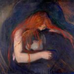
Munch’s Psychological Modernism
In 1897, Edvard Munch was 33 years old and already burdened by a reputation that most artists acquire only after death. He had exhibited across Scandinavia and continental Europe, polarized audiences in Berlin, and survived a censorship scandal in Kristiania (now Oslo). But his work remained fundamentally misunderstood—dismissed by some as sickly, obsessive, even mad. What Munch was doing, in fact, was inventing a new kind of painting: one that did not describe a scene but enacted a state of mind. By 1897, he had begun to strip away the illusion of external calm to reveal the raw, unstructured turbulence of psychological life.
Exile, Madness, and the Echoes of Personal Grief
Munch’s early years had been marked by death and illness. His mother died of tuberculosis when he was five; his sister Sophie succumbed to the same disease nine years later. His father, a rigidly pious military doctor, died when Munch was 26, leaving him with a conflicted legacy of religious guilt and emotional volatility. These traumas were not just biographical footnotes—they were the substrate of his entire visual vocabulary.
The series of paintings and prints Munch developed in the 1890s, collectively known as The Frieze of Life, attempted to capture what he called “the modern life of the soul.” Love, anxiety, jealousy, separation, and death became recurring motifs, not as moral tales but as archetypal episodes rendered with hallucinatory immediacy. In Separation (1896), the male figure’s chest seems torn open, bleeding golden strands of memory toward a receding, ghostlike woman. In Madonna (1894–95), the sensual pose and halo of the Virgin are rendered as erotic ecstasy verging on the demonic. These were not provocations—they were confessions.
By 1897, Munch had relocated to Paris for a brief but influential period. There, he encountered the post-Impressionist experiments of Gauguin and Van Gogh, both of whom shared his distrust of realism. Yet Munch’s direction was distinct. Where Van Gogh poured energy into the expressive potential of landscape and color, Munch focused relentlessly on the interior world of the human figure, often with a palette of diseased greens, bruised purples, and sickly yellows. The result was unnerving. As the German critic Julius Meier-Graefe wrote, “Munch paints as if the skin had been removed.”
The emotional intensity of these works was not merely a stylistic choice—it was existential. Munch’s own mental health was increasingly unstable. He suffered from paranoia, insomnia, and what he described as “states of vertigo” that could last for days. But his illness was not separate from his art. It was the furnace in which his images were forged.
Berlin and the Shadows of Scandinavian Nightmares
Munch had first achieved notoriety in Berlin, where a group of bohemian intellectuals had embraced his work for its primal intensity. His 1892 exhibition at the Verein Berliner Künstler had been shut down after only a few days, prompting an international scandal and a permanent break with the conservative establishment. But this rejection made Munch into a cult figure. The avant-garde saw in him not a foreign eccentric but a prophet of modern anxiety.
He returned to Berlin frequently in the mid-1890s, participating in exhibitions and mingling with figures like the dramatist August Strindberg, the philosopher Stanisław Przybyszewski, and the artist Franz von Stuck. These were men similarly preoccupied with sexuality, madness, and metaphysical dread. Munch’s work found resonance in this atmosphere, where Symbolism, decadence, and early psychoanalytic thought were converging into a volatile cultural brew.
It was also in Berlin that Munch began experimenting more deliberately with printmaking—a shift that would define his output in the coming decade. His lithographs, etchings, and woodcuts did not merely reproduce his paintings; they transformed them. Stripped of color, reduced to line and texture, the images became more ghostly, more urgent. The Kiss, Anxiety, and Vampire took on new dimensions when rendered in stark black and white. What had seemed dreamlike in paint became funereal in ink.
In 1897, Munch was at work on multiple versions of The Scream, which he had first painted in 1893 but continued to rework obsessively. The figure—sexless, mouth agape, face distorted into a universal mask of horror—became less an individual than an icon. Set against a lurid blood-orange sky, the scream is both internal and cosmic. The landscape, based on a real view in Oslo, is twisted into a vortex of echoing curves. Nothing is stable. Everything trembles.
The idea that emotion itself could reshape the visible world was Munch’s radical contribution. In this sense, he anticipated the Expressionists by more than a decade. But unlike them, Munch did not believe in redemption through expression. His images do not offer catharsis. They offer recognition—and unease.
Lines That Tremble: Munch’s New Graphic Techniques
The key to Munch’s psychological modernism was not only in his subject matter but in his handling of form. By 1897, he had developed a visual language in which every element—line, color, composition—worked to destabilize the viewer. His figures often lean or sag unnaturally, as if weighted by invisible burdens. His lines pulse and repeat, creating a sense of internal vibration. His color choices suggest illness, decay, erotic tension. Perspective is flattened or skewed. Depth is reduced to atmosphere. In some works, background and foreground collapse into each other, turning the entire surface into a field of emotional force.
His printmaking, especially in woodcut, became increasingly experimental. Instead of using a press, Munch often printed by hand, deliberately creating uneven impressions. He would reuse blocks, cut and recut them, overlaying different colors or textures to produce ghost images and visual echoes. Mistakes were left visible. The physical process of printing became part of the psychological content of the work.
Several prints from 1897, such as Evening: Melancholy and Two Human Beings: The Lonely Ones, reveal a new economy of means. The compositions are spare, but nothing is neutral. A single curved shoreline, a lone tree, a pair of figures turned away from one another—these elements are rendered with such distilled emotion that they seem to vibrate on the page. They are not illustrations of loneliness. They are loneliness, given form.
Munch’s influence spread in unexpected directions. The Viennese Secessionists admired his Symbolism, but found his rawness unsettling. German artists in Dresden and Munich, especially the younger members of the group that would become Die Brücke, saw in his prints a blueprint for their own rejection of academic decorum. Even writers took note. Rainer Maria Rilke described Munch’s images as “conversations with a fever.”
A few key developments from 1897 encapsulate Munch’s ongoing evolution:
- He began planning a frieze for the Aula of the University of Kristiania, an ambitious (and ultimately doomed) public commission that brought his Symbolist project into direct confrontation with state authority.
- His use of drypoint and aquatint became more aggressive, introducing grain, blur, and smear as expressive tools.
- He deepened his motif of the doubled figure—lovers, siblings, doubles—mirroring both his autobiographical obsessions and a dawning awareness of psychological fragmentation.
By the end of the year, Munch was no longer simply a Scandinavian curiosity. He was becoming a central figure in the prehistory of modernism—a painter of interior catastrophe, of symbolic landscapes too charged for narrative but too human to dismiss. He did not depict the world. He revealed its fractures.
Whistler’s Peacock Room Comes to America
In 1897, one of the most ornate, controversial, and deeply personal interior spaces ever created by a single artist crossed the Atlantic. James McNeill Whistler’s Peacock Room, originally designed in the 1870s as a dining room for London shipping magnate Frederick Leyland, was dismantled, crated, and shipped to Detroit, where it was installed in the home of the American industrialist Charles Lang Freer. This act of transatlantic relocation was more than a change of address. It marked the moment when the ideals of the Anglo-Aesthetic movement—its sensuous formalism, its synthesis of Eastern and Western motifs, its cult of harmony and arrangement—entered the cultural bloodstream of the American Gilded Age.
From London’s Leighton House to Detroit’s Gold Coast
The Peacock Room was born from conflict. In 1876, Whistler had been commissioned by Leyland’s architect to add some decorative touches to a dining room already lined with dark leather wallpaper and filled with blue-and-white porcelain. Whistler took the liberty of transforming the entire room—without Leyland’s prior consent—into a golden chamber saturated in peacock-feather motifs, blue-gold panels, and shimmering gilded reliefs. The artist later described it as a “harmony in blue and gold,” an immersive aesthetic environment meant to enhance both the collection it housed and the mood it induced.
Leyland was furious. Though he paid Whistler a reduced fee, their relationship was permanently ruptured. In response, Whistler painted a mural above the fireplace of two peacocks in combat—Art and Money: or, The Story of the Room—in which one bird wears a dollar sign necklace. It was a beautiful insult. Leyland kept the room. Whistler never set foot in it again.
By the late 1890s, however, Leyland had died, and the room was no longer protected. Charles Lang Freer, a self-made railroad car manufacturer and avid collector of Asian and American art, saw an opportunity. He had already begun assembling a formidable collection of Whistler’s paintings and drawings, including Nocturnes and Symphonies that embodied the artist’s synesthetic ideals. For Freer, acquiring the Peacock Room was not just a coup—it was a completion.
In 1897, he arranged for the entire room to be transported from London to Detroit. It was reinstalled, piece by piece, in Freer’s home on Ferry Avenue, where it housed his own porcelain collection. Unlike Leyland, Freer understood Whistler’s vision as total art: the merging of space, object, and sensation. The room now served not only as a private gallery, but as a philosophical laboratory for the American reception of Aestheticism.
Harmony in Blue and Gold as a Theatrical Space
The Peacock Room was never just a dining room. It was a performance. Every surface—walls, shelves, ceiling, shutters—was part of a single decorative scheme. The walls were painted a rich Prussian blue; the shutters and shelves were gilded and patterned with stylized feathers; the ceiling beams and cornices were ornamented in bronze and gold. The interplay between matte and gloss, between curved and rectilinear forms, was calculated to produce a kind of visual music.
In Whistler’s ideal, art did not tell stories. It orchestrated sensations. He disliked the term “decorative,” preferring “arrangement” or “harmony,” and often titled his paintings with musical analogies. In this, he anticipated later abstractionists like Kandinsky and Mondrian. But the Peacock Room remained resolutely figurative—full of stylized birds, arabesques, and cultural references. What made it radical was not its content, but its unity. It was, as Whistler wrote, “a space made visible in color.”
In Freer’s Detroit installation, the theatricality of the room took on a new dimension. Whereas Leyland had filled it with Chinese porcelain arranged for show, Freer arranged his ceramics according to aesthetic harmony—matching glazes and shapes to the rhythms of Whistler’s design. The room became a kind of living cabinet, a space in which East and West, craft and art, merged under the banner of visual intuition.
Three distinctive features of the Peacock Room stood out in 1897 as unmatched:
- The hand-painted shutter panels, whose peacock eyes formed a rhythmic counterpoint to the plates displayed on the walls.
- The deep blue walls, originally intended to set off porcelain, but which themselves became fields of pictorial drama.
- The mocking peacock mural—an act of revenge frozen into decoration—that turned the entire room into a layered psychological portrait.
This interplay between beauty and antagonism, between serenity and provocation, made the room more than a showpiece. It was a site of unresolved tension. And by placing it in an American setting, Freer turned that tension into a dialogue between cultures, economies, and sensibilities.
The Taste of Charles Lang Freer and the Gilded Age Collector
Freer was not a dilettante. Unlike many of his contemporaries, whose collecting habits were driven by fashion or social aspiration, he approached art with almost religious seriousness. He was influenced by the ideas of connoisseurship advanced by figures like Bernard Berenson, but also by a belief—drawn partly from Whistler—that art should not be judged by historical pedigree, but by formal integrity and emotional resonance. His collection, which would later form the basis of the Freer Gallery of Art in Washington, D.C., was shaped by a principle of inner harmony.
The acquisition of the Peacock Room was, for Freer, a symbolic act. It signaled his belief that American culture could not merely import European art, but must absorb and reinterpret it. He often spoke of the “spiritual unity” of art, linking Whistler’s Aestheticism with Japanese ceramics, Persian miniatures, and early Chinese bronzes. The room, in this context, became a physical manifestation of that unity—an environment in which disparate objects and influences could resonate together.
Freer’s relationship with Whistler had always been complex. He admired the artist’s sensitivity but was frustrated by his volatility. In a letter to a friend in 1897, Freer wrote: “He is a difficult man, but his eye is flawless. When he is not being petulant, he is sublime.” Whistler, for his part, was alternately grateful and irritated by Freer’s patronage. He often complained that Freer wanted too much explanation, too much reassurance. “The room speaks,” Whistler insisted. “One must listen without demanding words.”
By bringing the Peacock Room to Detroit, Freer did something rare: he created a space in which Aestheticism could survive intact—unmolested by commercial vulgarity or moral panic. In doing so, he also laid the groundwork for an American understanding of modernism not as rupture, but as refinement.
The irony is that Whistler never saw the room in its American setting. He died in 1903, having never traveled to Detroit. For him, the room remained a site of betrayal, a lost battle. But in Freer’s home, it found new life—not as a monument to conflict, but as a quiet, gilded echo chamber for beauty.
The Formation of the Société des Artistes Indépendants
In 1897, as academic institutions clung to fading prestige and salons grew bloated with predictability, a quiet revolution solidified in the heart of Paris. The Société des Artistes Indépendants, founded over a decade earlier in 1884, came into its own as the preeminent alternative to official culture. Though not founded that year, 1897 marked its definitive maturation: it no longer merely rejected the salon system—it replaced it. With no jury, no awards, and no hierarchy, the Indépendants offered what few institutions could—absolute freedom of exhibition. In practice, this was both utopia and chaos. But in the crucible of that openness, the future of 20th-century art began to stir.
Seurat’s Ghost and the Pointillist Legacy
The organization had always claimed Georges Seurat as a spiritual founder, and by 1897 his presence had become spectral but undeniable. Seurat had died young, in 1891, but his method—pointillism, or divisionism, as it was sometimes called—cast a long, technical shadow over the exhibition’s walls. Paul Signac, a close friend and acolyte, was now one of the Société’s most prominent organizers, and his canvases carried forward Seurat’s belief in the harmony of scientific method and emotional resonance.
But Signac was not simply repeating his mentor’s formulas. In works like The Demolisher (1897) and Opus 217, he explored broader symbolic possibilities, turning urban labor and musical reference into grand formal experiments. The brushwork remained precise, the palette luminous, but the content drifted from observation to suggestion. His interest in anarchist theory and utopian politics lent a new charge to his subject matter. Color became not just a matter of optics, but of ethics—how to see, how to compose, how to live.
By 1897, pointillism was less a method than a memory. Artists like Henri-Edmond Cross and Théo van Rysselberghe still worked within its luminous grids, but others used it as a stepping stone. Georges Lemmen’s softened figures and Louis Hayet’s dusky tones betrayed a shift toward Symbolist mood rather than scientific precision. The ideal of “objective” color harmony had collapsed into a more personal, dreamlike use of hue. Seurat’s ghost lingered—but his temple had become a theater.
The Indépendants provided the stage. Without juries or prizes, the walls bore everything from meticulous optical studies to hallucinatory visions. It was not coherence but collision that defined the show—and this instability became its strength. The viewer, unmediated by institutional judgment, had to navigate the overload of images and draw meaning from the frictions between them.
Women at the Salon: Cross-Currents of Gender and Exposure
One of the quiet revolutions taking place within the Société des Artistes Indépendants was the space it offered—however imperfectly—to women. Though still working in a culture that marginalized their contributions, female artists found in the open-door policy of the Indépendants a rare opportunity to exhibit on their own terms. Without a jury, there was no need for masculine endorsement. The work simply appeared.
Among the most visible in 1897 was Berthe Morisot’s niece, Paule Gobillard, whose work combined Impressionist looseness with an emerging Symbolist introspection. She focused on female figures, often in private spaces, rendered not for display but for presence. Her color was quiet, her line tentative but insistent. In the anarchic environment of the Indépendants, such intimacy stood out as defiance.
Other artists, like Marie Laurencin (still a teenager in 1897 but beginning to circulate in artistic circles), would soon enter the orbit of the Indépendants, bringing a sensibility rooted less in theory than in atmosphere. Their work rejected the grand allegory and moral claims of Salon art. Instead, they offered gestures of ambiguity—interior scenes, ambiguous gazes, decorative surfaces laced with emotional tension.
It was still a deeply unequal world. Critics routinely ignored or condescended to women’s work, and many female painters struggled to be taken seriously outside the domestic or decorative frame. But the Indépendants offered at least a breach in the wall. There, a female hand could paint not as a novelty or exception, but as a voice among many. The institution’s radical neutrality had, by accident or intent, created space for something genuinely new.
Three overlooked innovations made by women at the Indépendants in the 1890s deserve attention:
- Use of embroidery and textile motifs as painting structure, especially in works by Élizabeth Sonrel and Blanche Jacquet.
- Fusion of Symbolist content with Impressionist technique—soft outlines with dreamlike subject matter.
- Portraiture that resisted flattery or femininity, instead leaning into plainness, privacy, and restraint.
These were not footnotes to the main narrative. They were clues to where the narrative was going. The abstract artists of the next generation—Delaunay, Kupka, Kandinsky—would build on the modes of lyricism and interiority pioneered by these so-called minor figures.
Color as a Philosophy: Redon, Denis, and Gauguin’s Influence
As academic realism declined and Impressionism fragmented, a new kind of painter emerged at the Indépendants: the color philosopher. For these artists, the surface was not a mirror but a field of meaning. The canvas spoke not through resemblance, but through tone, hue, saturation, and placement. This shift was less technical than metaphysical. What did color mean? What was its mood, its morality, its sound?
Odilon Redon, the veteran Symbolist, had by 1897 embraced pastel and oil with increasing frequency, leaving behind his charcoal “noirs” in favor of glowing, otherworldly compositions. His flowers, saints, and imaginary beasts floated in colored mist, neither allegorical nor literal. They suggested a private cosmology, built on feeling rather than logic. To walk past a Redon at the Indépendants was not to decode an image—it was to enter a mood.
Maurice Denis, a member of the Nabis, brought a more structured approach. His famous declaration that “a painting—before being a warhorse, a nude woman, or some anecdote—is essentially a flat surface covered with colors assembled in a certain order” became a credo for the moderns. In works like April or Mother and Child, exhibited at the Indépendants, Denis fused liturgical serenity with rhythmic pattern. The result was neither naturalistic nor abstract. It was decorative theology.
Then there was Gauguin. Though living in Tahiti at the time, his work had already begun to filter back into Paris through prints and reproductions. His use of arbitrary color, cloisonné outlines, and mythologized primitivism shaped the Indépendants’ atmosphere even in absentia. His disciples—Émile Bernard, Charles Laval, Paul Sérusier—brought his gospel of simplification and spiritual synthesis to the walls. Their canvases radiated conviction, sometimes to the point of dogma.
In 1897, color was no longer just a tool. It was a field of inquiry, a philosophy, a kind of language. The Indépendants had no official doctrine, but they offered a space in which color itself could be sovereign—freed from optical theory, released into speculation.
This freedom came at a price. Many critics derided the exhibition as incoherent, indulgent, even anarchic. “A riot of paint,” one newspaper called it. “An asylum of the unschooled.” But others sensed something deeper: the erosion of old boundaries between image and idea. The Indépendants did not show the future. They allowed it to appear.
The Birth of the Munich Secession’s Rival: Jugendstil
In 1897, in the German-speaking world, the term Jugendstil began to gain traction as more than just a label—it was a provocation, a mood, a challenge. Named after the Munich-based magazine Jugend, founded that same year by Georg Hirth, Jugendstil emerged as a distinctly German contribution to the broader phenomenon of Art Nouveau. But where the French and Belgians favored curvilinear sensuality and the British cultivated hand-crafted mysticism, Jugendstil was sharper, more graphic, more didactic. It did not simply decorate—it instructed, warned, announced. In its birth year, 1897, it already carried the ambition to remake not only visual culture, but the entire relationship between art and the modern citizen.
Jugend Magazine and the Graphic Turn
Jugend began as a cultural journal aimed at a literate bourgeois readership, mixing literature, criticism, satire, and illustration. What made it revolutionary was its visual strategy. Each issue was a gallery in miniature, showcasing bold new styles in poster design, typography, and line art. The covers in particular became iconic—woodcuts, lithographs, and ink drawings that defied the gray density of the traditional German press. In their place were theatrical figures, architectural motifs, botanical forms, and allegorical symbols rendered in compressed, high-contrast forms.
The magazine’s founding designer, Otto Eckmann, developed an illustrative style that blended Gothic calligraphy with Japanese linework, creating posters and headers that felt both ancient and electric. Alongside him were other emerging artists—Peter Behrens, Thomas Theodor Heine, and Fritz Erler—each pushing the boundaries of graphic simplification and aesthetic intensity. What united them was not a manifesto, but a conviction that the age required a new alphabet of form. The curved line, the asymmetrical layout, the integration of word and image—these were not embellishments but principles.
More than just a showcase for design, Jugend became a platform for a new way of thinking about art. In its pages, readers encountered not only visual pleasure but visual philosophy. Art was no longer a framed object. It was something that flowed through print, space, and public life.
Three early innovations from Jugend in 1897 helped define its radicality:
- A consistent integration of text and image into single, unified compositions, anticipating modern magazine and advertising design.
- A rejection of academic realism in favor of stylized, idealized figures drawn from myth, fairy tale, and modern allegory.
- The use of negative space and bold contour to create immediate, emotionally charged visual impact.
Jugend did not create Jugendstil single-handedly. But it gave it a face—and more importantly, a reproducible format. It circulated modernism not through elite galleries but through kiosks and cafés.
Posters, Typefaces, and the Utopian Surface
Where earlier 19th-century art had often struggled to escape the gravitational pull of the gallery wall, Jugendstil artists embraced mass media as the new frontier. Posters became the defining medium—not merely as advertisements but as public works of art. The street became an exhibition space. In Munich, Vienna, and Berlin, passersby found themselves confronted by bold silhouettes, exotic lettering, and suggestive compositions that merged fantasy and provocation.
This poster culture was not ornamental fluff. It was a declaration of intent. The modern city, increasingly crowded, loud, and visually saturated, demanded a new legibility. Art could no longer whisper. It had to signal, to claim space, to impress itself instantly on the distracted urban eye.
Typographic design became a core field of experimentation. Artists like Eckmann and Behrens designed new typefaces rooted in calligraphic tradition but stripped of baroque elaboration. The result was a fusion of the medieval and the machinic—letterforms that could be printed en masse, yet still carried a sense of spiritual weight. These fonts appeared not just in posters, but in menus, shop signs, and bookplates. Even bureaucratic forms began to take on the imprint of aesthetic reform.
This approach extended to interior design, where Jugendstil promoted the idea that every surface was a site of meaning. Chairs, mirrors, wallpaper, and chandeliers were treated not as functional items but as aesthetic statements. Nothing was too humble to be designed.
Three principles defined the Jugendstil surface:
- Geometry wedded to nature: straight lines and stylized flowers coexisting in tension.
- An anti-historical approach: rejecting pastiche in favor of synthesis.
- Visual economy: reducing form to essentials without surrendering expressiveness.
If Art Nouveau elsewhere could veer toward decorative indulgence, Jugendstil often leaned toward restraint. Even its most ornate works carried a sense of moral clarity. Beauty was not escape—it was instruction. Every poster, every page, every plate was a lesson in how to see anew.
Henry van de Velde and the Ethics of Ornament
Though born in Belgium, Henry van de Velde became one of the intellectual architects of Jugendstil‘s ethos, especially in its northern and Germanic iterations. In the mid-1890s, van de Velde had broken with the Neo-Impressionist painting circles of Paris and turned to applied arts, convinced that design—not oil on canvas—was the true terrain of modern life. By 1897, he was producing furniture, interiors, clothing, and publications that embodied a rigorous new ideal: ornament must arise organically from function, and all decoration must carry ethical weight.
Van de Velde was not a theorist of style alone. He wrote extensively, and his essays laid the groundwork for what would later become the foundational ideas of the Deutscher Werkbund and eventually the Bauhaus. In his view, modern art should not retreat into personal expression or nostalgia. It must respond to the conditions of modern life—urbanization, industry, anonymity—by creating coherence and dignity in everyday things.
In his designs, van de Velde fused line and logic. A writing desk might undulate gently, but never arbitrarily. A candlestick might echo the curvature of a plant, but would always obey its material constraints. His interiors were immersive, but not theatrical. They sought clarity without sterility, unity without monotony.
Van de Velde’s work resonated with the growing anxiety around mass production. He did not reject machines—but he insisted that their outputs be guided by intelligence and sensibility. This was not Luddite nostalgia. It was an attempt to salvage meaning from mechanization.
In 1897, he exhibited a series of applied designs that would influence figures from Peter Behrens to Walter Gropius. His aesthetic carried forward three key propositions:
- Art must be redefined to include all designed objects, not just those framed and displayed.
- Ornament must arise from the material itself—no more glued-on frills.
- Beauty is not subjective indulgence, but a social good, embedded in structure and clarity.
Van de Velde was not alone in this vision, but he articulated it with unmatched coherence. In Jugendstil, his principles found a vehicle. The movement’s broad reach—from poster to plate, from shopfront to typeface—became a kind of mobile cathedral for a new moral aesthetic.
By the end of 1897, Jugendstil was no longer an idea in formation. It had become a vocabulary—reproducible, influential, polarizing. Critics derided it as affectation. Traditionalists dismissed it as rootless. But to its practitioners, it offered something rare: a chance to make the visual world modern not by rejecting tradition, but by boiling it down to form, intention, and line. The movement was still young, but it had found its face—and, in Jugend, its voice.
Rodin’s Burghers in Bronze
By 1897, Auguste Rodin’s The Burghers of Calais had entered public space not as a triumphal monument, but as an aesthetic and political controversy. Commissioned in 1884 by the French city of Calais to commemorate an act of heroic civic sacrifice during the Hundred Years’ War, the sculpture had taken more than a decade to complete, cast, and install. When it was finally unveiled in bronze in 1895, its reception was conflicted. Two years later, its position in both art history and civic consciousness remained unresolved. Rodin had redefined public sculpture—not with a figure of victorious command, but with six nearly broken men, barefoot and burdened, on the threshold of death. It was not heroism as glory, but heroism as despair.
A Commission Born of National Trauma
The origins of The Burghers of Calais lay in a 14th-century episode charged with national mythology. In 1347, after a prolonged siege by Edward III of England, six leading citizens of Calais volunteered to surrender themselves in exchange for the city’s survival. As the story goes, they walked barefoot and bareheaded to the English king, wearing nooses around their necks, prepared for execution. At the last moment, their lives were spared by the intercession of Queen Philippa of Hainault. For the Third Republic, eager to consolidate patriotic feeling through commemoration, this tale of civic virtue and sacrifice was an ideal subject.
Rodin’s proposal, accepted after a brief competition, broke with every conventional expectation of public statuary. Rather than presenting a single heroic figure elevated on a plinth, he envisioned a group of anguished men, each expressing an individual psychology—doubt, terror, resignation, defiance. They would stand not above the viewer, but at eye level. There would be no central figure, no narrative climax, no allegorical symbols. The drama was interior.
This approach alarmed the commissioning committee almost immediately. Rodin’s preparatory models—hauntingly raw, with slumping shoulders and gaunt faces—seemed to some like a mockery of civic pride. One committee member reportedly asked, “Why must they look so defeated?” The answer, implied in every contour of the figures, was that sacrifice is not theatrical. It is excruciating.
Rodin defended his vision with characteristic bluntness. “These men are not heroes,” he said. “They are victims.” Yet in refusing to monumentalize his subjects in the traditional sense, Rodin offered a deeper, darker kind of monument—a meditation on mortality, courage, and ambiguity. The work was approved, then delayed, then reapproved. The final bronze was not installed in front of Calais’s Hôtel de Ville until 1895, and even then, its placement was compromised: instead of standing at ground level, where Rodin intended, it was elevated on a plinth, reinstating the very distance he had tried to eliminate.
Corporeal Despair: Hands, Feet, and Faces in Flux
Rodin’s language was anatomy. He did not tell stories; he built bodies. In The Burghers of Calais, that language reached a new level of expressive intensity. Each of the six figures—Jean d’Aire, Andrieu d’Andres, Jean de Fiennes, Pierre de Wissant, Jacques de Wissant, and Eustache de Saint Pierre—was modeled not as a type, but as a unique human presence. Their gestures do not align. Their faces do not agree. The group barely coheres as a composition. That instability is deliberate.
The hands are large, angular, emphatic—often splayed or clenched in unnatural contortions. They seem to speak in a separate register from the rest of the body, articulating terror or hesitation with a fluency that contradicts the men’s stillness. The feet, bare and heavy, suggest the weight of decision—each step toward martyrdom measured and irreversible. The faces are less individualized than agonized: eyes downcast, brows furrowed, mouths set in expressions that veer between stoic restraint and visible dread.
Rodin worked obsessively on each figure, creating numerous plaster and clay studies before arriving at final forms. He often modeled them nude before adding drapery, believing that cloth should conform to the body, not conceal it. In the final bronze, the drapery clings like wet linen, revealing the skeletal structures beneath. These are not idealized male bodies. They are middle-aged, emaciated, world-worn. Heroism, here, has no gloss. It is the heroism of endurance, of submission to history’s demand.
Three formal elements made The Burghers of Calais uniquely radical in its sculptural time:
- The decentralization of composition: no figure commands attention; every angle offers a different emotional axis.
- The low intended placement: designed to confront the viewer at eye level, collapsing the boundary between monument and observer.
- The insistence on psychological realism over allegorical abstraction.
In this way, Rodin brought sculpture into new territory. He did not abandon classicism—he recharged it with emotional immediacy. His burghers are not symbols. They are men, standing on the edge of obliteration, asking nothing but to be seen.
The Politics of Display: Calais and the Art of Memory
Once installed, the sculpture quickly became a lightning rod for civic debate. In Calais, many citizens were dismayed by the group’s unflinching melancholy. Where was the triumph? Where was the national pride? Others, especially younger artists and critics, hailed the work as a breakthrough—a monument that did not flatten history into iconography but opened it up as human drama.
The work’s reception elsewhere added to its complexity. In Paris, a plaster cast shown at the Salon was met with fascination, even reverence. Foreign critics praised its originality. The British sculptor Alfred Gilbert called it “the most profound statement of group sculpture in modern times.” And yet, even in artistic circles, discomfort lingered. The Burghers refused to uplift. It mourned.
This refusal had political implications. In a France still haunted by the humiliations of the Franco-Prussian War, Rodin’s sculpture offered not reassurance but confrontation. Its message was not “We prevailed,” but “We suffered.” In a republic increasingly reliant on public monuments to stitch together a fractured identity, this was a dangerous honesty.
Rodin himself grew frustrated with the controversy. He accepted other commissions, focused on new projects—The Gates of Hell, Balzac, The Thinker. But The Burghers of Calais remained a core statement. It encapsulated his belief that art must be faithful to the human condition, not to civic fantasy.
A few concrete details about the sculpture’s journey help clarify its layered significance:
- Rodin completed the bronze cast in 1895, but the full-size plaster had been exhibited as early as 1889, shocking conservative audiences.
- The initial plan was to install it in front of Calais’s town hall at street level, but resistance from officials led to its elevation on a traditional pedestal.
- Rodin retained the right to cast additional versions, and by 1897, discussions had begun about placing copies in Paris and elsewhere—eventually resulting in the work’s presence in museums worldwide.
Today, The Burghers of Calais is often cited as a foundational modern sculpture—not because it broke with tradition, but because it forced tradition to confront emotional truth. It did not glorify the past. It gave it form. In 1897, that act was still scandalous. But in its refusal to lie, it opened the door for a new kind of monument—one built not of certainty, but of shared vulnerability.
Imperial Japan at the Venice Biennale
In 1897, the Venice Biennale was still young—only two editions old—but already it had become the most visible stage for nations to project artistic identity on an international scale. It was not merely an art exhibition; it was a diplomatic theater, where states curated not just paintings but reputations. That year, among the new exhibitors, Japan made its official debut. The display was modest in size but resonant in impact. Imperial Japan, only three decades into its post-isolation modernity, had chosen to enter the European art world with calculated elegance and quiet authority. What it showed—and how it was received—revealed as much about Western desire as about Japanese intent.
The Meiji Aesthetic: Hybridity and Control
By the late 19th century, Japan’s Meiji government (established in 1868) had undergone a remarkable transformation. In the space of a generation, it had moved from feudal fragmentation to industrial centralization, adopting Western political, military, and economic models while seeking to maintain a distinctive cultural identity. Art was not exempt from this project. In fact, it was instrumental to it. The Japanese state carefully managed its artistic exports, cultivating an image of modernity tempered by tradition.
At the Venice Biennale in 1897, Japan’s pavilion (technically a gallery within the general exhibition rather than a national pavilion as later standardized) featured a selection of works that balanced native idioms with European techniques. There were hanging scrolls in ink and color, decorative ceramics, and small landscape studies that echoed the flattened planes and sharp contours of ukiyo-e, yet often softened by Western-style perspective or naturalistic rendering. The effect was hybrid—but not confused.
Among the artists exhibited were members of the Nihonga school, which had emerged in the 1880s as a state-supported style combining traditional materials (silk, ink, mineral pigments) with compositional and thematic ideas borrowed from European art. These painters—like Hashimoto Gahō and his students—produced works that seemed timeless, yet were entirely of their moment. In Venice, their pieces suggested a nation in command of its own visual heritage, capable of presenting it not as exotic artifact but as evolving idiom.
This strategy was deliberate. Japan did not wish to appear as a primitive or picturesque other. It wished to be seen as a cultural equal—one that could participate in the European art conversation without mimicking its terms. The Meiji aesthetic was less about purity than about control: the orchestration of an image of Japan that was ancient, serene, and dignified—precisely at the moment it was hurtling toward modern industrial capitalism.
Ukiyo-e’s Shadow in a Globalized Art Market
The irony, of course, was that much of Japan’s artistic prestige in Europe rested on an earlier, unplanned wave of influence: the arrival of ukiyo-e prints in the 1860s and 1870s, which had transformed Western visual culture from Impressionism to Art Nouveau. Artists like Hokusai, Hiroshige, and Utamaro had never intended their prints for European audiences—but collectors, dealers, and artists across France, Britain, and Germany embraced them with near-religious fervor.
By 1897, this craze—often called Japonisme—had matured from novelty to institution. Japanese prints hung in Parisian salons, lined the walls of English drawing rooms, and shaped the compositions of artists from Monet and Degas to Van Gogh and Toulouse-Lautrec. The influence was not merely stylistic. It altered the Western concept of what an image could do. Asymmetry, negative space, flattened color fields, and decorative linework—all became part of the modern visual lexicon.
But at Venice, the question was different. Could Japan be more than a source of inspiration for others? Could it speak with its own voice, in its own form, on equal footing with the Western canon? The works on display answered with quiet insistence. There were no pastiches. These were not mock-European oils or overtly “Japanese” curios. They were something else: confident hybrids, marked by a kind of visual diplomacy. The prints had been a surprise. The paintings were a proposition.
Not all viewers accepted this proposition. Some critics in Italian newspapers praised the refinement of brushwork and composition, while others dismissed the exhibit as too subtle, too static, too decorative. But even the dismissals revealed an anxiety: Japan was not behaving as expected. It was not offering up its past as an aesthetic souvenir. It was entering the future—with poise.
Three strategic decisions defined Japan’s Venice debut in 1897:
- The inclusion of both traditional and semi-Westernized works, avoiding extreme positions and emphasizing continuity.
- The careful use of format and mounting—hanging scrolls and folding screens presented with dignified minimalism rather than theatrical flair.
- The absence of nationalist bombast: no mythic warriors, no imperial slogans, just careful images of nature, people, and silence.
It was, in effect, a soft manifesto—art not as spectacle, but as cultural self-possession.
Reception in Italy and the Problem of Exoticism
Italy’s relationship to Japan in the 1890s was one of fascination mixed with projection. Italian artists and critics admired the technical finesse of Japanese art, but often interpreted it through a Romantic lens—cherry blossoms, tea houses, geishas, and monks. The Japanese exhibition at Venice subtly resisted this frame. Though its images included familiar subjects—cranes, bamboo, quiet hills—they did so with restraint. There were no caricatures, no indulgences in the lush eroticism that Western collectors had often prized in ukiyo-e.
Yet the problem of exoticism persisted. Western audiences continued to view Japanese art as a portal to spiritual clarity, natural harmony, or aesthetic detachment—as though Japan existed outside of history. This fantasy was convenient, especially at a time when Europe itself was convulsed with industrial anxiety and social unrest. Japan, in this context, served as both mirror and mask: a way for Europeans to see their own aesthetic crises refracted through a supposedly timeless other.
Some Italian critics, influenced by Symbolist ideals, praised the Japanese works for their “spiritual silence” and “economy of means”—phrases that revealed more about European longing than about Japanese intention. Others dismissed them as insufficiently dramatic, lacking in “grandeur.” Few recognized the quiet confidence with which Japan had entered the arena. The biennale was full of noise. The Japanese gallery was a pause.
And yet that pause proved powerful. In the years to follow, Japan’s presence at international exhibitions would expand. Its artists would become more assertive, more experimental, and more willing to confront Western models directly. But in 1897, the tone was measured. It was an invitation—not a demand.
By presenting itself not as a curiosity but as a culture of precision and depth, Japan at the Venice Biennale issued a quiet warning to the West: admiration is not understanding. And art, even when it arrives on soft feet, can carry the weight of empires.
Félix Vallotton and the Power of the Woodcut
By 1897, Félix Vallotton had carved out—not just metaphorically but literally—a singular place in the Parisian art world. A Swiss-born painter and critic who became a naturalized French citizen, Vallotton was already known for his sharp wit, cool palette, and austere domestic scenes. But it was his woodcuts, produced in the mid-1890s and shown widely by 1897, that stunned critics and collectors alike. These stark black-and-white prints, radically simplified yet emotionally charged, signaled a revival of the woodcut not as nostalgic craft but as a cutting-edge form. In Vallotton’s hands, the medium became political, psychological, and theatrical—an art of silence that could scream.
The Intimacy of Print: Bedrooms and Barricades
Vallotton began making woodcuts in earnest in 1891, inspired by the resurgence of interest in Japanese prints and the graphic innovations of contemporaries like Toulouse-Lautrec and Bonnard. But his direction diverged sharply. Where Lautrec was exuberant, Vallotton was severe. His prints featured flat planes of black ink, sharply delineated silhouettes, and an almost surgical use of white space. There was no shading, no texture, no atmospheric haze. Instead, there was drama—rendered in the simplest terms possible.
By 1897, Vallotton had produced several major series that cemented his reputation. Intimités, published in La Revue blanche, was among the most discussed. Ten small woodcuts, each depicting a moment of tension between a man and a woman, it functioned as a dissection of bourgeois relationships—quiet rooms filled with mistrust, seduction, betrayal. The titles were as pointed as the images: Money, The Lie, The Visit, The Confession. These were not romantic scenes. They were traps.
In The Lie, for instance, a man leans over a seated woman, his face obscured. Her body is turned away, stiff, lips shut. The room is all shadows, angles, and implication. No expression is visible. But everything is legible. The starkness of the medium forces the viewer to inhabit not the character’s psyche, but the tension between them.
That same year, Vallotton also exhibited prints that addressed political violence—scenes of street protest, police raids, and anonymous crowds caught in the flashpoint of urban revolt. Unlike Daumier or Goya, Vallotton did not caricature or moralize. His depictions of upheaval were eerily calm: unarmed protesters fleeing down narrow alleys, gendarmes advancing in formation, a black sky pressing down. The tone was less revolutionary than forensic.
This dual focus—on the claustrophobia of the bedroom and the anonymity of the barricade—suggested a broader theme. Whether in love or in politics, modern life was a matter of pressure, surveillance, miscommunication, and dread. And the woodcut, with its binary force—black or white, presence or absence—was the perfect medium to express it.
Black-and-White Worlds of Bourgeois Farce
Vallotton was not a moralist. His work did not instruct. But it did observe—with uncanny clarity—the rituals of hypocrisy that shaped fin-de-siècle society. As a member of the Nabis, the group of young artists aligned with Symbolism and decorative art, he occupied an ambivalent position. While others pursued mystical reverie or Japonisme-inspired flatness, Vallotton turned his eye toward Parisian life: its pretensions, its anxieties, its coded performances.
His paintings from this period—calm interiors, nudes, park scenes—are composed with geometric precision and a dry, unsettling stillness. But it was in the woodcuts that his ironic detachment achieved full power. There, he abandoned color and depth entirely, reducing the world to silhouettes and thresholds. He rarely showed faces. Instead, he showed hands, doors, shadows, furniture—objects that spoke the truths people would not.
Three stylistic devices distinguished Vallotton’s prints from his contemporaries:
- The dramatic use of white space not as background, but as an active compositional force—often suggesting silence, repression, or exposure.
- The near-total absence of internal line within figures, flattening them into signs rather than characters.
- The use of titles as counterpoint, often injecting irony or doubling the emotional meaning of the image.
In The Kiss, for example, a man and woman embrace behind a curtain—but their bodies are little more than conjoined silhouettes, and the space around them looms with ambiguity. Is this love, or intrusion? Is the curtain concealing intimacy or revealing it?
This ambiguity was Vallotton’s hallmark. His prints do not guide the viewer; they provoke interpretation. They offer no emotional release. The tension stays unresolved, like a chord never struck.
Yet his work was not entirely bleak. There was comedy, too—dark, dry, and often directed at middle-class pretensions. In The Visit, a woman in black enters a pristine salon where a man sits, rigid and expectant. The image is almost diagrammatic. But the implication—of seduction, boredom, transaction—is unmistakable. It is theater, but it is also anthropology.
How a Medium Became Modern
Vallotton did not invent the modern woodcut, but in 1897, he arguably perfected it. His prints influenced a generation of artists across Europe, especially in Germany, where Expressionists would soon take up the medium with more visceral energy. Yet it was Vallotton who demonstrated that the woodcut could speak in a modern idiom—not merely as a revivalist or decorative form, but as a sharp tool for psychological and political observation.
In technical terms, his method was direct: he drew his images onto blocks of soft wood, then carved them himself, using clean lines and minimal crosshatching. The result was an image that could be printed easily and in multiple editions—democratic, portable, and resistant to painterly fetish. It was art that did not require a gallery. A page, a pamphlet, a journal column could become its home.
But beyond technique, Vallotton’s contribution was conceptual. He treated the print not as illustration but as argument. Each image was complete in itself—tight, cryptic, unflinching. This made his work strangely modern, even now. In a culture saturated with images, Vallotton demanded that the viewer pause, reflect, infer. His prints could be “read” like prose, but they also withheld. They were visual aphorisms.
A few facts from 1897 underscore the uniqueness of his position:
- He exhibited both prints and paintings at the Salon des Indépendants that year, but the prints drew the most critical attention—for their boldness and their restraint.
- He published multiple prints in La Revue blanche, aligning himself with literary modernists and anarchist thinkers alike.
- His reputation grew not from institutional endorsement, but from circulation—his images appeared in magazines, private portfolios, and collectors’ drawers, spreading not through galleries, but through networks.
By the end of 1897, it was clear: Vallotton’s woodcuts were not just images. They were a way of thinking—about power, about intimacy, about the spaces we inhabit and the ones we conceal. Where other artists used color, he used contrast. Where others sought clarity, he imposed disquiet. In an era obsessed with beauty, Vallotton turned the image into a trap. And once inside it, there was no easy way out.
The Death of Gustave Moreau
In April 1897, Gustave Moreau died in his home in Paris at the age of 72. His death marked the quiet end of an extraordinary career—one that had shaped the Symbolist imagination of fin-de-siècle France while remaining, in many ways, outside of its mainstream. Revered by students, misunderstood by the public, and only partially embraced by critics, Moreau had spent the final decades of his life not chasing acclaim but preparing for his afterlife. At the time of his death, his studio contained more than 8,000 works—oil paintings, watercolors, drawings, and studies—nearly all of which he left to the French state. But this was not an act of vanity. It was an act of curation. Moreau’s studio was not simply where he worked. It was where he built his world.
The Studio as Sanctuary and Mausoleum
Moreau had long withdrawn from the rhythms of the Paris art world. After his early successes in the 1860s—especially with works like Oedipus and the Sphinx and The Apparition—he became increasingly solitary, skeptical of the public stage. Though he exhibited at the Salon through the 1870s and maintained friendships with leading cultural figures, he grew disillusioned with the machinery of fame. By the 1880s, he was working largely for himself, producing works that were not intended for sale but for preservation.
His home on rue de La Rochefoucauld became a kind of temple. Canvases leaned against walls; sketches filled drawers and portfolios; small altars to mythology and Biblical mysticism stood in corners. His students at the École des Beaux-Arts, where he began teaching in 1891, recalled his studio as a place of near-monastic silence, where color and story bled together in dreamlike intensity. Moreau rarely gave formal instruction. Instead, he offered presence—a daily demonstration of how art might be lived as a mode of being.
Upon his death, it became clear that he had prepared the studio to survive him. He instructed his heir to transform the space into a museum—not a conventional gallery, but a total environment. Walls were to be crowded, not spaced; drawings were to remain in drawers where visitors could handle them; works were to be grouped thematically, not chronologically. It was not a mausoleum in the funereal sense. It was a labyrinth, a garden, a chapel of images.
The Musée Gustave Moreau, which opened in 1903, fulfilled this vision with remarkable fidelity. But even in 1897, before the public had access, the studio was understood among artists as sacred ground. Pierre Puvis de Chavannes, Odilon Redon, and especially the young Symbolists saw Moreau not as a predecessor but as a prophet.
Three distinctive features of the studio made it a mythic space:
- The density of unfinished work, suggesting not abandonment but perpetual becoming.
- The recurrence of certain motifs—Salome, Orpheus, the Sphinx—echoing like incantations across decades.
- The atmosphere of luminous interiority, where every object seemed lit from within.
Moreau had not retired. He had retreated into purpose.
The Biblical and the Hallucinogenic
Moreau’s iconography defied easy classification. He painted saints and sinners, gods and monsters, but always through a lens of psychological abstraction. His figures did not act; they posed, hovered, contemplated. His canvases were filled with jewels, halos, blood, and mystery—but they were not narratives in the traditional sense. They were meditations, often frozen at moments of supreme ambiguity: before the strike, after the revelation, during the trance.
In The Apparition (c. 1876), Salome confronts a vision of the severed head of John the Baptist—floating, radiant, dripping gold and horror. The painting glows with opulence, but the emotion is pure dread. In Jupiter and Semele (c. 1894–95), the god dissolves into radiance as he destroys the mortal woman who desires him. The canvas is vast, molten with color, and nearly incomprehensible on first glance. It must be entered slowly, like a liturgical text.
Moreau’s interest in the Bible and classical mythology was not antiquarian. He saw these stories as structures for psychic experience—as allegories of desire, faith, cruelty, and beauty. His approach was deeply internal. The line between vision and hallucination was porous. In this, he resembled poets more than painters. Baudelaire and Mallarmé were closer kin than Gérôme or Cabanel.
In the 1890s, as Symbolism gained momentum across the arts, Moreau’s reputation evolved. Once seen as eccentric or decadent, he became a touchstone. Redon called him “a dreamer of high seriousness.” The Belgian critic Albert Mockel described his paintings as “icons for a religion that does not yet exist.” He had anticipated the aesthetic hunger of the age: for mystery without dogma, for beauty without resolution.
Three formal strategies marked Moreau’s signature style:
- The layering of translucent glazes to create visual luminosity and spiritual ambiguity.
- The intricate use of gold and jewel tones to render the sacred not as sublime but as intimate.
- The collapsing of narrative time, turning stories into moments of suspended revelation.
Moreau’s art was slow, devotional, elliptical. It required patience. But for those willing to wait, it offered entry into a world where every figure shimmered with unknowable interiority.
Legacy Through Pedagogy: Rouault, Matisse, and the École Moreau
While Moreau’s own output had begun to taper in the final years of his life, his influence was extending through his students. Appointed professor at the École des Beaux-Arts in 1891, he took on a generation of young artists who would go on to redefine modernism in the 20th century. Among them were Henri Matisse, Georges Rouault, Albert Marquet, and Charles Camoin.
His teaching method was famously hands-off. He would critique a painting with a nod or a sentence. He encouraged students to read widely, to dream, to pursue individuality rather than conform to any school. Matisse later said, “He didn’t tell us what to do, but he gave us the desire to do.” Rouault called him “a man of the spirit… a guide who opened inner doors.”
This was not the standard model of academic instruction. But it had profound consequences. Rouault carried forward Moreau’s religious symbolism and painterly intensity, turning it toward social critique. Matisse, though formally opposite in almost every way, credited Moreau with instilling a respect for the inner necessity of form—for the idea that composition is a moral act.
After Moreau’s death in 1897, these students began to define themselves not as acolytes, but as inheritors. They saw in his work not formulas but freedoms. The museum, once it opened, became a point of pilgrimage—not just for Symbolists, but for Fauves, Surrealists, and even early abstractionists. Kandinsky admired Moreau’s insistence on interior meaning. Klee praised his color as a vehicle of thought.
A few lesser-known facts from Moreau’s death year reveal the quiet breadth of his legacy:
- He requested no public funeral. His burial at Montmartre Cemetery was attended by a small circle of friends and pupils.
- He left handwritten notes and marginalia scattered among his drawings, many of which remain unpublished—suggesting a mind still at work, still reaching.
- The French state, unsure what to make of his archive, nearly declined the donation; only the insistence of former students secured the museum’s future.
Moreau did not seek revolution. He sought revelation. His death in 1897 did not close a chapter—it sealed a chamber. And within that chamber, the next century of painting would come knocking.
Year’s End: Legacy, Tension, and the Future’s Shape
As 1897 drew to a close, there was no consensus, no grand proclamation to bind the year into a singular movement or message. Instead, there was accumulation—a series of fractures, departures, and quiet revolutions that would, in retrospect, be seen as foundational. What made the year so strangely pivotal was not the dominance of any one style, school, or ideology, but the proliferation of experiments—technical, psychological, decorative, political—that challenged every category inherited from the 19th century. The old scaffolding had not collapsed. But it was no longer holding. Art was beginning to float.
Modernism Without a Name
The term “modernism” had not yet taken hold in 1897, at least not in the sense it would acquire in the decades to come. But its raw materials were everywhere. The Vienna Secession had declared artistic autonomy from institutional taste. Vallotton had redefined printmaking as existential critique. Munch was collapsing the boundary between image and emotion. Beardsley’s final, haunting works blurred eroticism and spirituality into a singular line. Klimt, Redon, Whistler, and even Moreau—all, in different ways, had begun to displace narrative with sensation, realism with reverie, allegory with ambiguity.
The idea that a painting or sculpture should instruct the viewer—morally, historically, or politically—was weakening. In its place arose a different ambition: to reveal a state of being, or to invent a visual logic adequate to modern life. Whether through the lush density of Art Nouveau ornament, the black-and-white starkness of Symbolist woodcuts, or the dissonant emotions in Munch’s psychological friezes, artists were searching for structures that could sustain not just beauty, but uncertainty.
Several phenomena made this shift visible:
- The increased role of artist-founded societies and independent salons in shaping public taste, rather than academy-led exhibitions.
- The emergence of art magazines—not just as reporting organs but as sites of stylistic incubation (Jugend, La Revue blanche, The Studio).
- The growing presence of hybrid national and aesthetic identities—Japanese artists at European shows, American collectors acquiring European works, and Central European artists resisting both France and Germany’s cultural dominance.
In this environment, even old forms felt new. Gold leaf became not a Renaissance echo but a mystical field (in Klimt’s hands). Woodcut, once medieval, became ultra-modern (in Vallotton’s). Iconography from the Bible, Greece, and the East was mined not for morality but for metaphor.
Modernism had not yet named itself. But it had arrived.
Tension Between Form and Feeling
One of the defining undercurrents of 1897 was the unresolved—and often unresolvable—tension between formal innovation and emotional intensity. Artists no longer trusted linear perspective, narrative clarity, or heroic composition. But what would replace them? Geometry? Pattern? Abstraction? Silence?
Art Nouveau’s stylized surfaces, Jugendstil’s graphic language, and the Symbolist painters’ dreamscapes all approached this question differently. What united them was an attempt to bridge the gap between external form and internal condition. The decorative was not escapist; it was expressive. The grotesque was not rejection; it was revelation. Even in works of serenity—like Whistler’s Peacock Room or Redon’s pastel visions—there was an undertow of estrangement.
Artists were groping toward an art that could carry contradiction without collapse. The result was often unstable, but that instability became part of the aesthetic. A painting could be both sacred and ironic, beautiful and grotesque. A sculpture could be heroic and humiliated at once (as in Rodin’s Burghers). A print could be intimate yet anonymous (as in Vallotton’s Intimités). These were not failures of coherence. They were experiments in complexity.
By the end of 1897, the critical vocabulary had begun to reflect this shift. Words like “decorative,” “mystical,” “anxious,” “synthetic,” and “symbolic” appeared more frequently in reviews. The critic was no longer a judge of fidelity to nature, but a reader of mood, tone, and structure. Interpretation itself became more subjective, more provisional.
Three representative contradictions of 1897’s aesthetic mood:
- Art became more public (exhibited widely), but also more private (concerned with interior states).
- Form became more controlled (design-driven), but meaning became more elusive (non-narrative, allusive).
- Artists rejected institutions, yet created new ones (Secession, Indépendants, Jugend)—choosing autonomy over isolation.
The year’s greatest achievement may have been this: it made contradiction bearable. It made unresolved feeling into a style.
The Unsettled Middle: Why 1897 Refuses to Resolve
In hindsight, it is tempting to treat the late 1890s as a prelude—a transition from 19th-century convention to 20th-century rupture. But 1897 resists that simplification. It was not a prelude. It was a climax of a different kind: a convergence of tendencies that would soon diverge, sharpen, or vanish entirely.
By 1905, the Vienna Secession would fracture. Klimt would leave. Expressionism would rise. Matisse and Picasso would begin dismantling the picture plane. The decorative abundance of Art Nouveau would fade before the machine clarity of modern design. Symbolism would be absorbed into Surrealism or dismissed as decadence. Many of 1897’s experiments would be abandoned or transformed.
But in that moment—brief, vivid, unresolved—the art world held open a vast field of possibility. There was still room for ornament and introspection, for myth and modernity, for violence and silence. That range would narrow in the new century, as movements hardened and theories multiplied. But in 1897, everything was still provisional.
The year did not deliver manifestos. It delivered tensions—between nations and styles, between mediums and markets, between artists and their own pasts. And it did so with grace. Even the most unsettling works of the year retained elegance, however strained. This was an era of surfaces, but not superficiality.
A few overlooked but emblematic echoes of 1897’s contradictions:
- In Paris, the Eiffel Tower still stood as a contested symbol—loved by modernists, loathed by traditionalists, tolerated by the state.
- In Vienna, the Peasant War murals by Albin Egger-Lienz began, combining heroic subject matter with abstracted form—history painting at war with itself.
- In Berlin, Käthe Kollwitz published her Weavers cycle—social protest rendered with intimate, almost sacred gravity.
Each of these pointed forward. But each also held something unresolved, something that 1897 made uniquely possible: the belief that fragmentation could be fertile.
The art of 1897 did not promise clarity. It promised urgency, ambiguity, and the right to imagine otherwise. That is why it matters—not as a moment of culmination, but as a space of suspension. The hinge did not yet swing. But the pressure was building.