You can sometimes spot inexperienced design before reading a single word. The typography gives the game away. A restaurant reaches for Papyrus to announce “authentic tradition.” A café discovers Lobster and suddenly looks suspiciously like twenty other cafés. Comic Sans appears on a serious office notice, while another new brand types its name in a fashionable geometric sans-serif and assumes the logo is finished. The problem is not that these typefaces are inherently useless. The problem is choosing them without thinking. Fonts designers should avoid are usually the fonts they cannot justify.
Professional typography is not a blacklist. Memorizing that Comic Sans is “bad” and Helvetica is “good” does not make someone a designer. It merely replaces one shortcut with another. Good typography requires judgment about audience, proportion, spacing, hierarchy, readability, medium, and context. It also requires understanding that familiar typefaces carry associations built up through years of use.
A typeface can therefore become a victim of its own success. Once distinctive lettering appears on enough menus, invitations, posters, websites, and homemade logos, people recognize its personality before they process the words. The font starts doing the conceptual work. That is dangerous because professional design should make deliberate choices rather than borrow a ready-made mood.
There are surprisingly few fonts that deserve permanent exile. Comic Sans had a purpose. Papyrus was deliberately designed to look handmade. Helvetica can be badly used despite its enormous influence. The dividing line is not between approved and forbidden typefaces. It is between typography chosen for a reason and typography chosen because it happened to be sitting in the font menu.
The Fonts That Instantly Scream Amateur Design
Certain fonts become clichés because they communicate a mood immediately. That is initially an advantage. A decorative script can suggest informality. Rough lettering can imply age or craft. A geometric sans-serif can suggest order and modernity. But repeated use gradually turns those associations into visual shorthand. Eventually, instead of saying “handmade,” “historic,” or “friendly,” the typeface simply says, “I have seen this before.”
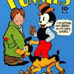
Comic Sans is the obvious example, but its actual history is more interesting than the jokes. Microsoft credits Vincent Connare as its designer. Connare began creating the typeface in October 1994 while Microsoft was developing comic-style software. He wanted lettering that looked more appropriate inside speech balloons than conventional type. Comic Sans was considered for Microsoft 3D Movie Maker and later shipped with the Windows 95 Plus! pack. Microsoft subsequently included version 2.00 in its Core Fonts for the Web program on March 4, 1998. Its original context helps explain its informal personality. The problem begins when that personality wanders into situations demanding authority, elegance, restraint, or seriousness.
Papyrus demonstrates a different danger. Designed by Chris Costello, it uses irregular, roughened forms that suggest hand-made lettering. That distinctive appearance gives it instant character. It can evoke age, craft, fantasy, nature, or something vaguely archaeological. Unfortunately, those associations also make Papyrus an easy shortcut. It has appeared so widely in themed businesses, signs, flyers, and amateur graphics that the effect can overwhelm whatever message the designer intended. A font selected to make something look unusual can become painfully predictable.
Comic Sans, Papyrus, Lobster and the Usual Suspects
Lobster shows how quickly the same phenomenon can happen in the digital age. Designer Pablo Impallari released version 1.000 on May 2, 2010. Development moved rapidly, with further versions appearing on May 3, May 10, May 18, and a substantially redrawn version on July 2, 2010. Lobster offered bold, connected display lettering with the energy of painted commercial signs. That made it attractive for cafés, packaging, invitations, restaurants, and cheerful small-business identities.
Its success also became its weakness. A highly distinctive script has very little anonymity. Once audiences have seen those sweeping forms repeatedly, a logo using them no longer feels individually lettered. This does not make Lobster badly designed. It means the designer must account for the associations it now carries.
Brush Script and similar faces create the same temptation. Designers often decide that a project should feel “personal” or “handmade” and immediately choose a script. Yet script is an enormous category. Formal calligraphy, casual handwriting, sign-painter lettering, brush lettering, and elegant italic forms communicate very different things. Choosing any script simply because it looks handwritten is like choosing a trumpet because the brief says “music.”
Warning signs that the font is doing too much of the designing include:
- You chose it mainly because it was already installed.
- The font supplies almost the entire personality of the project.
- Competing businesses use nearly identical typography.
- You cannot explain why its proportions suit the message.
- Changing the font causes the whole concept to collapse.
Helvetica and Arial Aren’t Automatically Professional
Once beginners learn to distrust Comic Sans, another trap appears. Helvetica becomes “good.” Arial becomes “boring.” Geometric sans-serifs become “modern.” Increase the tracking, surround the wordmark with white space, place it on a tasteful beige background, and suddenly everything looks expensive. Except it does not. Minimalism can disguise weak thinking just as easily as decorative typography can.
Helvetica deserves its reputation as one of modern typography’s major designs. The Museum of Modern Art credits Max Miedinger and Edouard Hoffmann and identifies the Haas Type Foundry in Switzerland in connection with its development. MoMA celebrated Helvetica’s fiftieth anniversary with an exhibition that opened on April 6, 2007, and ran through March 24, 2008. Its clarity and adaptability helped it spread widely across corporate identity, signage, publishing, and graphic design.
Yet Helvetica cannot rescue poor typography. Bad spacing remains bad spacing. Weak hierarchy remains weak hierarchy. Lines set too tightly remain difficult to read. A famous typeface is not an automatic design system.
Arial has suffered from equally simplistic judgments. Monotype credits Robin Nicholas and Patricia Saunders with drawing Arial in 1982 for an early IBM laser printer and identifies Monotype Grotesque as an important part of its ancestry. Arial and Helvetica can appear closely related, especially to non-specialists, but their details differ. Reducing Arial to a cheap insult avoids the more useful question: does it perform well in the specific job?
When “Clean and Minimal” Becomes a Design Crutch
Futura offers another lesson. Paul Renner designed the typeface, which the Bauer foundry issued in 1927. Its construction famously draws on geometric forms. Museum Angewandte Kunst describes its design in relation to elementary shapes including circles, triangles, and squares. That geometry helped give Futura a distinctive modern character, but nearly a century of admiration does not mean it belongs on every architectural identity or technology logo.
Newer geometric families can fall into the same trap. Poppins, for example, supports Latin and Devanagari. Indian Type Foundry describes its forms as strongly geometric and nearly monolinear, while still employing optical corrections where necessary. The current family record credits Jonny Pinhorn and dates that version to March 23, 2018. Those details remind us that “geometric sans-serif” is not one generic visual ingredient.
Minimal branding becomes weak when designers imitate the appearance of restraint without doing the underlying work. A centered word in a clean sans-serif may look beautiful on an embossed stationery mockup. Remove the expensive photography and textured paper, however, and the typography must stand alone.
That is why fonts designers should avoid cannot reasonably mean never using Helvetica, Arial, Futura, or Poppins. Avoid automatic choices instead. Make every candidate compete for the job. Test the real company name, awkward letter combinations, numbers, punctuation, lowercase text, capitals, and different sizes. A prestigious name in the font menu does not guarantee a good result.
Good Designers Don’t Choose Fonts by Reputation
Professional font selection starts with the problem. Who will read the text? Where will they encounter it? At what size and distance? Will it appear on packaging, websites, signs, printed reports, phones, or all of them? Does the client need multiple languages? Are several weights necessary? Will financial tables require clear numerals? These questions are less glamorous than browsing beautiful specimens, but they separate typography from decoration.
Even basic letter proportions matter. X-height affects how large lowercase text appears at a given point size. Open counters can help characters remain clear when text becomes small. Width affects how comfortably copy fits into narrow columns. Stroke contrast changes texture. A typeface that looks magnificent at 72 points may become tiring at nine points.
Spacing matters just as much. Kerning controls spacing between particular character combinations, while tracking changes spacing across groups of letters. Poor spacing can make excellent letterforms look amateurish. Logos are especially unforgiving because people see them repeatedly and at many sizes.
Line length and leading also influence readability. Extremely long lines make the eye travel too far before returning to the next line. Very narrow columns create constant breaks. Tight leading turns paragraphs into dark blocks, while excessive leading disconnects consecutive lines. No “professional font” can correct those mistakes automatically.
The Questions Professionals Ask Before Picking a Typeface
Audience comes first. Typography for a children’s museum should not automatically resemble typography for an investment company. A luxury hotel, machine manufacturer, neighborhood bakery, law office, and record label all communicate differently. The type should serve that voice rather than imposing a fashionable personality on it.
Medium comes next. Fine strokes that look elegant on a large monitor may disappear in poor printing. Tight counters can fill in at small sizes. A beautiful logo may turn into a blur when embroidered onto fabric. Packaging introduces folds, curves, foil, and shelf competition. Signage introduces distance. Professional typography is tested where it will actually live.
Language support can also be decisive. Poppins is useful here because its design addresses both Devanagari and Latin writing systems. A brand operating across languages needs more than a handsome English wordmark. Character coverage, weight, rhythm, and visual compatibility must work across the required scripts.
Licensing cannot be ignored either. Fonts are software, and different licenses may govern desktop work, websites, apps, servers, advertising, or other distribution. Having a font file does not automatically grant permission to use it everywhere. A designer who hands a client a beautiful identity with an expensive licensing headache has not completely solved the problem.
Then there is font pairing. Pairing is not about finding two fashionable typefaces that look attractive beside each other. Each needs a job. Contrast can work beautifully: serif against sans-serif, expressive against restrained, broad against narrow. Harmony can work too. But if two typefaces are so similar that nobody understands why both are present, one may be unnecessary.
The strongest test is surprisingly unglamorous: use real content. Build the awkward page first. Try prices, dates, addresses, percentages, long headings, captions, tables, disclaimers, and mobile screens. A font that looks wonderful when displaying a perfect six-letter brand name may reveal serious weaknesses when asked to handle ordinary business.
The Real Designer Move Is Knowing When to Break Rules
Typography rules are useful because they protect beginners from predictable mistakes. “Don’t use Comic Sans” is easier to remember than a long discussion about context and visual tone. “Never use more than two fonts” is easier than explaining hierarchy. But rules are training wheels. Professional judgment eventually requires understanding why the rule exists and recognizing the rare occasions when breaking it produces a stronger result.
That means even a notorious typeface can sometimes work. Comic Sans used deliberately in an informal comic-related setting is very different from Comic Sans appearing accidentally on a formal certificate. Papyrus used knowingly as a cultural reference is different from Papyrus chosen because somebody typed “ancient font” into a menu. Context changes meaning.
Intentional ugliness can also be a legitimate graphic device. A designer may deliberately create awkwardness, nostalgia, humor, or visual tension. But deliberate awkwardness is difficult because the audience needs enough evidence to sense control behind it. Otherwise, intentional bad design and ordinary bad design look remarkably similar.
Professional designers therefore do not prove themselves by maintaining an enormous blacklist. They prove themselves through control. Scale, spacing, color, hierarchy, composition, contrast, and context determine whether a typeface succeeds. The font is one instrument in the orchestra, not the conductor.
How to Make Even a “Bad” Font Choice Work
Start by asking what associations the typeface already carries. Comic Sans arrives with decades of cultural baggage. Papyrus does too. Lobster brings its history of cheerful commercial use. Helvetica carries expectations of modernist clarity and corporate restraint. Those associations are not necessarily reasons to reject them. They are part of the material being designed.
Next, examine whether the typeface still works when its novelty disappears. A striking display font may charm a client during the first presentation but become exhausting after two years on packaging. Branding needs endurance. Distinctiveness matters, but so does the ability to survive repeated exposure.
Before banning—or choosing—a font, ask five questions:
- Does it fit the intended audience?
- Does it communicate the right personality?
- Is it readable in the real application?
- Will it still work after the novelty disappears?
- Can you clearly explain why you chose it?
The final question may be the most important. “It looked cool” is not always a terrible starting point; visual instinct matters. But professional design should survive a second question: why does it look right here?
Real designers are not defined by the fonts they refuse to touch. They are defined by knowing why they use the ones they choose. Comic Sans is not a magical certificate of incompetence, just as Helvetica is not a magical certificate of taste. The strongest designers understand history, audience, form, technology, and context well enough to make deliberate choices—and occasionally to break the supposedly sacred rules.
Open your latest project and find the typeface you chose almost automatically. Replace it with three serious alternatives. Adjust the spacing, hierarchy, and scale for each one rather than merely swapping fonts. If the original still wins, keep it. At least now it has earned the job.