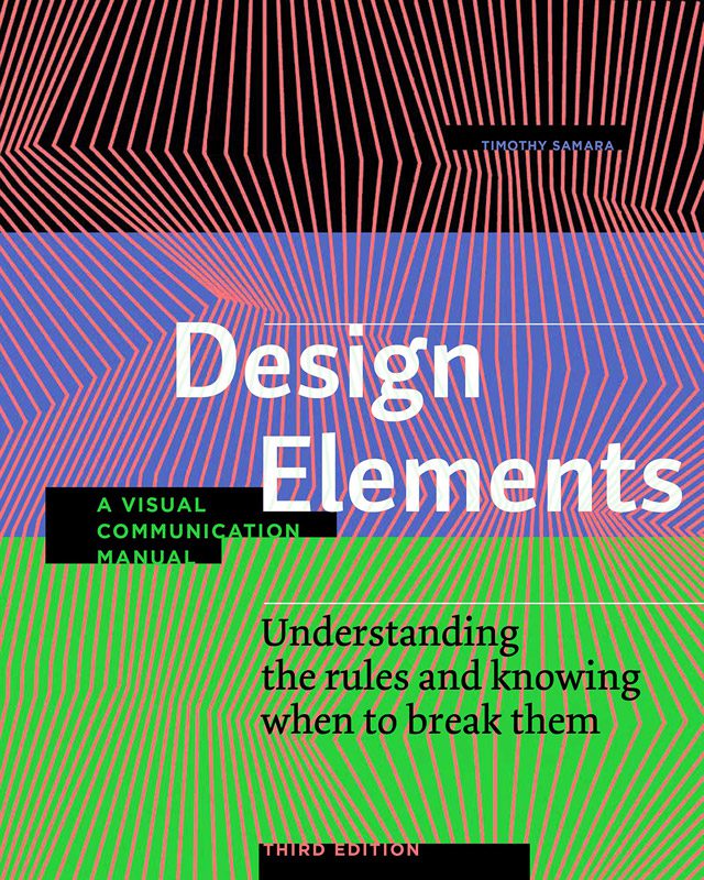
In the world of graphic design, it’s not just about making things look pretty—it’s about creating designs that communicate effectively and leave a lasting impact. Whether you’re a novice just starting out or a seasoned designer looking to refine your skills, mastering the fundamentals is essential. That’s where Design Elements: A Graphic Style Manual by Timothy Samara comes in. First published in 2021, this book is packed with actionable insights that can help you take your design work to the next level. Let’s dive into how Design Elements can transform your creative process and why it has become a must-read for graphic designers everywhere.
Who is Timothy Samara?
Timothy Samara is an experienced graphic designer, educator, and author whose career spans over two decades. Known for his practical approach to design, Samara has taught at top design schools, including the School of Visual Arts and Pratt Institute. His work focuses on bridging the gap between design theory and practical application, making him an invaluable resource for designers looking to master the craft.
Throughout his career, Samara has published multiple books on design, but Design Elements stands out as one of his most comprehensive and user-friendly works. His belief that “good design is about solving problems, not just making things look good” permeates every chapter of the book, offering readers both a philosophical and practical understanding of design.
Structure and Layout of the Book
One of the first things you’ll notice about Design Elements is its intuitive structure, which makes the book easy to navigate whether you’re a beginner or a professional. The book is divided into five main sections: typography, color, composition, layout, and visual elements. This clear organization allows readers to focus on specific aspects of design and how they work together to create cohesive, visually striking projects.
Each section features in-depth explanations of key principles, illustrated with real-world examples that bring these concepts to life. The book’s layout is itself a testament to good design—it’s clean, easy to read, and full of visual hierarchy that helps guide your eye through the content. For designers, this is not just a book to read; it’s a visual experience that reinforces the lessons it teaches.
Typography Mastery: A Core Focus
Typography is one of the most fundamental elements of graphic design, and Samara dedicates an entire section of the book to it. In Design Elements, he walks readers through the basics of typography, explaining how typeface selection, spacing, and hierarchy all contribute to a design’s readability and emotional impact.
For beginners, Samara provides a solid introduction to typography, covering the differences between serif and sans-serif fonts, how to properly kern text, and why line spacing matters. However, the book doesn’t stop there. For more experienced designers, Samara delves into advanced topics such as how to combine multiple typefaces in a single design, how to manipulate type to create visual interest, and when to break the traditional rules of typography.
One of the key takeaways from this section is that typography isn’t just about making words look good—it’s about creating a clear and compelling message. Samara uses real-life examples of both successful and failed typography to illustrate how small changes in type can make a big difference in how a design is perceived.
Color Theory and its Role in Impactful Design
Color is one of the most powerful tools in a designer’s arsenal, and Design Elements provides a thorough guide to using color effectively. Samara begins with the basics, explaining how primary, secondary, and tertiary colors work together to create harmony in design. He also covers important concepts like contrast, saturation, and color temperature, giving readers the foundation they need to start experimenting with color in their own work.
But Samara doesn’t stop at the basics. The book dives deeper into how color can be used to create mood, guide the viewer’s eye, and evoke specific emotions. Samara emphasizes that understanding color theory is not just about knowing what looks good—it’s about knowing how to use color strategically to enhance communication.
For example, in one of the book’s case studies, Samara shows how the use of warm, vibrant colors can evoke feelings of excitement and energy, while cool, muted tones can create a sense of calm and professionalism. He also highlights the importance of color accessibility, teaching designers how to ensure their designs are inclusive for individuals with color blindness or other visual impairments.
Composition and Layout: Breaking the Rules with Confidence
One of the most valuable sections of Design Elements is its discussion of composition and layout. Samara emphasizes that while there are tried-and-true principles for organizing elements on a page—such as the rule of thirds, symmetry, and balance—understanding when and how to break these rules is key to creating innovative designs.
For beginners, Samara lays out the basics of composition, explaining how to use grid systems, how to create visual flow, and how to balance text and images in a way that draws the viewer’s eye to the most important elements. However, the book also encourages designers to think outside the box. Samara explains that once you understand the rules of composition, you can begin to break them in ways that create dynamic, engaging designs.
One particularly useful example from the book demonstrates how breaking the grid system can create tension and visual interest, making a design more memorable. Samara also emphasizes the importance of negative space, showing how leaving parts of the page empty can enhance the impact of the elements that are there.
The Power of Minimalism in Design
Minimalism is a design philosophy that has gained widespread popularity in recent years, and Samara explores its principles in Design Elements. At its core, minimalism is about stripping away unnecessary elements to focus on what truly matters. But as Samara explains, this doesn’t mean making designs overly simple or boring—it means being intentional about every design choice.
Samara shows how minimalism can create a sense of clarity and sophistication in a design. By removing clutter and focusing on essential elements, designers can create work that is both aesthetically pleasing and highly effective in communicating a message.
One of the most important lessons in this section is that minimalism is about balance. Samara warns against going too far with simplicity, explaining that while it’s important to avoid clutter, it’s equally important to maintain visual interest. The key is to find the right balance between simplicity and engagement.
The Importance of Context: Designing for Specific Audiences
Another valuable aspect of Design Elements is its focus on designing with context in mind. Samara stresses that good design is not just about making something look good—it’s about understanding the needs of the audience and creating a design that speaks to them. Whether you’re designing for a specific age group, culture, or industry, understanding the context in which your design will be viewed is crucial.
In the book, Samara provides real-world examples of how context can influence design decisions. For instance, he explains how a design intended for a younger audience might use bold colors and playful typography, while a design for a corporate audience might call for more subdued tones and clean, professional typefaces. He also discusses how the medium—whether it’s print, web, or mobile—can impact design choices.
This focus on context is one of the most practical aspects of the book, as it reminds designers that their work doesn’t exist in a vacuum. By understanding the audience and the environment in which a design will be seen, designers can create more effective, impactful work.
The Verdict: Why Design Elements Stands Out
Design Elements: A Graphic Style Manual is a must-read for any designer looking to improve their craft. Timothy Samara’s ability to break down complex design concepts into practical, easy-to-understand lessons makes this book an invaluable resource for designers of all levels. Whether you’re just starting out or looking to refine your skills, this book provides the tools and insights needed to create visually stunning, effective designs.
What sets Design Elements apart from other design books is its balance between theory and application. Samara not only explains the principles of good design—he shows you how to apply them in real-world projects. The book is filled with examples, case studies, and visual demonstrations that make even the most abstract concepts feel concrete and actionable.
As famed graphic designer Paul Rand once said, “Design is the silent ambassador of your brand.” Design Elements gives designers the tools they need to create work that speaks volumes, without saying a word.
Key Takeaways
- Typography Mastery: Design Elements offers a comprehensive guide to both basic and advanced typography, making it accessible to designers at all levels.
- Color Strategy: Samara provides practical tips on using color effectively to create impact and convey meaning in design.
- Breaking the Rules: The book encourages designers to break traditional design rules in thoughtful ways that add visual interest and create memorable work.
- Minimalism: Samara demonstrates how minimalism can enhance clarity and effectiveness in design, while still maintaining engagement.
- Audience Awareness: The book teaches designers how to tailor their designs to specific audiences, ensuring that their work resonates with the target market.
FAQs
- Is this book suitable for beginner designers?
Yes, Design Elements provides foundational insights while also catering to more experienced designers. - What makes Design Elements stand out compared to other design books?
It combines practical, real-world examples with in-depth discussions of design principles. - Does the book focus only on graphic design?
While primarily focused on graphic design, the principles apply to various creative fields. - Are there visual examples in the book?
Yes, it includes a wealth of visual examples that clearly illustrate design principles. - How does Design Elements approach typography?
It provides a comprehensive guide to both basic and advanced typography, making it accessible to designers at all levels.


