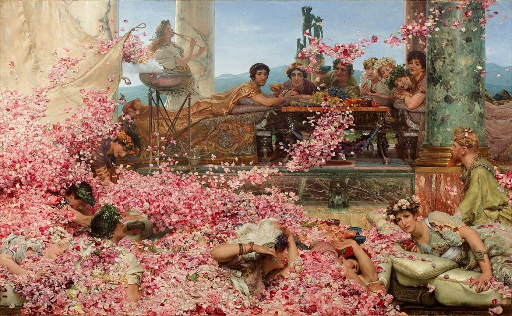
The history of pink begins in fragments: a shard of dyed textile, a smear of faded pigment on an ancient wall, a thread pulled from a burial shroud. Unlike the bold primaries that dominate the earliest surviving art, pink arrives more tentatively, its survival fragile, its visibility dependent on the chemistry of time. To trace its origins is to sift through shadows, because pink was never a natural primary. It was always a dilution, a mixture, a careful weakening of red. Yet this very softness gave it its distinct character, separating it from the hard-edged authority of crimson or vermilion.
Ancient experiments with diluted reds
In the earliest cave paintings of Europe, dated tens of thousands of years ago, hunters favored the robust strength of red ochre. Mixed with fat or spit, applied by hand or through hollowed bone tubes, these pigments carried a symbolic force. But ochre did not easily yield a true pink. Its iron oxides were too earthy, its tones too brown. To find the pale rose shades we now recognize as pink, one must look not to Paleolithic caves but to later societies that refined the art of extracting and altering colors.
The first pinks came from red that had been deliberately softened. The roots of the madder plant, cultivated in Mesopotamia, Egypt, and later across the Mediterranean, offered a dye that could be coaxed into shades ranging from deep burgundy to delicate blush, depending on the mordants used. Archaeologists have uncovered Egyptian linens bearing such hues, faded but discernible after millennia of burial. To modern eyes, they are unmistakably pink—though for their makers, the shade likely read simply as a lighter red, a mark of luxury and technological control rather than a distinct category of color.
A small group of other substances also provided pathways to early pink. Diluted cinnabar, more commonly prized as the brilliant mineral mercury sulfide that yielded vermilion, could be tempered into softer tones. Organic lake pigments, derived from insects such as kermes on Mediterranean oaks, also produced a pale wash when extended with chalk or gypsum. None of these were stable on walls; time and exposure degraded them quickly, which may explain why pink is scarce in ancient murals compared with its close cousin red.
Textiles before paintings
Where pink did thrive in antiquity was not on stone but on fabric. Clothing and woven ornament were the first canvases for soft reds, partly because the dyeing process lent itself to variation in tone. While Roman fresco painters reached instinctively for bold vermilion to capture theatrical scenes or household gods, Roman clothiers could offer a spectrum of shades by varying the concentration of madder or insect dyes. Pliny the Elder, writing in the 1st century AD, described the elaborate processes of color preparation, remarking on the expense of imported dyestuffs and their association with wealth. Though the word “pink” as a distinct color category did not exist in his Latin vocabulary, the delicate tints that today we would call rose or blush were already circulating in Roman wardrobes.
The association of soft red with fabrics also hints at why it did not yet dominate painting. Paint sought permanence; dye, fashion and ephemerality. A fresco in Pompeii could preserve for centuries the saturated force of red, but the airy delicacy of pink was more likely to be found in a tunic that eventually decayed to dust.
Fragile traces in manuscripts and decoration
In the centuries that followed Rome’s decline, a different medium preserved pink for posterity: parchment. Illuminated manuscripts of the early Middle Ages often used diluted red lakes to shade clothing, flowers, or borders. When carefully mixed with chalk, these lakes produced tender rose tones that softened the stark contrasts of gold and ultramarine. Though the monks and artisans who painted these manuscripts had no distinct word for “pink” in their lexicons, their hands gave shape to a color that would later emerge as a category of its own.
A particularly telling detail is the way pink appears in Christian iconography of compassion and tenderness. The blood of martyrs and Christ’s Passion was represented in rich crimson, but the Virgin Mary might be clothed in a paler red, signifying gentleness. This duality—violent red beside tender pink—was already beginning to take form, foreshadowing the symbolic roles the color would later assume.
Yet even here, pink was precarious. Many medieval pigments faded with exposure, leaving only ghosts of their original blush. What survives is uneven: a patch of rose on a saint’s robe, a softened tint in a marginal decoration, a faded border once brighter than it now appears. Pink in the Middle Ages was not a dominant force, but it flickered, occasionally, into visibility.
The hidden role of pink before its name
An intriguing difficulty in tracing pink’s history lies in language. The English word “pink” itself did not enter common use as a color term until the late 17th century, derived from a flower—the dianthus or “pink.” Before that, cultures described what we would now call pink with phrases like “light red,” “rose,” or “pale crimson.” This linguistic absence makes it easy to overlook pink’s presence in earlier art. Historians sometimes mistake the lack of a name for the lack of a phenomenon. In reality, soft reds were everywhere: in cloth, cosmetics, illuminated margins, and diluted paints. They were simply unnamed, residing in the shadows of red.
This helps explain why, when we look back at antiquity and the medieval world, pink appears elusive. It existed, but often incidentally—byproducts of dilution, variations in dye strength, or faded remnants of stronger colors. Its story at this stage is not one of prominence but of subtlety, of a color lingering at the edge of vision until later centuries brought it into sharper focus.
reflection
The first appearances of pink pigments remind us that colors do not enter human culture fully formed. They creep in through accident, through softened tones, through fading over time. Pink was once merely a weakened red, a pale cousin of something stronger. And yet, in that softness lay a future. The Egyptians who dyed linen in madder, the Romans who wore pale-dyed tunics, the monks who shaded manuscript margins with rose washes—all were laying groundwork for a color that would later take on independent cultural meaning. Before pink could be celebrated, politicized, or dismissed as frivolous, it had to exist as a fragile fact of pigment and dye. Its earliest role was that of a shadow of red—but sometimes shadows take on a life of their own.
The Science of Seeing Pink
Every culture has its myths about colors, but pink stands out for a very particular reason: it does not exist on the visible spectrum. One can find red, orange, yellow, green, blue, and violet in the rainbow, but never pink. This absence has puzzled and delighted philosophers, scientists, and artists alike. To understand why pink is at once real and elusive, we must look at the mechanics of human vision, the chemistry of pigments and light, and the peculiar psychology of the color itself.
A color without a wavelength
The human eye perceives color through three kinds of cone cells in the retina, each sensitive to different ranges of light: long wavelengths (red), medium wavelengths (green), and short wavelengths (blue). Every color we see is the result of combinations of signals from these cones. Red and blue have their place on the spectrum, but to produce pink, the eye requires an odd compromise: a strong signal from the “red” cones, a weaker but noticeable response from the “blue” cones, and a void where green would normally register. The brain then constructs a sensation that feels real enough—pink—but has no single corresponding wavelength.
This makes pink what scientists call a “non-spectral color,” existing only as a mixture, never as a pure beam of light. It is a creation of perception, a collaboration between biology and imagination. Painters working with pigments discovered this instinctively long before optics gave them the vocabulary. They knew that diluting red with white or mixing with certain blues produced a new and charming hue. Only centuries later did physiology explain why.
Pigment, light, and illusion
Pink in pigments and pink in light are not quite the same. When a painter takes vermilion and mixes it with lead white, the result is a material color, a reflection of certain wavelengths absorbed and others bounced back. In contrast, when a theater technician projects overlapping beams of red and blue light on a stage, the pink that emerges is immaterial, dissolving when the lights change. Artists learned long ago that pigments can betray expectations: some pinks look lively under sunlight but dead under candlelight, because different wavelengths are absorbed or reflected depending on the source.
Equally curious are the afterimages pink creates. Stare long enough at a bright magenta patch, then shift your eyes to a white wall, and a ghostly green appears—an optical echo produced by fatigued cones in the retina. These afterimages fascinated 19th-century color theorists such as Michel Eugène Chevreul, who demonstrated how adjacent hues influence one another through contrast. In his diagrams, pink became not a passive color but an active agent, altering the appearance of whatever sat beside it.
The psychology of pink
Scientific experiments in the 20th century introduced another dimension: emotional effect. Certain shades of pink were observed to lower heart rates or soften aggressive behavior, while others produced the opposite, sharpening restlessness or even agitation. The infamous “Baker-Miller pink,” developed in the 1970s for prison walls, was said to calm inmates by overwhelming the visual system with saturated rosy tones. Later studies challenged these claims, suggesting that the effect was temporary at best, but the episode revealed how deeply we link color perception to mood and behavior.
This duality—pink as calming, pink as irritating—remains part of its cultural complexity. A pale blush can suggest delicacy, warmth, or tenderness, while a hot magenta can feel electric, even assaultive. Physiologically, both are variations of red light balanced against absent green. Psychologically, however, they diverge wildly, a reminder that perception is never merely mechanical.
A paradox
The science of pink reveals a paradox: it is both utterly real and strangely artificial. The eye invents it out of gaps, filling in what nature’s spectrum does not provide. Pigments can approximate it, light can simulate it, but in both cases, the final effect exists not in the material itself but in the mind that perceives it. This makes pink, perhaps more than any other color, an emblem of human imagination layered on top of physical fact. Its absence from the rainbow does not diminish it; rather, it gives pink a peculiar status, a color that owes its very existence to the way we see.
Medieval Attitudes Toward Soft Reds
The Middle Ages were not an era of pink in the modern sense. The very word did not exist, and the palette of medieval painters leaned heavily on strong, symbolic primaries—deep ultramarines, fiery vermilions, glowing gold. Yet within this world of saturated color, softer reds appeared with surprising frequency, especially in manuscripts, textiles, and devotional imagery. To medieval eyes, these shades were not “pink” but rose or pale red, and they carried meanings distinct from their more forceful counterparts.
A diluted red for delicate illumination
Monastic scriptoria across Europe turned pale reds into tools of nuance. By grinding madder lake and extending it with chalk or gypsum, illuminators achieved tender washes of color that softened borders, floral motifs, and draperies. In the great codices of the Carolingian and Gothic eras, these diluted hues offered a counterpoint to the intensity of gold leaf and indigo.
The palette was always fragile. Organic lake pigments tended to fade, leaving later viewers with ghostly remnants rather than the full bloom of medieval color. Yet enough has survived to reveal that scribes and painters valued the visual quietude that a softened red could offer. Against the majesty of ultramarine robes for the Virgin or the scarlet blood of martyrs, rose tints played a supporting but essential role, offering balance rather than spectacle.
A story survives from the Abbey of Saint Gall, where a 9th-century monk wrote instructions for preparing pigments. Among recipes for bold reds and blues, he described methods for producing lighter tones by dilution. Such guidance suggests that pale reds were not accidental but cultivated intentionally, appreciated as part of the painter’s repertoire.
Compassion, mercy, and the softened red of devotion
In Christian symbolism, color carried profound theological weight. Red was the color of sacrifice and blood, of martyrdom and divine wrath. But when that red was softened—either by dilution in paint or fading in cloth—it took on gentler associations. Artists often clothed Christ as a child in rose-hued garments rather than fiery crimson, signaling innocence rather than Passion. Similarly, certain depictions of the Virgin Mary employed a pale red mantle, balancing between the purity of blue and the authority of red.
These choices were never arbitrary. Medieval viewers were attuned to the gradations of meaning that color could convey. A pale rose suggested tenderness and mercy, distinguishing it from the harsher symbolism of scarlet. In stained glass, too, artisans sometimes achieved a softer glow by layering thin washes of color, producing a luminous pinkish light that transformed the interiors of Gothic cathedrals at sunset. The effect, fragile and fleeting, gave spiritual resonance to a shade that lacked a precise name.
One striking example can be found in manuscript depictions of courtly love scenes. Troubadour romances often portrayed knights offering flowers—roses, especially—to their beloved. The link between the rose flower and the rose color was not incidental; the bloom carried the dual symbolism of beauty and transience, love and fragility. Thus the pale red used to depict petals was never merely decorative—it resonated with layers of poetic association.
Courtly fashion and the aura of pale red
Beyond religious art, medieval courts embraced soft reds in fabric and costume. Dyers, working with madder and cochineal (after its introduction from the Mediterranean trade routes), produced a spectrum from deep crimson to pale rose. While scarlet often denoted wealth and status due to the expense of its dyes, lighter shades found favor in garments designed for elegance and refinement.
In 14th-century France and Burgundy, pale reds appeared in tapestries and illuminated romances that celebrated aristocratic leisure. Banquet scenes often showed young nobles in gowns of rose-colored silk, a subtle distinction from the regal authority of scarlet. What to modern eyes might look like pink was, for them, a softer extension of red, suited to themes of youth, love, and joy.
Yet critics were not absent. Preachers sometimes condemned the frivolity of bright clothing, pale red included, associating it with vanity or worldly pleasure. A sermon might contrast the sober earth tones of humility with the artificial brightness of courtly fabrics. This moral ambivalence foreshadowed later centuries, when pink would again be tied to debates about luxury, morality, and excess.
The medieval world did not name pink, but it lived with it—on the pages of illuminated manuscripts, in the robes of sacred figures, in the soft glow of stained glass, and in the silks of aristocratic courts. What we call pink was for them a diluted red, a color that mediated between extremes: between blood and mercy, between sacred authority and tender compassion, between regal scarlet and youthful play. Its meanings were contextual, fragile, and often fleeting, but already it had begun to carve out a space distinct from the reds that overshadowed it. What began as dilution was quietly becoming differentiation, preparing the way for the Renaissance, when pink would assume a new and vital role in the representation of flesh and light.
Renaissance Experiments with Flesh and Light
If the Middle Ages treated pale red as a supporting role in manuscripts and fabrics, the Renaissance placed it at the very heart of painting. As artists pursued the ideal of naturalism, they faced a challenge that no previous era had solved with such intensity: how to paint human skin. Flesh tones demanded subtlety, variation, and warmth. Pure red was too harsh, ochre too earthy, and white too cold. The solution lay in mixtures that produced delicate shades we now recognize as pink. In the Renaissance, pink ceased to be incidental dilution and became an indispensable tool of representation.
Flesh as the proving ground of pink
The renewed interest in classical antiquity encouraged painters to study the body directly, both in anatomy and appearance. Artists dissected cadavers to understand musculature, sketched live models, and experimented endlessly with color to suggest blood beneath skin. Flesh is never uniform—cheeks flush, veins tint the surface, and shadows alter tone with every shift of light. To capture this reality, painters needed pigments that could reproduce not only warmth but translucence.
The Venetian masters were especially bold. Titian’s female nudes, for instance, reveal a mastery of layered glazes in which vermilion was softened with lead white and sometimes touched with yellow or blue to produce luminous pinks. The result was not a flat surface but a living body, animated by light that seemed to move beneath the skin. To contemporary viewers, these paintings were not only sensual but astonishingly lifelike, demonstrating that pale reds could convey vitality in a way no pure pigment could achieve.
Anecdotes from artists’ workshops reveal how technical the problem became. Apprentices learned recipes for “carnation,” the term then used for flesh colors. Manuals described mixtures of red lake with lead white, layered to achieve blushes and transitions. Even the imperfections of skin—rosy knuckles, flushed cheeks, lips touched with deeper red—relied on these experiments in pink. Flesh was the canvas where pink proved its necessity.
The Venetian brilliance of color
Nowhere did pink flourish more fully than in Venice. The city’s humid light, reflected off canals, demanded a painterly response different from the crisp contours of Florence. Venetian artists favored color over line, and their canvases glowed with atmospheric warmth. Tintoretto and Veronese joined Titian in exploring the spectrum of flesh tones, pushing the possibilities of diluted reds.
Veronese, in his great banquet scenes, clothed noblewomen in rose-colored silks that shimmered against marble columns and azure skies. These fabrics, painted with painstaking glazes, displayed both luxury and sensuality. Their pinkness was not incidental but deliberate: a display of refinement, youth, and opulence. In contrast, Tintoretto’s religious scenes often rendered Christ’s body in pale rose tones that highlighted vulnerability and suffering, balancing the spiritual with the human.
In both sacred and profane subjects, pink allowed Venetian painters to bridge worlds—between divine ideal and mortal body, between grandeur and intimacy. It was a color that carried narrative weight while dazzling the senses.
The technical alchemy of glazes
The Renaissance was also an age of technical innovation in materials. Oil paint, perfected in the 15th century, gave artists unprecedented control. Unlike fresco or tempera, oil allowed for slow drying and translucent layering. Painters could apply a deep red glaze over a pale underlayer, producing glowing effects that imitated the play of light beneath skin. The result was not merely a surface color but an illusion of depth, a living warmth.
Consider the difference between a fresco by Masaccio, where flesh often appears cooler and flatter, and an oil portrait by Titian or Giorgione, where the sitter’s cheeks bloom with delicate rosiness. The shift was not simply stylistic; it was material. Oil paint made pink both more achievable and more convincing.
Technical manuals of the era reveal how deliberate these choices were. Cennino Cennini’s Il Libro dell’Arte (c. 1400) includes instructions for mixing flesh tones with cinnabar, vermilion, and white. Later texts expanded on these recipes, noting the importance of thin glazes and subtle shading. By the 16th century, the art of creating pink flesh was a measure of skill itself, a hallmark of the successful painter.
In the Renaissance, pink stepped out from the margins and claimed its place as a central artistic tool. No longer a diluted red or a fragile accident, it became the key to rendering flesh, to embodying human presence with warmth and immediacy. Through Venetian colorists especially, pink found a language of sensuality, tenderness, and technical brilliance. It carried bodies into the realm of art with unprecedented realism, preparing the stage for the Baroque, when theatricality would amplify pink’s role still further.
The Baroque Embrace of Theatrical Color
If the Renaissance made pink essential to the depiction of living flesh, the Baroque transformed it into a language of drama. The 17th century reveled in contrasts: light against darkness, grandeur against intimacy, passion against restraint. Within this heightened theater of vision, pink was no longer a subtle technical device but a stage actor in its own right. Theatrical flesh, sumptuous fabrics, and glowing skies all bore shades of pale and heated red, amplifying emotion to match the grandeur of the age.
Rubens and the vitality of flesh
No painter embodies Baroque pink more completely than Peter Paul Rubens. His canvases overflow with vitality, bodies tumbling in motion, their skin suffused with a warmth that seemed to pulse with blood. Rubens mastered the use of rosy tones to convey energy, not delicacy. His mythological goddesses and muscular heroes alike carried flesh tinted with a pink that was robust, glowing, and almost excessive.
Observers at the time marveled at Rubens’s ability to render the human body as living matter. His pinks were never flat but layered: deeper reds in shadow, pale rose on illuminated surfaces, subtle transitions that suggested circulation beneath the skin. The sensuality of his Venus figures derived as much from this lively coloring as from their forms. Even in religious paintings, his Christ figures bore a blush that emphasized humanity, vulnerability, and suffering, softening the grandeur of divine drama.
The vigor of Rubens’s pink flesh influenced a generation of painters across Europe, from Anthony van Dyck’s elegant portraits to the theatrical saints of Spanish altarpieces. What had once been a quiet tool of Renaissance naturalism became, under Rubens’s brush, a declaration of life itself.
Stagecraft, costume, and the power of spectacle
Baroque art shared its sensibilities with the theater, where costumes and scenery demanded strong colors that could carry across candlelit halls. Pink, in silks and satins, gleamed with particular brilliance under such lighting. Court masques and operas featured performers in rose-colored garments that glowed against deep backgrounds, echoing the chromatic contrasts of Baroque painting.
This interplay between stage and canvas enriched both. Painters borrowed theatrical palettes, while designers looked to painters for inspiration in fabrics and color schemes. In portraits of aristocrats, rose silks often symbolized elegance and youthful vitality. Van Dyck’s portraits of English nobles, for instance, frequently included touches of pink in ribbons, sashes, or cheeks, signaling refinement without undermining dignity.
At the same time, critics occasionally expressed discomfort with such lavish display. Just as sermons in the Middle Ages had warned against vanity in clothing, some 17th-century moralists questioned whether the proliferation of rosy silks and cosmetics signaled moral decay. Pink thus bore both admiration and suspicion—a luxurious delight and a potential sign of excess.
Religious tensions and Counter-Reformation imagery
Pink in Baroque religious art held a different tension. The Counter-Reformation urged artists to inspire devotion through clarity and emotional impact. Bold reds symbolized Christ’s sacrifice and the fire of the Holy Spirit, but softer reds had their place as well. Painters such as Guido Reni used pale rose tones for angelic figures, emphasizing innocence and divine light. In Marian imagery, the Virgin’s robes sometimes bore a blush hue, mediating between her purity and her role as compassionate intercessor.
Yet the theatricality of Baroque pink could raise eyebrows within the Church. Was a rosy, sensual Christ too human? Did pink-skinned angels verge on frivolity? These debates reflected broader anxieties about art’s ability to inspire devotion without tipping into spectacle. The ambiguity of pink—tender yet sensual, spiritual yet worldly—made it a charged choice in religious contexts.
In Spain, painters such as Murillo softened their sacred subjects with warm rose flesh that made saints approachable, even intimate. Murillo’s children, beggars, and Madonnas carried pink tones that emphasized humanity and compassion. The effect was emotional rather than doctrinal, appealing to the faithful through warmth rather than austerity.
The Baroque embraced pink as part of its broader love of spectacle. In Rubens’s mythologies, van Dyck’s portraits, operatic costumes, and Counter-Reformation altarpieces, pale and heated reds became a language of drama, sensuality, and compassion. Where the Renaissance had made pink indispensable to realism, the Baroque made it indispensable to feeling. No longer background or dilution, it was now an active force—at times admired, at times criticized, but always impossible to ignore.
Rococo and the Age of Powdered Pinks
If the Baroque draped pink in drama, the Rococo dressed it in satin and powdered it with light. The 18th century, particularly in France, cultivated an aesthetic of delicacy, elegance, and playful intimacy. Within this atmosphere, pink found itself at home as never before. No longer simply flesh or sacred light, it became a color of interiors, fashion, porcelain, and flirtation. Pale roses, powdered blushes, and shimmering silk pinks flourished in an age that prized refined beauty over heavy grandeur.
Madame de Pompadour and the invention of “rose Pompadour”
No figure is more closely linked with pink in the Rococo than Jeanne-Antoinette Poisson, better known as Madame de Pompadour, mistress of King Louis XV. Her influence over taste and style was immense, extending beyond politics into every branch of the arts. The Sèvres porcelain manufactory, supported by her patronage, developed a new shade of pink glaze that soon bore her name: rose Pompadour.
This porcelain pink was not timid. It was refined yet vivid, a shade that managed to appear both luxurious and graceful. Pieces of Sèvres porcelain decorated with this color became symbols of courtly elegance, collected by aristocrats across Europe. Through Pompadour, pink became an aristocratic statement—sophisticated rather than childish, luxurious rather than marginal.
Portraits of Pompadour by François Boucher and others often clothed her in rose-hued gowns, emphasizing not just beauty but cultivated taste. The paintings blurred the line between sitter and fashion plate: she embodied pink, and pink embodied her.
Interiors, silks, and powdered faces
The Rococo interior was a world of soft pastels, gilded curves, and painted panels. Pink played a central role in this decorative scheme, paired with pale blues, creams, and gold. Salon walls might be adorned with rose-hued upholstery, while painted panels depicted mythological or pastoral scenes in delicate blush tones. The color helped create an atmosphere of intimacy, suited to conversation, music, and flirtation.
In fashion, pink silks and satins were omnipresent. Both men and women wore pale rose garments, though women in particular embraced elaborate gowns that layered textures and shades. Powdered wigs, tinted cosmetics, and rouge heightened the effect, blurring the line between natural blush and artificial decoration. A face carefully dusted with pink powder was both a symbol of health and a mask of refinement.
Even in painting, the powdered look influenced depictions. Artists such as Boucher and Fragonard used pale pinks not only for fabrics but for skin, producing an effect of softness and artificial glow that matched the powdered aesthetic of the court.
Critics of frivolity and “feminine” luxury
Not everyone admired the proliferation of pink. Moralists and critics saw in it the emblem of frivolity and decadence. Pink, associated with cosmetics, silks, and the boudoir, came to symbolize luxury without virtue. In satirical prints, powdered courtiers appeared effete, their rose-colored garments signaling detachment from serious matters of state.
Philosophers of the Enlightenment often preferred clarity, sobriety, and reason to Rococo excess. For them, pink interiors and silk gowns epitomized a world of surfaces, all decoration and no substance. As political tensions grew in France, the colors of Rococo luxury—including pink—would come to embody the ancien régime’s detachment from common reality.
Yet even its critics could not deny pink’s power. The very fact that moralists singled it out as a symbol of decadence showed how closely it was tied to the spirit of the age. If scarlet had been the color of medieval martyrdom and Rubensian vitality, Rococo pink became the color of aristocratic elegance and its discontents.
The Rococo elevated pink to a height it had never before reached. In porcelain, silk, interiors, and portraiture, it defined the aesthetics of the French court and radiated outward across Europe. Through Madame de Pompadour, pink gained a name and an identity, transformed from diluted red into a fashionable shade in its own right. At once admired for its refinement and condemned for its frivolity, it encapsulated the contradictions of 18th-century luxury. Soon, the tide would turn, and pink’s courtly glow would fade under the harsher light of revolution.
Revolutionary Shifts in Pink’s Meaning
The late 18th century swept away the powdered delicacy of Rococo pink with the force of revolution. The guillotine did more than end lives; it ended entire aesthetics. Colors once associated with aristocratic luxury became symbols of corruption, and none more so than the silken pinks that had adorned the boudoirs of Versailles. As revolutionaries reached for sharper, more austere palettes, pink entered a period of decline, burdened by associations with excess and frivolity.
The fall of courtly pink
The French Revolution made colors political in ways they had rarely been before. The red, white, and blue of the tricolor stood for liberty, equality, and fraternity; crimson caps symbolized the people’s defiance. Against these bold statements, pastel pink looked insipid and dangerously aristocratic. Silk gowns in rose Pompadour were now liabilities, emblems of a world violently rejected.
Pamphlets and caricatures of the revolutionary period often depicted nobles in pink silks as grotesque, contrasting their artificial elegance with the raw determination of the sans-culottes. The delicacy of Rococo pink, once admired, was now mocked as weak, frivolous, and corrupt. In this climate, artists abandoned it in favor of severe lines and sober tones.
The fate of pink in this era reflects how fragile color associations can be. Within a decade, a shade celebrated as sophisticated and modern had become politically toxic.
Neoclassical austerity and the rejection of softness
The Revolution also ushered in Neoclassicism, with its admiration for the clean forms of antiquity and its moral emphasis on virtue and restraint. Jacques-Louis David, the leading painter of the revolutionary and Napoleonic era, favored strong reds, stark whites, and deep blacks. His heroic figures wore togas and armor, not silks in powdered pinks.
In this new language of art, pink had no place. It was too soft, too associated with boudoir intimacy, too far removed from the stoic ideals of civic virtue. Where Baroque and Rococo painters had reveled in the play of pink flesh, Neoclassicism presented bodies in disciplined, sculptural clarity. The softness of rose tones seemed incompatible with the era’s moral and political severity.
Even in fashion, white muslin dresses inspired by Greco-Roman statuary replaced the elaborate pink gowns of Versailles. The so-called chemise à la reine, popularized by Marie Antoinette herself, was adopted in stripped-down versions by revolutionary women, emphasizing simplicity over luxury. Once again, pink became suspect, a reminder of ancien régime extravagance.
Romantic skies and the return of emotional pink
Yet pink did not vanish entirely. In the early 19th century, as Romanticism began to replace Neoclassical austerity, artists rediscovered softer colors as tools of emotional expression. Instead of powdered silks or porcelain, pink now appeared in skies at dawn and dusk, in the flush of landscapes, and in atmospheric effects that carried symbolic weight.
Painters such as J.M.W. Turner in England and Caspar David Friedrich in Germany used delicate pink light to evoke states of feeling—melancholy, transcendence, awe before nature. The political baggage of Rococo pink had faded, replaced by a new context in which the color could suggest fleeting beauty, fragility, or spiritual yearning.
This Romantic pink was not the ornamental shade of Versailles interiors but the ethereal wash of sunset. It was distant, ephemeral, and open to interpretation. If the Revolution had stripped pink of its aristocratic luxury, Romanticism restored to it a different kind of significance: emotional depth without frivolity.
The revolutionary era reveals how quickly cultural meanings can shift. Rococo pink, once celebrated as elegant and refined, became a casualty of political upheaval, its associations with aristocracy and luxury too dangerous to survive. Neoclassicism shunned it, but Romanticism found new life for it in nature’s skies. Pink’s trajectory across this turbulent century underscores its vulnerability to changing values—capable of signifying power, frivolity, or emotion depending on circumstance. In the aftermath of revolution, pink was no longer merely a fashionable shade; it had become a barometer of shifting cultural ideals.
Pink in the 19th Century: Between Innocence and Desire
The 19th century witnessed a striking transformation in pink’s reputation. Freed from its Rococo ties yet still shadowed by revolutionary suspicion, the color evolved into a spectrum of meanings, shifting between childhood innocence, bourgeois refinement, and sensual allure. Pink became a flexible register, capable of suggesting purity in one context and eroticism in another. This ambivalence gave the color renewed vitality in the visual culture of the century.
Childhood and the gentle blush of innocence
Before the late 19th century, pink was not firmly tied to girls. In fact, fashion manuals of the early Victorian period often recommended pink for boys and blue for girls. The logic was simple: pink was considered a lighter, youthful version of red, a color associated with strength and vigor, while blue was linked with the Virgin Mary and thus with feminine modesty. In children’s portraits, especially among the middle and upper classes, young boys sometimes wore rose-colored garments, signaling tenderness and vitality.
In girls’ clothing, too, pale pinks suggested youth and freshness rather than the gender coding we take for granted today. Painters such as Sir Thomas Lawrence, whose society portraits captured children in glowing fabrics, often employed soft pink dresses or sashes to emphasize innocence and charm. These choices did not yet carry the rigid associations they would acquire later; pink was a color of childhood, regardless of sex, rather than a badge of femininity.
Illustrated fashion plates from mid-century magazines further reveal how widely pink circulated in children’s attire. Its association was not restrictive but expansive, linked with the idea of freshness, tenderness, and early life.
Impressionism and the shimmer of light
As painting shifted with the innovations of Impressionism, pink took on new roles. Renoir’s portraits and nudes famously bathed flesh in rosy tones, giving his figures a soft, glowing vitality. His use of pink was often criticized as overly sweet by contemporaries, yet it was inseparable from his vision of warmth and sensuality. Renoir’s pinks captured not only skin but atmosphere: cheeks flushed by sunlight, dresses catching reflections, blossoms glowing in gardens.
Claude Monet, too, used pink in his landscapes—not for figures but for light itself. Sunrises and sunsets in his canvases often bore washes of rose, delicate modulations that carried the vibrancy of shifting skies. In works like his Haystacks series, subtle pink tones emerge in dawn or evening light, demonstrating his sensitivity to the color as part of nature’s fleeting palette.
Through Impressionism, pink shed some of its Rococo artificiality and became instead a register of perception itself: how light and air refracted across surfaces. No longer confined to aristocratic interiors, it belonged equally to open air and natural vision.
Exotic fabrics and the allure of the Orient
The 19th century also witnessed a fascination with the “Orient”—a broad and often romanticized term for the cultures of the Middle East, North Africa, and Asia. Painters such as Eugène Delacroix and Jean-Auguste-Dominique Ingres filled their canvases with imagined harems and exotic interiors, where pink silks and draperies played an essential part.
In Delacroix’s Moroccan sketches, pinks appeared in textiles, architecture, and skies, reflecting both actual encounters and embellished recollections. Ingres’s odalisques, painted with elongated precision, often reclined on rose-hued fabrics that heightened their sensuality. These pinks were not innocent but erotic, signaling desire, fantasy, and exotic otherness.
The fascination with pink fabrics in Orientalist art reveals how the color could oscillate between European associations of childhood and innocence at home, and an imported sense of erotic luxury abroad. In both cases, its softness carried emotional weight—whether tender or sensual.
In the 19th century, pink came into its own as a color of contradictions. It dressed children in innocence, illuminated Impressionist canvases with light, and draped imagined harems with sensual fabrics. It no longer carried the aristocratic exclusivity of the Rococo nor the political suspicion of the Revolution. Instead, it became versatile, spanning a spectrum from purity to seduction. This ambivalence made it one of the century’s most dynamic colors, preparing the way for the scientific and industrial revolutions in color that would soon expand its possibilities even further.
The Science of Color and the Modern Palette
The 19th century was not only an era of artistic revolutions but also of scientific discovery, and nowhere was this more evident than in the study of color. For the first time, pigments and dyes were examined not merely as practical substances but as objects of chemistry and optics. Pink, long dependent on unstable organic lakes and diluted reds, suddenly found itself supported by new technologies that expanded its range and durability. The result was a palette of pinks that artists, designers, and manufacturers could exploit with unprecedented freedom.
Synthetic dyes and the explosion of pink fabrics
The pivotal breakthrough came in 1856, when the young English chemist William Henry Perkin accidentally created the first synthetic dye, mauveine, while attempting to synthesize quinine. This discovery inaugurated the age of aniline dyes, a revolution that soon flooded markets with inexpensive, vivid, and varied colors. Among them were brilliant pinks and magentas that far surpassed the fugitive lake pigments of earlier centuries.
Fashion embraced these new colors with enthusiasm. Magenta, introduced in the 1850s, was named after the Battle of Magenta in northern Italy, linking a dazzling shade of pinkish-red with martial victory. Textile manufacturers across Europe quickly adopted it, producing fabrics that held their color far more reliably than organic dyes. Dresses, ribbons, and upholstery in bright pinks became suddenly accessible not just to aristocrats but to the growing middle classes.
The democratization of pink through synthetic dyes altered its cultural standing. Once a fragile shade associated with elite fabrics and delicate paintings, it now entered everyday life, available to anyone who could purchase mass-produced cloth. The spread of pink into common fashion and domestic interiors made it both more familiar and more versatile, less tied to courtly luxury than to the emerging consumer society.
Color theory debates and the psychology of pink
While chemists provided new pigments, theorists sought to understand how colors interacted with the eye and with each other. Michel Eugène Chevreul, director of the Gobelins tapestry works in Paris, published his influential Law of Simultaneous Contrast of Colors in 1839. He demonstrated how adjacent colors influence perception, an insight that became crucial for artists from the Impressionists onward. For pink, this meant that its softness could be intensified by juxtaposing it with greens, or made warmer by contact with oranges.
Later psychologists studied color’s effects on emotion and perception. While not always scientifically rigorous, their observations added a new dimension to pink’s reputation. Some argued that pale pinks soothed the eye, while intense magentas excited or agitated it. These ideas filtered into design and architecture, where pink interiors were recommended for nurseries, salons, or boudoirs, spaces thought to benefit from calm or charm.
Such theories reinforced the view that pink was more than a diluted red—it was a color with its own psychological and aesthetic identity, capable of producing distinctive effects in both art and environment.
Artists’ pigments and the expansion of the painter’s palette
For painters, the late 19th and early 20th centuries brought a range of new stable pigments. Cadmium red, introduced in the early 19th century, could be lightened with white to produce brilliant, durable pinks that resisted fading. Quinacridone pigments, discovered in the mid-20th century but rooted in earlier synthetic advances, later offered even richer possibilities.
These pigments allowed artists to treat pink not merely as a flesh tone but as an expressive color in its own right. Post-Impressionists and early modernists embraced the expanded palette. Toulouse-Lautrec used acidic pinks in his posters of Parisian nightlife, while the Nabis group experimented with harmonies of rose and green. By the time of the Fauves, pink could appear on canvas in bold, unapologetic blocks, no longer bound to delicate roles but asserting itself as a primary agent of modern expression.
For the first time in history, painters could rely on pink as a stable, versatile, and vibrant pigment. The fragility of medieval lakes and the fading silks of Rococo interiors were replaced by a chemistry that ensured permanence. Pink had moved from the margins of color technology to the center of the modern palette.
The 19th century’s scientific revolutions transformed pink from a fragile and often fleeting hue into a durable, versatile color available across the social spectrum. Synthetic dyes democratized it, color theory dignified it, and new pigments expanded its artistic possibilities. Pink was no longer the diluted accident of earlier centuries but a consciously chosen color, supported by chemistry and theory. By the dawn of the 20th century, pink was ready to step into the avant-garde—not as a background shade or a symbol of luxury, but as a force of modern expression.
Pink in the Early 20th Century Avant-Garde
The arrival of the 20th century brought upheaval not just in politics and society but in color itself. Artists cast aside inherited conventions and sought new visual languages for a fractured modern world. In this climate, pink shed its associations with fragility or frivolity and entered the avant-garde with startling force. No longer confined to backgrounds, fabrics, or flesh, it became a bold chromatic weapon, a shock to the eye, and a declaration of modernity.
Fauvism and the scandal of shocking color
When Henri Matisse and his circle exhibited their work in Paris in 1905, critics were outraged. The Fauves—the “wild beasts”—had unleashed canvases drenched in unnatural colors. Among the greens, oranges, and violets, pink emerged as a startling presence. Matisse’s landscapes and portraits often used broad areas of pink that bore little resemblance to natural flesh or earth. Instead, pink appeared as pure paint, autonomous and unapologetic.
In Woman with a Hat, Matisse rendered his wife’s face with streaks of green, orange, and pink, dissolving naturalism into a riot of contrasts. The pinks were not tender but assertive, demanding to be seen. This broke with centuries of tradition, where pink had been tied to subtlety and softness. For the Fauves, it was liberation: a way to announce that painting owed nothing to natural appearances.
The scandal of Fauvism confirmed that pink could shock as much as soothe. A color long associated with delicacy had been weaponized into visual aggression, destabilizing its cultural reputation.
Surrealism and the uncanny flesh of dreams
If the Fauves used pink as raw color, the Surrealists explored its psychological strangeness. Flesh in dreams often appeared too pink, too soft, too artificial—qualities Surrealist painters exploited to evoke unease. Salvador Dalí, for example, filled his dreamscapes with fleshy forms whose rosy tones heightened their uncanny quality. Pink in this context was not innocent but disturbing, blurring the boundary between body and object.
In Surrealist works by artists such as Leonora Carrington and Yves Tanguy, pink appeared in dreamlike skies, biomorphic shapes, or fantastical creatures, destabilizing expectations. Its softness could be menacing, its warmth unsettling. By detaching pink from familiar contexts and inserting it into dream logic, the Surrealists revealed its potential for strangeness.
This was a profound shift: pink no longer symbolized tenderness or frivolity but could serve as the color of psychological disquiet, unsettling in its very excess.
Elsa Schiaparelli and the invention of “shocking pink”
The crossover between art and fashion crystallized in the 1930s with Elsa Schiaparelli, the Italian designer who collaborated with Surrealists and embraced daring color. In 1937 she introduced “shocking pink,” a vivid magenta that defied convention. Unlike the pale roses of Rococo interiors or the delicate blushes of Impressionist gardens, Schiaparelli’s pink was loud, assertive, and modern.
She used it in gowns, perfume bottles, and accessories, turning it into a brand as much as a color. Salvador Dalí, with whom she collaborated, praised her audacity. “Shocking pink” became synonymous with daring glamour, an ironic reclaiming of a shade long dismissed as decorative or soft.
This invention reverberated beyond fashion. It demonstrated that pink could be radical, chic, and confrontational, far from its association with innocence. By mid-century, Schiaparelli’s “shocking pink” would inspire both artists and advertisers, embedding itself in the vocabulary of modern color.
The early 20th century transformed pink into a tool of artistic rebellion. The Fauves wielded it as raw energy, Surrealists made it uncanny, and Schiaparelli turned it into a signature of daring modern fashion. No longer marginal or merely ornamental, pink asserted itself as a color capable of shock, irony, and innovation. Its role in the avant-garde shattered its older connotations and prepared it for the cultural battles of the mid-20th century, where it would become not just an artistic choice but a symbol of mass culture and politics.
Pink and Politics in Mid-Century Art
By the middle of the 20th century, pink had moved far beyond the boudoir and the artist’s palette. It had become a color embedded in politics, commerce, and the visual vocabulary of an emerging mass culture. In postwar societies shaped by consumerism and ideological rivalry, pink acquired a double life: on one side, it was kitsch and suburban, the hue of advertisements and household products; on the other, it was reclaimed by artists as a vehicle for irony, critique, or transcendence. Its ambivalence made it one of the most charged colors of the mid-century.
The pastel of suburbia and the feminine ideal
In the 1950s, pink filled the landscapes of advertising, design, and domestic architecture. Pastel pink kitchens, bathrooms, and cars spread across American suburbs, promoted as symbols of comfort and modernity. The color was marketed especially toward women, whose consumer choices were targeted with visions of cheerful domesticity. Ads for refrigerators and washing machines glowed in soft pinks, reinforcing a cultural link between femininity and pastel domestic charm.
This mass-marketing of pink created a tension. What had once been avant-garde in the hands of Schiaparelli was now a cliché, reproduced endlessly in pastel tiles, floral wallpapers, and candy wrappers. To some, it symbolized stability and prosperity; to others, it was suffocating, reducing the color to a stereotype of feminine domesticity.
Yet its very ubiquity ensured that artists could not ignore it. Pink had become a cultural code, and to use it in art was to enter into dialogue with its mass associations.
Pop Art explosions and the power of hot pink
The Pop Art movement seized on pink as both subject and medium. Andy Warhol, with his silkscreen portraits of Marilyn Monroe, used hot pink hair and lips to underscore the artificiality of celebrity. The shocking pinks of his prints were not tender but brash, exposing the glamour machine of Hollywood. By pushing pink into neon territory, Warhol transformed it into a symbol of mass culture’s brightness and emptiness.
Other Pop artists followed suit. Tom Wesselmann’s Great American Nudes employed flat expanses of pink flesh, reducing bodies to signs within a commercialized visual language. Roy Lichtenstein’s comic-inspired works often filled female faces with pale pink Ben-Day dots, turning skin into a mechanical pattern. In these hands, pink was ironic, detached, and critical, no longer a naturalistic tone but a manufactured surface.
Pop Art thus redefined pink as the color of consumer spectacle—both seductive and hollow. Its mass-produced presence in art mirrored its omnipresence in advertising, ensuring that viewers could not escape its cultural weight.
Sublime pinks in abstraction
Yet pink also found a more serious register in the mid-century, particularly in the hands of Abstract Expressionists and Color Field painters. Mark Rothko’s canvases, for instance, sometimes layered soft pinks with deep reds and purples, creating meditative atmospheres of luminous depth. These pinks were not ironic but spiritual, attempting to evoke profound emotional states.
Similarly, Barnett Newman and Helen Frankenthaler used pale rose washes in large-scale works that enveloped viewers in color fields. Here pink was not frivolous but transcendent, stripped of figurative association and returned to pure sensation. Frankenthaler’s stain paintings often let diluted pinks seep across canvas, suggesting openness and serenity rather than irony or kitsch.
This duality—pink as Pop and pink as sublime—captures the color’s mid-century complexity. At the very moment it was dismissed as kitsch, it also served as a vehicle for some of the century’s most ambitious abstract art.
Mid-century pink was a battlefield of meanings. In suburban homes it suggested comfort and femininity; in Pop Art it was a symbol of spectacle and artificiality; in abstraction it reached toward the sublime. Its associations with politics and commerce could not be separated from its artistic uses, making every appearance of pink in mid-century art a layered statement. By the 1960s, the color had become a paradox: both the hue of consumer clichés and a pathway to transcendence. This paradox would only deepen as contemporary artists pushed pink into new territories of irony, immersion, and global resonance.
Contemporary Uses of Pink
By the late 20th and early 21st centuries, pink had become one of the most versatile and contested colors in art and culture. Freed from its older ties to aristocracy, domesticity, or even Pop irony, it entered a new phase of experimentation. Contemporary artists, architects, and designers embraced pink not only as pigment but as environment, transforming it into immersive space, cultural commentary, and digital identity. Few colors today carry such a wide spectrum of meanings—playful, critical, nostalgic, and global all at once.
Conceptual strategies and the subversion of expectation
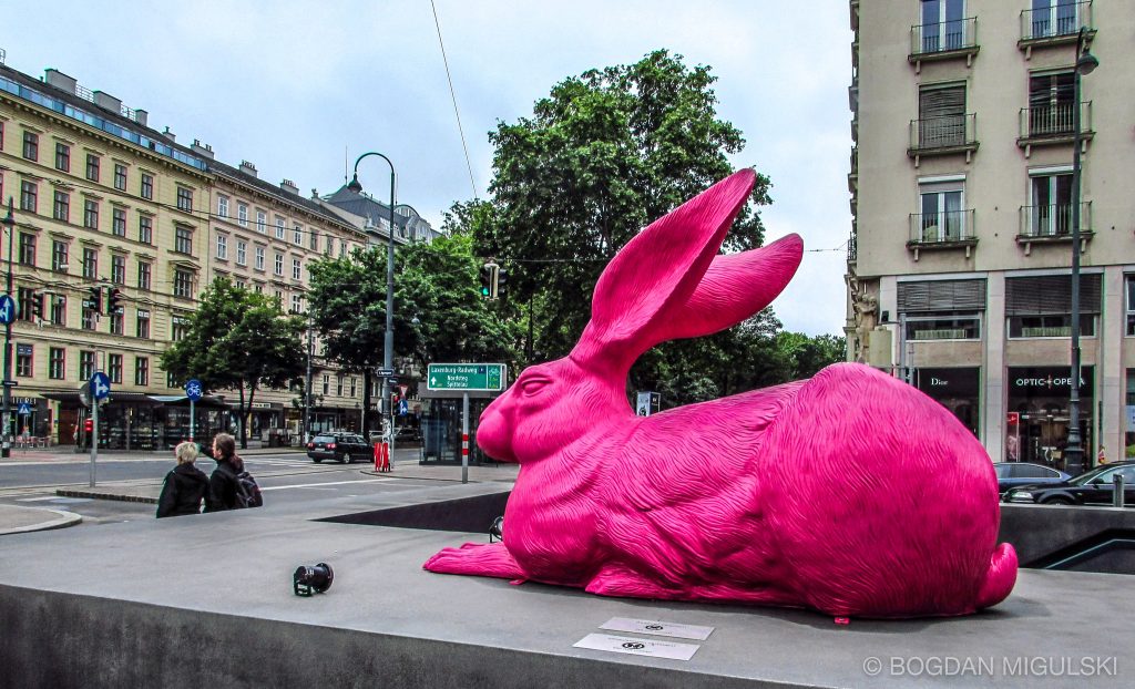
Many contemporary artists use pink precisely because of its loaded history. Its associations with sweetness, innocence, or kitsch allow it to be deployed with irony or critique. In installations and conceptual works, pink often appears in unexpected contexts: monumental sculptures painted bubblegum rose, industrial objects bathed in fluorescent magenta, or entire rooms washed in pastel pink light.
By forcing viewers to confront pink at overwhelming scale or in incongruous situations, artists expose the gap between cultural expectation and actual perception. A pink prison cell, a pink war machine, or a pink monument all destabilize assumptions, demonstrating how a color coded as harmless can become unsettling. In this way, pink becomes a tool of conceptual play, revealing how much cultural baggage a single hue can carry.
Architecture and immersive environments
Architecture has also embraced pink on a new scale. Buildings coated in pale rose or hot pink facades appear from Mexico City to Miami, transforming urban skylines with playful vibrancy. Installations and art museums have used pink as an immersive experience: entire rooms drenched in pastel tones that alter perception and mood.
In such spaces, pink is not a detail but the atmosphere itself. Visitors find themselves walking inside a color, their senses recalibrated by its saturation. The rise of experiential art in the late 20th century made pink a natural choice for creating environments that feel at once inviting and uncanny. Its softness can soothe, but its intensity at scale can overwhelm, reminding us that even delicate colors carry force when expanded to architectural proportions.
Photography, branding, and the digital turn
Perhaps nowhere has pink flourished more visibly than in photography and digital media. The rise of social platforms in the early 21st century coincided with the spread of pastel aesthetics often dubbed “millennial pink”—a dusty rose shade that seemed to dominate everything from fashion campaigns to café interiors. In photography, pink became shorthand for contemporary chic, instantly recognizable in product design, advertising, and curated digital feeds.
Photographers played with pink as backdrop, light filter, or subject, capitalizing on its ability to carry both retro nostalgia and modern sleekness. The digital screen intensified pink’s cultural reach: neon magentas glowed in pixels, while soft blushes suggested minimalism and calm. As a result, pink became not only a color of objects but a visual identity, capable of branding entire lifestyles.
This digital proliferation made pink simultaneously overfamiliar and endlessly adaptable. From minimalist design studios in Scandinavia to streetwear in Tokyo, it could be chic, ironic, or comforting—often all at once.
Contemporary pink resists easy classification. It appears in conceptual subversions, architectural environments, and digital branding alike, shifting seamlessly between play and seriousness. What once was aristocratic, frivolous, or politically suspect is now an open field of experimentation. Its very contradictions make it compelling: soft yet aggressive, nostalgic yet futuristic, ironic yet sincere. In the contemporary landscape, pink has become less a fixed symbol than a flexible medium, one that artists and designers continually reinvent for a global audience. Its history lingers, but its future is still being written—one saturated wall, glowing screen, or unexpected installation at a time.
The Ambivalence of Pink Today
Few colors in the contemporary imagination inspire as much contradiction as pink. It is everywhere—on runways, in product design, in advertising, on city walls—yet its meanings remain unstable, shifting depending on context. Unlike red, which retains connotations of passion and power, or blue, which suggests stability and depth, pink has no single identity. It is innocent and ironic, commercial and critical, global and local. Its very instability has made it the most malleable and ambivalent color of our time.
Cultural contradictions: softness, irony, and protest
On one level, pink continues to embody softness. Pale blush tones dominate nurseries, bridal marketing, and cosmetics packaging, all leaning on its historic associations with tenderness. Yet at the same time, the very same hue has been used in protest movements and subcultural fashion as a tool of defiance. A color once mocked as frivolous has become, paradoxically, a vehicle for seriousness—chosen precisely because it unsettles assumptions.
Irony plays a large role here. Contemporary culture often revels in the clash between pink’s sugary associations and its deployment in harder contexts. Designers coat brutalist concrete in candy pink, musicians release albums swathed in neon magenta covers, and activists wear pink in settings where it disrupts expectation. The contradictions do not resolve; they coexist, giving pink its unusual potency.
In this sense, pink thrives on ambivalence. Its history of being dismissed as “light red” or a trivial shade has become part of its strength. To use pink today is to invoke a complex dialogue with centuries of cultural baggage.
Global variations and shifting meanings
Pink’s modern meanings are not confined to Europe or North America. In Japan, soft cherry-blossom pinks have long carried connotations of transience and beauty, tied to the brief flowering of spring. In India, vibrant pinks flourish in textiles and architecture, from Jaipur’s “Pink City” walls to festival garments. In parts of Latin America, hot pinks appear in traditional dress and contemporary design alike, their brightness read as celebratory rather than delicate.
This global palette complicates any attempt to universalize pink’s meaning. A color associated with frivolity in one culture might signify vitality in another. In our interconnected world, these interpretations mingle: the cherry blossom becomes a global design motif, Jaipur pink appears on international fashion runways, and neon digital pink circulates worldwide through screens.
As a result, pink today is as much a global phenomenon as a local tradition, a color that speaks many dialects without ever settling into a single tongue.
Future directions: ecological pinks and technological invention
Looking forward, pink is being reshaped by science and ecology. Biodesigned pigments made from bacteria and fungi are producing new shades, including delicate pinks that are biodegradable and sustainable. Architects experiment with rose-colored concretes, while digital artists create pinks visible only in virtual space, their luminosity impossible to reproduce in pigment.
These innovations suggest that pink will continue to evolve alongside technology and environmental concerns. Its future is not bound by its past as diluted red or fashionable silk but open to reinvention as a material of sustainability and a phenomenon of digital light.
Pink’s survival has always depended on transformation—first as faded madder dye, later as powdered Rococo luxury, then as synthetic neon, and now as ecological experiment. This continual reinvention ensures that it remains culturally alive, never collapsing into a single meaning.
The ambivalence of pink today may be its greatest strength. Once dismissed as fragile or trivial, it now thrives precisely because it cannot be pinned down. Tender yet aggressive, nostalgic yet futuristic, pink carries the weight of its history while refusing to settle into a single role. Artists, designers, and everyday users continue to stretch its meanings, ensuring its relevance in a world that prizes both irony and sincerity. If some colors declare certainty, pink embodies complexity. Its story is unfinished, and perhaps that is why it remains one of the most fascinating colors in art and culture—a hue that still surprises, unsettles, and delights.