When people think of Art Nouveau, they often picture flowing hair, decorative borders, elegant women, and elaborate posters. Much of that visual language became popular because of the work of Alphonse Mucha during his years in Paris.
But Mucha’s Paris years were not simply a story of artistic success. They were a period of financial struggle, lucky accidents, commercial deadlines, cultural experimentation, and constant observation. Many of the habits that made his work famous can still teach creative people something useful today.
1. Success Arrived Through an Unexpected Opportunity
In 1894, Mucha was not Paris’s most famous artist. He was doing illustration and design work while trying to establish himself. His breakthrough came when actress Sarah Bernhardt needed a poster for the play Gismonda during the holiday season when many established artists were unavailable.
Mucha accepted the commission and produced a poster unlike the louder advertising styles of the day. Its tall format, subtle colors, and graceful figure immediately attracted attention across Paris.
Creative careers often change because of a single opportunity handled exceptionally well rather than years of perfect planning. When an unexpected project appears, treat it as if the entire world might see it.
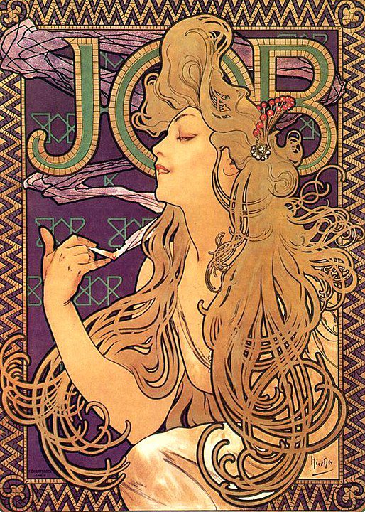
2. He Made Advertising Look Like Fine Art
Most posters in Paris competed through visual noise. Mucha took a different approach. Instead of shouting at viewers, he invited them to linger.
His posters combined careful drawing, ornamental detail, elegant typography, and balanced compositions. People often removed the posters from walls and kept them as decorative objects rather than disposable advertisements.
Many creative fields reward attention more than volume. Before adding another effect, ask whether your work would become more memorable by becoming more refined instead.
3. He Understood the Power of the Silhouette
One reason Mucha’s work remains recognizable is that it reads clearly from a distance. The figures are usually organized around strong outlines and simple overall shapes.
Even when the decorative details become intricate, the viewer first encounters a clear visual structure. The silhouette does much of the work before the eye notices the smaller ornaments.
When designing anything, reduce it to its simplest shape first. If the structure works in silhouette, the details have a stronger foundation to support them.
4. He Borrowed Widely Without Looking Random
Paris exposed Mucha to many influences: Byzantine art, medieval decoration, Japanese prints, folk traditions, religious imagery, and contemporary design trends.
What makes his work remarkable is not that he borrowed influences, but that he transformed them into a coherent visual language. Everything eventually looked unmistakably “Mucha,” even when its sources came from different places and periods.
Collect influences broadly, but spend more time integrating them than accumulating them. Your goal is not to display influences but to absorb them.
5. Repetition Was Part of the Formula
Critics sometimes accused Mucha of repeating himself. The flowing hair, circular halos, floral motifs, and decorative borders appear throughout his Paris work.
Yet repetition helped create recognition. Viewers could identify a Mucha poster almost instantly. He refined a visual vocabulary instead of abandoning it whenever it became successful.
Not every repeated element is a weakness. Pay attention to the visual habits that repeatedly strengthen your work and develop them deliberately rather than constantly replacing them.
6. Commercial Work Was Not a Distraction
Many artists separate personal work from commercial work. Mucha’s Paris career often blurred the distinction.
He designed advertisements, calendars, packaging, magazine illustrations, decorative panels, and posters. Rather than treating these assignments as lesser tasks, he used them as opportunities to experiment with composition, ornament, and visual storytelling.
Some of your most valuable creative discoveries may emerge from practical assignments rather than personal passion projects. Treat ordinary work as a laboratory.
7. He Turned Decoration Into Structure
At first glance, Mucha’s work can seem purely decorative. Look more closely and the decoration often organizes the composition.
The halos, borders, floral patterns, and geometric framing devices guide the viewer’s eye. Ornament is not merely attached to the image; it helps hold the image together.
Before adding decorative elements, ask what job they perform. Good decoration should contribute to structure, movement, or meaning rather than simply filling space.
8. He Understood That People Remember Characters
Many of Mucha’s famous posters advertise products or performances, yet viewers often remember the figure rather than the product.
The women in his posters became symbolic personalities. Their poses, expressions, costumes, and surroundings created an emotional atmosphere that lingered in memory.
Facts are often forgotten faster than personalities. Whether you’re designing, writing, or presenting ideas, build memorable characters or identities around the message whenever possible.
9. Paris Was a Classroom, Not Just a Destination
For Mucha, Paris was more than a place to sell work. It was a place to observe. He studied museums, architecture, publishing, theater, fashion, and the rhythms of urban life.
His success emerged partly because he paid attention to what people found beautiful, exciting, and modern. He learned from the city while simultaneously developing his own voice.
Wherever you live, treat your surroundings as a source of creative research. Spend time observing how people communicate visually before deciding how your own work should communicate.
Conclusion
The Paris years transformed Alphonse Mucha from a struggling illustrator into one of the defining visual figures of the Art Nouveau era. His success was not built on a single style alone. It came from observation, clarity, consistency, craftsmanship, and an unusual ability to elevate commercial work into something people wanted to keep.
More than a century later, those lessons remain surprisingly practical: build a recognizable visual language, learn from many influences, treat every assignment seriously, and remember that elegance often attracts more attention than noise.