Drama in art doesn’t require a battle, a storm, or someone collapsing onto a velvet chaise. Often it comes from much smaller decisions: where the light falls, what gets hidden, how much empty space surrounds a figure, or what the artist refuses to explain.
Across painting, photography, film, illustration, and design, artists repeatedly use a handful of visual strategies to make an image feel tense, theatrical, mysterious, or emotionally charged. Here are nine worth stealing.
1. Make the Dark Areas Really Dark
Caravaggio didn’t simply paint dramatic subjects. He built many of his pictures around extreme differences between light and darkness. Figures emerge from shadow while large parts of the scene remain nearly black, a technique closely associated with tenebrism.
The darkness does more than make the illuminated areas brighter. It withholds information. We can’t completely see the room, so our attention becomes concentrated on the faces, hands, gestures, and objects the artist chooses to reveal.
When you want more drama, don’t brighten everything for clarity; decide what the viewer actually needs to see and let some of the rest disappear.
2. Put Something Important Near the Edge
A centered subject tends to feel stable. Move that subject toward the edge and the psychological temperature can change surprisingly quickly.
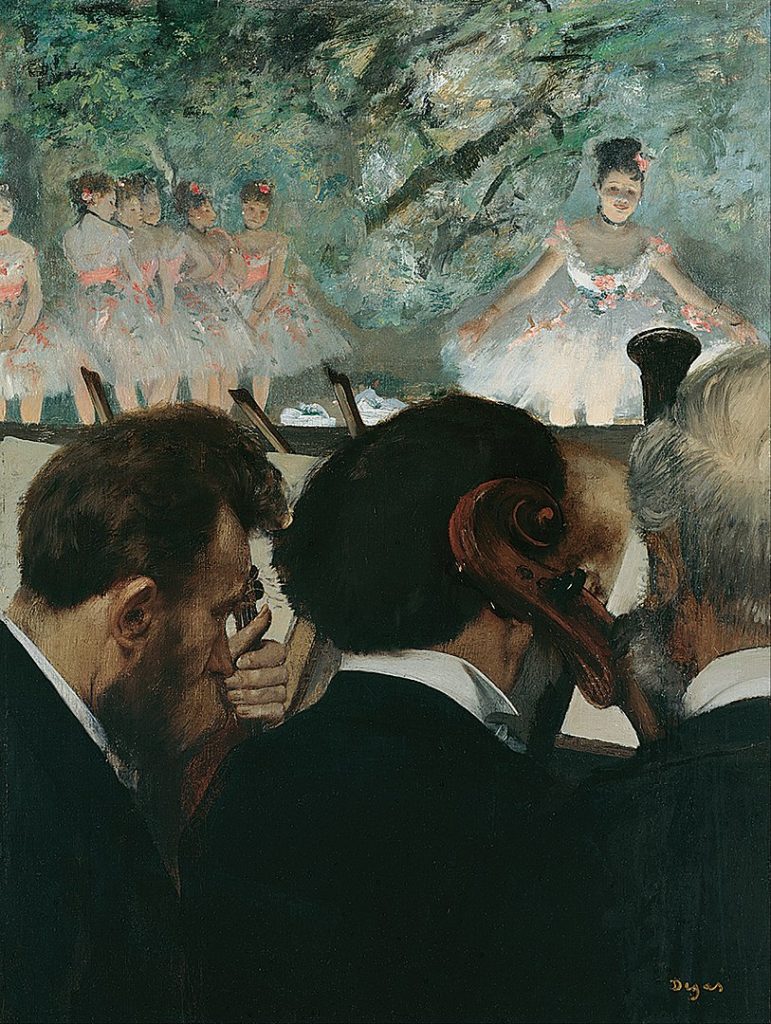
Edgar Degas repeatedly used abrupt cropping in scenes of dancers, cafés, and horse races. Figures are cut by the frame, while large or unexpected areas of floor, wall, or empty space remain visible. The composition can feel less like a carefully arranged tableau and more like a moment caught while life continues outside the picture.
Cropping also makes the viewer imagine what lies beyond the frame.
Try moving your main subject away from the comfortable center, then crop until the image feels slightly unresolved without becoming confusing.
3. Use a Diagonal When You Want Movement
Horizontal and vertical lines usually feel relatively stable. Diagonals imply movement, imbalance, ascent, descent, collision, or instability.
Baroque painters understood this extremely well. In Peter Paul Rubens’s The Elevation of the Cross, for example, Christ’s body and the cross rise dramatically across the composition rather than sitting calmly inside a grid of verticals and horizontals. The eye is pulled through the action.
You can use the same principle without painting a Baroque masterpiece. A staircase, arm, shadow, road, table edge, or tilted horizon can provide the diagonal.
If a composition feels static, look for an important horizontal or vertical element you can turn into a diagonal rather than simply adding more activity.
4. Show the Moment Before the Moment
One of the best ways to create drama is not to show the climax.
An image of someone opening a mysterious door can be more compelling than an image showing exactly what is behind it. A raised hand can be more charged than the completed action. Alfred Hitchcock famously distinguished between surprise and suspense: knowing danger exists while waiting for something to happen can create sustained tension.
This principle matters because viewers become participants. Once you provide a situation but delay its resolution, their minds begin predicting what comes next.
When depicting an important event, test the instant just before the obvious climax and see whether anticipation makes the image stronger than explanation.
5. Make One Thing Much Smaller Than Another
Scale is an emotional tool.
Caspar David Friedrich frequently placed relatively small human figures against mountains, seas, fog, skies, and vast landscapes. The figures give us a measuring device: once a person appears, the surrounding world suddenly feels enormous.
Scale can suggest vulnerability, power, loneliness, awe, absurdity, or threat. And the contrast doesn’t have to involve landscapes. A tiny chair in a huge room, an oversized face beside a small figure, or one enormous typographic element can produce the same basic effect.
Instead of making every element comfortably proportional, exaggerate one important size relationship and use the imbalance to tell the viewer what should feel powerful or vulnerable.
6. Leave an Uncomfortable Amount of Empty Space
Empty space isn’t necessarily peaceful.
Edward Hopper often surrounded people with walls, windows, streets, hotel rooms, offices, and expanses of architecture that seem larger than the human activity taking place within them. That space can make a figure appear isolated even when almost nothing overtly dramatic is happening.
The useful trick is that emptiness changes our perception of what remains. A lone person surrounded by space attracts a different kind of attention from the same person surrounded by objects and people.
Before adding another object to an empty area, test whether the emptiness itself is creating the emotion you want.
7. Hide Part of the Story
René Magritte understood that mystery often gets stronger when ordinary things refuse to explain themselves.
In The Son of Man, a floating green apple blocks much of the man’s face. The obstruction is memorable partly because faces are exactly where viewers instinctively look for identity and emotion. Magritte gives us the figure while denying us the information we most want.
You can create similar tension with backs turned toward the viewer, closed doors, curtains, reflections, shadows, objects covering faces, or action occurring partly outside the frame.
Identify the piece of information viewers will instinctively search for, then experiment with partially withholding it rather than immediately giving it away.
8. Put Opposites in the Same Picture
Drama often comes from contradiction rather than intensity.
Francisco Goya could combine elegance with violence, beauty with unease, and ordinary social behavior with something deeply unsettling. Surrealists later pushed contradiction in another direction, bringing familiar objects together in combinations that made everyday reality suddenly feel strange.
Oppositions can be visual as well as conceptual: tiny and huge, smooth and rough, bright and dark, luxurious and damaged, formal and chaotic, innocent and threatening.
The contrast gives the viewer something to mentally resolve.
When an idea feels too predictable, introduce one element that belongs to its opposite world and see whether the contradiction sharpens the meaning.
9. Control Where the Eye Goes First
Drama depends partly on sequence.
Artists can guide attention through contrast, color, sharpness, scale, faces, gestures, directional lines, and light. Rembrandt often illuminated faces and hands selectively, allowing those areas to become psychological anchors while less important information receded into darker passages.
This means you can think about an artwork almost like editing a scene: first the viewer sees this, then notices that, then discovers something else. If everything demands attention simultaneously, there may be plenty of visual noise but very little suspense.
Squint at your work and notice what survives first; if the most important element doesn’t win immediately, reduce the competition around it before making it louder.
Drama is usually less about adding dramatic things than controlling information. Artists create tension by revealing and concealing, enlarging and shrinking, stabilizing and destabilizing, filling space and leaving it empty.
The useful question isn’t simply, “How can I make this more dramatic?” It’s “What should the viewer notice, what should they wonder about, and what should I make them wait to discover?”