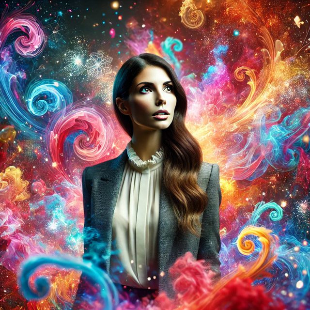
Color palettes set the tone for the spaces we inhabit, the digital interfaces we interact with, and the clothes we wear. In 2025, expect a fusion of bold vibrancy and calming minimalism that reflects deeper cultural shifts, technological advancements, and changing consumer behavior. As we dive into this year’s top color trends, we’ll see how designers can leverage them to create impact and connection.
Why Color Palettes Matter in Design
Color doesn’t just decorate—it communicates. It triggers emotions, shapes perceptions, and influences decisions. Think about the way red commands attention in stop signs or urgent alerts, while blue builds trust in corporate logos. The right colors can guide consumer behavior, improve user experience, and solidify brand identity.
The Role of Color Psychology
- Red triggers urgency or passion, commonly used in call-to-action buttons.
- Blue fosters calmness, making it popular in wellness apps and healthcare branding.
- Green conveys nature and growth, often linked to sustainable products and brands.
In 2025, designers will use these principles to craft experiences that are more inclusive, accessible, and emotionally engaging.
Methodology for Predicting 2025’s Color Palettes
Forecasting color trends isn’t just an art—it’s a science. Organizations like Pantone and WGSN use a mix of data analysis, cultural insights, and even AI predictions to identify colors that will resonate globally.
How Forecasters Analyze Trends
- Cultural analysis: Tracking global movements, social trends, and media representation to predict impactful colors.
- Consumer behavior: Studying how consumers respond to colors across industries, from tech to fashion.
- Global events: Examining the influence of economic shifts, climate awareness, and tech advancements on color choices.
For example, Pantone’s 2024 Color of the Year was influenced by rising digital immersion, prompting a surge in neon hues. Meanwhile, the growing focus on sustainability pushed earthy tones to the forefront. These dynamics set the stage for 2025.
The Key Color Palettes for 2025
Let’s explore the defining color palettes expected in 2025, from high-energy neon hues to serene earth tones.
Electric Vibrancy
Colors: Neon blues, vivid pinks, bright yellows.
Electric vibrancy represents the drive for innovation and escapism. These neon hues are becoming integral to digital design, AI art, and immersive experiences like VR and AR.
Why It Matters
- Higher engagement: Studies from Adobe show that neon colors improve click-through rates by up to 20%.
- Youthful appeal: A 2024 survey by WGSN found that 70% of Gen Z respondents preferred bright colors that express individuality.
- Digital adaptability: Neons are highly visible on screens, making them ideal for UI/UX design.
Example: Nike’s latest sneakers incorporate neon accents to create a dynamic look that resonates with younger audiences.
Earthy Hues
Colors: Rust reds, warm browns, moss greens.
Earthy tones are closely tied to sustainability and well-being. In 2025, brands will use these shades to evoke a sense of grounding and warmth, particularly in eco-conscious products.
Why It Matters
- Sustainability perception: According to Nielsen, 66% of global consumers prefer sustainable brands, with earthy colors playing a key role in this association.
- Warmth and comfort: Designers use these tones in interior design to create cozy, welcoming spaces.
- Cultural significance: Earthy tones connect with indigenous designs, emphasizing heritage and tradition.
Example: IKEA’s 2025 collection emphasizes these shades in furniture and decor, aligning with their focus on sustainable living.
Soft Minimalism
Colors: Soft pastels, beige, lavender, dusty rose.
Soft pastels are associated with mental wellness, representing calm and serenity. This palette will be dominant in digital interfaces, wellness branding, and product packaging.
Why It Matters
- Mental wellness: The World Health Organization reports a 25% increase in mental health issues globally, driving demand for calming design.
- Versatility: Pastels blend well across different design fields, from lifestyle branding to web interfaces.
- Approachability: Soft colors make brands appear more inclusive and user-friendly.
Example: Calm, a leading meditation app, plans to use soft pastels in its 2025 redesign, promoting relaxation through visual cues.
Futuristic Metallics
Colors: Chrome silver, iridescent purple, liquid gold.
Metallics evoke luxury, innovation, and a touch of the futuristic. In 2025, expect them to influence automotive design, high fashion, and luxury tech branding.
Why It Matters
- Luxury appeal: Research by McKinsey shows that consumers associate metallics with high-end products, driving sales in the luxury sector.
- Tech symbolism: These colors symbolize innovation, often used in tech product launches and concept designs.
- Visual depth: Metallics add dimension and movement to digital interfaces, making them a popular choice for websites.
Example: Tesla’s concept car for 2025 will feature a chrome finish, reflecting the company’s focus on both luxury and innovation.
Monochrome Dynamics
Colors: Black, white, charcoal gray.
Monochrome palettes offer a minimalist yet powerful aesthetic. In 2025, expect a resurgence of black-and-white themes in high fashion, digital design, and branding.
Why It Matters
- Minimalism: Monochrome aligns with the growing demand for clean, simple designs.
- Bold contrast: Sharp contrasts between black and white create visual impact, drawing attention to specific design elements.
- Timelessness: Monochrome works across various sectors, maintaining relevance in both digital and print media.
Example: Apple’s 2025 product launch will emphasize a sleek, monochrome theme, reinforcing its minimalist brand identity.
How Cultural Shifts Shape Color Trends
Color trends often reflect broader cultural dynamics, from environmental awareness to digital transformation.
1. Environmental Awareness
Earthy tones continue to gain popularity as brands emphasize sustainability. According to a 2023 Nielsen study, 73% of consumers want products that contribute to a sustainable future.
2. Digital Transformation
The rise of digital art and AI-driven experiences pushes neon and metallic hues to the forefront, symbolizing tech innovation and immersive design.
3. Mental Wellness
Colors like soft pastels are increasingly used in wellness branding, reflecting a global shift toward mental well-being and self-care.
4. Exoticism
Designers are using a broader range of colors to represent different cultures and identities, creating a more inclusive visual language.
Practical Application of 2025’s Color Palettes in Different Design Fields
Digital and Web Design
- Neons improve user engagement by drawing attention to clickable elements.
- Pastels create a relaxing interface that enhances user experience.
Interior Design
- Earthy tones foster a sense of warmth and connection in living spaces.
- Metallic finishes add a touch of luxury to kitchens, bathrooms, and office spaces.
Fashion and Apparel
- Neons and metallics drive streetwear and high fashion trends, signaling bold self-expression.
- Monochrome remains a classic, favored for minimalist collections and luxury accessories.
How Designers Can Leverage 2025’s Color Trends
- Use Color Tools: Platforms like Adobe Color and Pantone Connect help designers experiment with new palettes.
- Stay Informed: Follow reports from Pantone, WGSN, and other experts to stay ahead of trends.
- Balance Boldness and Calm: Use vibrant hues to attract attention and softer tones to create a welcoming atmosphere.
- Prioritize Accessibility: Ensure color contrast meets readability standards, making designs accessible to all.
Expert Opinions and Predictions on 2025’s Color Palettes
According to Leatrice Eiseman, Executive Director of the Pantone Color Institute:
Colors in 2025 will be a blend of nostalgia and bold innovation, reflecting our hopes for both connection and progress.
Amy Bingham from WGSN adds:
The neon surge isn’t just about boldness; it’s about reclaiming space in an overstimulated digital age.
Final Thoughts on 2025’s Color Palettes
From bold neons to soft pastels, 2025’s color palettes will be both diverse and dynamic. They’ll represent a world in flux, combining innovation with comfort and inclusivity.
Designers, it’s time to explore these colors boldly. The trends of 2025 aren’t just about aesthetics—they’re a language of our evolving culture.
FAQs
- What are the key color palettes for 2025?
- Neons, earthy tones, soft pastels, metallics, and monochrome.
- How can designers use 2025’s color palettes in branding?
- Use bold colors for visibility and soft tones for calm, approachable branding.
- What’s the psychology behind the 2025 color trends?
- Reflects global trends like mental wellness, digital transformation, and sustainability.
- Will 2025’s color trends focus more on digital or physical design?
- Both, with neon hues thriving digitally and earthy tones in physical spaces.
- How are color trends predicted?
- Through analysis of cultural shifts, consumer behavior, and technological advancements.
Key Takeaways
- 2025’s color trends include neons, earthy tones, soft pastels, metallics, and monochrome.
- Reflect broader cultural shifts, such as sustainability, digital transformation, and mental wellness.
- Designers should balance bold experimentation with calming tones to engage diverse audiences.


