Great artists rarely treated color as a matter of simply choosing attractive hues. They used it to control attention, create depth, distort reality, organize a composition, and change how an image feels before the viewer has time to think about it. Their work suggests something useful: you don’t have to become a color theorist to get better at color. You have to notice what color is actually doing.
1. Van Gogh Knew That Color Could Replace Reality
Vincent van Gogh increasingly stopped treating observed color as a rule. Night could become deep blue, stars could burn yellow, and a café could glow with reds and greens far more intense than ordinary vision would suggest.
In letters discussing The Night Café, Van Gogh described deliberately using powerful reds and greens to communicate the disturbing atmosphere of the place. Accuracy was less important than emotional effect. Color was not merely describing the room; it was telling us how the room felt.
When literal color makes your work feel lifeless, ask what color would communicate the experience more accurately than observation does.
2. Monet Understood That Shadows Aren’t Simply Gray
Claude Monet and the Impressionists paid unusual attention to how light changes color. Look closely at Monet’s snow paintings, haystacks, cathedrals, or water scenes and shadows often contain blues, violets, pinks, greens, and reflected colors rather than generic gray or black.
That matters because shadow is not an absence of color. Its appearance depends on surrounding light, reflected surfaces, atmosphere, and nearby hues. Once you begin noticing those relationships, the world becomes considerably more colorful.
The next time you paint or photograph a shadow, study the colors inside it before automatically making it darker, grayer, or black.
3. Vermeer Knew a Small Amount of Strong Color Could Control a Room
Johannes Vermeer often worked with relatively quiet interiors: pale walls, dark furniture, muted fabrics, soft daylight. Against those restrained surroundings, concentrated areas of blue, yellow, and red become remarkably powerful.
Girl with a Pearl Earring offers an especially clear lesson. The blue and yellow of the head covering become vivid because they are surrounded by darkness and comparatively restrained skin tones. Strong color does not need to occupy much space to dominate an image.
If every part of your work is colorful, reduce the color in less important areas and let one or two concentrated hues earn the viewer’s attention.
4. Matisse Understood That Color Didn’t Have to Stay Inside Things
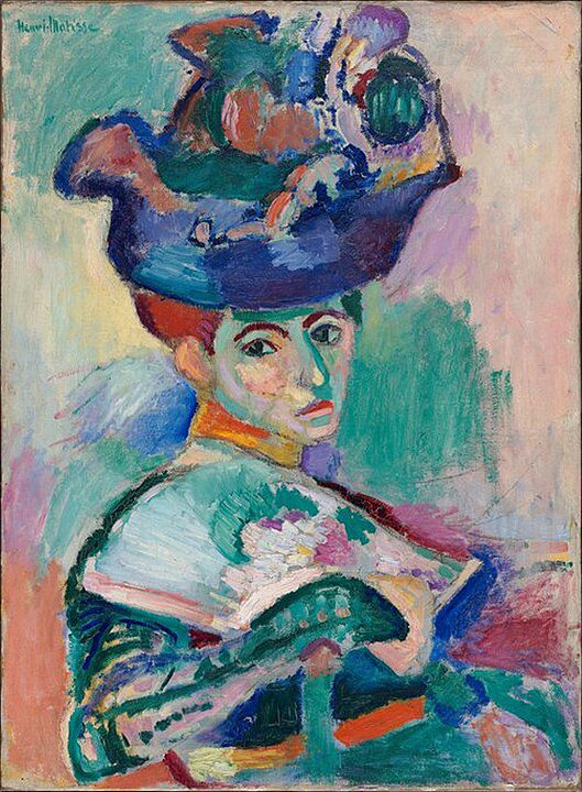
Henri Matisse could make a face green, a floor red, or a landscape explode into colors that had little obligation to natural appearances. In The Green Stripe, for example, a vertical band of green runs down his wife Amélie’s face.
The green is not there because Matisse believed her nose was literally green. It helps organize the face and the surrounding fields of color. Once color is released from description, it can become an independent structural element—almost like shape.
Instead of asking only “What color is this object?”, also ask “What color does this part of the composition need?”
5. Rembrandt Knew Darkness Makes Color More Expensive
Rembrandt did not need a rainbow to produce richness. Many of his paintings are dominated by browns, blacks, ochres, subdued reds, and deep shadows, with selected areas of flesh, white fabric, red, or gold emerging from the darkness.
The restricted environment increases the value of every brighter or warmer note. A tiny highlight can become more important than a large patch of saturated color would be in a busier painting. Restraint creates visual scarcity, and scarcity creates emphasis.
Before adding brighter colors to make an image more dramatic, try darkening or neutralizing the surrounding colors so the important ones have less competition.
6. Josef Albers Knew That You Never Really See a Color by Itself
Josef Albers spent years demonstrating a deceptively simple fact: the same color can appear dramatically different depending on the colors surrounding it. His long-running Homage to the Square series turned this phenomenon into the subject of the artwork itself.
A gray can look bluish beside orange and warmer beside blue. A muted color can suddenly seem vivid against something duller. This means choosing the “correct” color in isolation is often impossible. Color is relational.
When a color looks wrong, test the colors around it before changing the color itself.
7. Seurat Understood That Your Eye Can Mix Color
Georges Seurat and other Neo-Impressionists explored what happens when small touches of different colors are placed beside one another rather than fully blended on the palette. From sufficient distance, the viewer’s eye begins to integrate those separate marks.
Whatever the precise science behind nineteenth-century color theories, the visual lesson remains valuable: you do not always have to physically mix colors to create a combined effect. Texture, dots, strokes, pixels, threads, and repeated marks can allow neighboring colors to interact optically.
Before blending two colors into one smooth mixture, try placing them next to each other and see whether the viewer’s eye can do some of the mixing for you.
8. Rothko Knew Color Needs Space to Affect You
Mark Rothko’s mature paintings often consist of large, hovering rectangles of color with softened edges. Reproductions can make them look surprisingly simple, but their scale is crucial. Rothko wanted viewers relatively close to the paintings, where the fields of color could occupy a substantial part of their vision.
This reveals something easily forgotten on screens: the quantity of a color changes its effect. A two-centimeter square of deep red is a sample. A wall-sized expanse of the same red becomes an environment. Color has scale as well as hue.
When testing a color for a large work, room, poster, or screen, judge it at something close to its final size instead of trusting a tiny swatch.
9. Picasso Knew a Palette Could Hold an Entire Work Together
During Picasso’s Blue Period, roughly 1901–1904, blue and blue-green tones dominate many paintings of poverty, isolation, age, and vulnerability. The subjects change, but the restricted palette creates a remarkably consistent emotional climate.
The lesson is not that blue automatically means sadness. It is that repetition builds a visual world. Limiting the palette forces subtle variations to become more noticeable and prevents every object from demanding its own unrelated color solution.
Before choosing colors one object at a time, establish a limited palette for the whole work and make each individual color negotiate with that larger system.
Great artists understood that color is never just color.
It changes according to its neighbor. It gains power from restraint. It can organize space, exaggerate emotion, redirect attention, or make something ordinary feel strange. Sometimes the smartest color decision is choosing a brighter hue; sometimes it is removing half the colors you already have.
The next time color isn’t working, don’t immediately search for a better color. Ask what job you need the color to do.