Happiness is surprisingly difficult to paint. Sadness often comes with obvious visual shortcuts: dark colors, storms, isolation, shadows. Happiness is more complicated. It can look loud and festive, but it can also look quiet, peaceful, playful, intimate, or even ordinary.
Across centuries, artists developed recurring techniques for making viewers feel joy, warmth, contentment, and optimism. These weren’t simply tricks for painting smiling faces. They were deeper visual strategies for shaping emotional experience. Here are nine of the most useful.
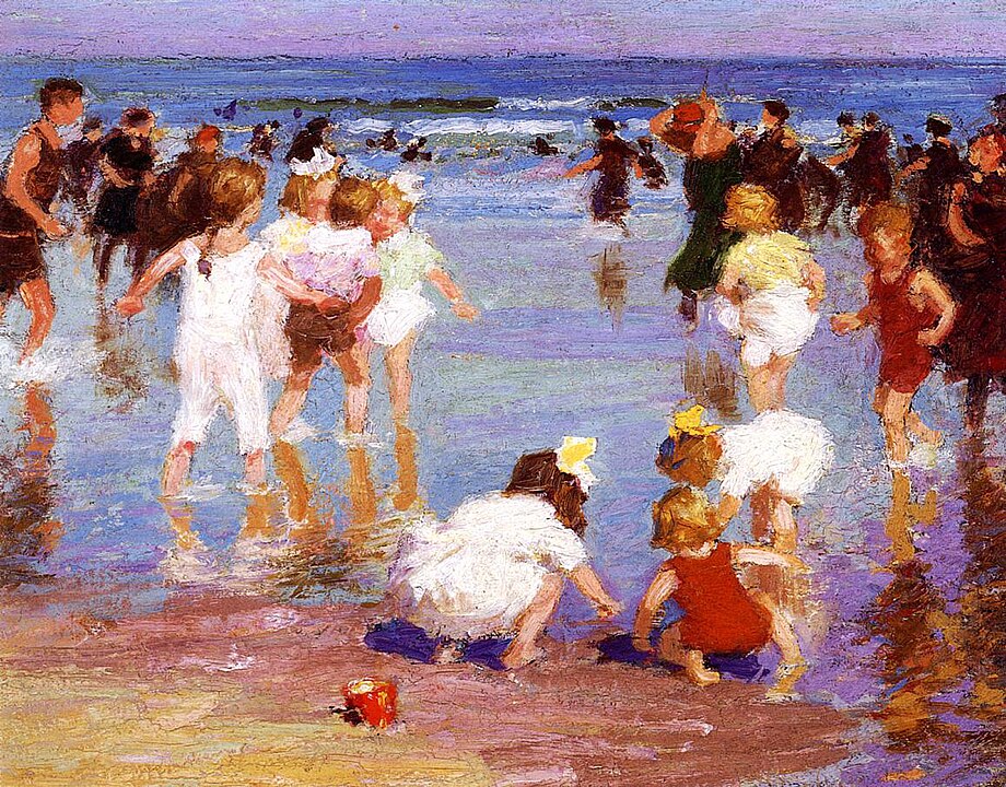
1. Happiness Often Lives in Light
Many artists discovered that happiness is communicated less through subjects than through the quality of light surrounding them.
The painters of the Impressionist movement became obsessed with sunlight because bright, shifting light creates a feeling of life and possibility. Even an ordinary garden, street, or riverbank could feel uplifting when illuminated by warm natural light.
Before adding more emotional symbolism to a piece, ask whether changing the quality of the light would communicate the feeling more effectively.
2. Joy Is Usually Shared
When artists wanted to suggest happiness, they frequently showed people gathering, eating, dancing, talking, or working together.
From village festivals to family scenes, happiness often appeared as connection rather than achievement. The emotional message came from relationships between figures, not from any individual person’s expression.
If you want your work to feel warmer, spend more attention on interactions between elements than on making each individual element more impressive.
3. Movement Creates Optimism
Static images can feel calm, but movement often feels alive.
Artists regularly used flowing brushwork, dancing figures, waving trees, running water, and diagonal compositions to create a sense of energy. Happiness frequently appears as something in motion rather than something frozen.
When a project feels emotionally flat, look for places where rhythm, flow, or movement can replace rigid stillness.
4. Color Works Best in Relationships
People often assume happiness equals bright colors. Artists learned that it is usually more complicated than that.
A vivid yellow feels stronger beside cooler colors. A bright red becomes more exciting when surrounded by softer tones. Happiness often comes from color relationships rather than maximum intensity everywhere.
Instead of making everything brighter, create contrast so your most important colors have room to feel alive.
5. Ordinary Moments Matter
Many artists painted happiness through everyday life rather than grand celebrations.
Children playing, friends talking, people relaxing outdoors, meals, gardens, and quiet domestic scenes appear repeatedly throughout art history. These subjects work because viewers recognize them from their own lives.
Pay closer attention to small moments that already exist around you instead of constantly searching for extraordinary subjects.
6. Nature Provides Emotional Space
Artists frequently used landscapes to evoke feelings of peace, freedom, and contentment.
Open skies, fields, rivers, gardens, trees, and seasonal growth create a sense of expansion. Even when no people appear, viewers often project themselves into these environments and experience a form of emotional relief.
When a creative project feels crowded, leave room for visual breathing space instead of filling every area with information.
7. Happiness Is Often Imperfect
One surprising pattern is that many convincing depictions of happiness contain imperfections.
A slightly crooked table, a messy picnic, a windblown dress, or an unfinished edge can make a scene feel more real. Excessive perfection often creates distance, while small flaws create familiarity.
Allow some irregularity to remain in your work when it helps the result feel more human.
8. Abundance Suggests Well-Being
Artists have long used visual abundance to imply happiness.
Fruit, flowers, harvests, crowded tables, thriving gardens, and rich textures appear repeatedly in paintings associated with prosperity and enjoyment. The feeling comes from generosity and fullness rather than luxury alone.
Before adding more complexity, ask whether a carefully chosen sense of abundance could strengthen the emotional atmosphere.
9. Happiness Doesn’t Always Smile
One of the biggest misconceptions in art is that happiness requires obvious smiling faces.
Many artists painted contentment through relaxed posture, comfortable spaces, harmonious compositions, or peaceful light. The viewer feels happiness even when nobody appears visibly excited. Sometimes satisfaction is quieter than celebration.
When trying to communicate a positive emotion, focus on the overall experience of the work rather than relying on the most obvious symbols.
Conclusion
Artists rarely painted happiness by simply showing cheerful people. Instead, they used light, color, movement, nature, connection, abundance, and everyday experience to create emotional environments that viewers could step into.
The useful lesson is that happiness is often less about what is shown and more about how it is shown. The same subject can feel joyful, melancholy, peaceful, or anxious depending on the visual decisions surrounding it. That is a lesson worth remembering in art—and in many other forms of creative work.