Everywhere you look, from gas stations to tech startups, companies are relying on logos to tell their story. But here’s the brutal truth: most of them are getting it wrong. A logo isn’t just a fancy stamp to slap on packaging. It’s a distilled symbol of a company’s character, values, and promise. When designed poorly, a logo doesn’t just fail to stand out—it actively damages trust and credibility.
The sad reality is that far too many businesses treat logos like fashion trends. They rush into design decisions based on what’s trendy, cheap, or convenient. What results is a market flooded with forgettable, poorly-executed, and even embarrassing logos. This isn’t just an aesthetic issue. It’s a strategic failure, often with measurable costs. As we’ll see, bad design can lead to lost sales, confused customers, and millions of dollars down the drain.
What a Logo Is — and Isn’t
The Role of a Logo in Brand Identity
A logo is not the brand. That’s a crucial distinction many businesses miss. A logo is a visual shorthand—a symbolic identifier that helps consumers recall a company and what it stands for. Think of it like a national flag: it isn’t the country itself, but it represents its ideals, history, and values. Without the right foundation, even the prettiest flag—or logo—rings hollow.
Effective logos function as consistent visual anchors. The FedEx logo, designed by Lindon Leader in 1994, uses negative space to subtly suggest motion and speed—key traits for a logistics company. Shell’s bold yellow-and-red shell logo, which dates back to 1904 and was refined over decades, symbolizes strength, clarity, and longevity. These logos don’t explain the whole company, but they trigger associations that align with the brand’s core identity. That’s the role a logo should play.
The Difference Between Logo and Branding
Many entrepreneurs, particularly in startups, make the mistake of equating a logo with their entire brand. A brand is the complete ecosystem of perception: the voice, visuals, values, customer experience, and yes, the logo. But the logo is merely the tip of the iceberg. It’s the signature, not the letter.
Branding involves every touchpoint—from tone of email communication to how a storefront feels. Visual branding includes color palettes, typography, layout systems, and iconography. Apple’s iconic bitten apple logo, first introduced in rainbow form in 1977 and later flattened in the early 2000s, doesn’t just work because it looks sleek. It works because it’s consistently used across all branding, packaging, retail, and advertising. When logos are treated as stand-alone magic tricks, disconnected from the full branding ecosystem, they lose their punch.
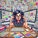
Why Most People Think They’re “Designers”
Graphic design tools have never been more accessible. Platforms like Canva and Adobe Express have turned everyone into a self-proclaimed designer. But ease of access doesn’t equate to skill. Design is not just about slapping a few shapes together; it’s a discipline built on theory, function, and communication.
This democratization of design has a downside. Business owners often rely on personal taste rather than trained insight. They confuse subjective preferences with professional design judgment. They’ll pick a trendy font, a vague icon, or a Pinterest color scheme without any thought to scalability, meaning, or longevity. The result? An amateur logo that looks cheap, doesn’t communicate anything useful, and can’t survive beyond a business card.
5 Red Flags of a Poorly Understood Logo Design:
- Uses generic clipart or free icons
- Lacks contrast or is hard to read when scaled down
- Overuses color gradients or trendy effects
- Includes too many fonts or colors
- Doesn’t align with the company’s mission or audience
Why Most Logos Fail: Common Mistakes
Overdesign and Trend-Chasing
One of the most common traps is mistaking “cool” for “effective.” Many companies chase whatever design trend is popular in a given year. In the mid-2010s, flat design took over—prompted by digital UI preferences and mobile-first design. Suddenly, every logo became a flat, two-color mark, stripped of shadows, texture, or depth. But by 2020, these logos began to blur together, looking almost indistinguishable across industries.
Design trends fade. A logo should be built to last. Over-designed logos, stuffed with gradients, drop shadows, and unnecessary complexity, are difficult to reproduce, remember, or scale. The Starbucks mermaid was refined over decades, moving from complex illustration to a clean, green, recognizable mark. The evolution was strategic—not trendy. Trend-chasing, on the other hand, is why countless startups today look exactly the same.
Lack of Functionality and Scalability
A logo must work in black and white, at one inch tall, or blown up on a billboard. This is where many logos fall apart. Tiny details get lost. Thin fonts vanish. Complicated gradients look muddy. Logos must be legible and distinct across a wide range of uses, from mobile apps to print collateral.
Functionality is also tied to visual clarity. Logos with low contrast or soft colors don’t hold up in different lighting conditions or digital settings. Imagine your logo embroidered on a shirt or printed in grayscale on a receipt. If it fails to remain clear and recognizable, it’s not functional. Good design anticipates every use-case scenario—and plans for it.
Generic and Forgettable Concepts
Nothing says “lazy branding” like a logo featuring a globe, a lightbulb, or an arrow. These are overused, tired visual clichés that say nothing meaningful about your specific business. A generic logo doesn’t just blend in—it actively undermines your credibility by making your company seem like it has no identity.
It’s not about reinventing the wheel; it’s about thoughtful execution. Think of the Nike swoosh, introduced in 1971. It’s a simple checkmark-shaped design, but it evokes speed, motion, and energy. That’s the power of refined minimalism with purpose. In contrast, most bad logos say nothing—or worse, send the wrong message entirely.
Top 5 Most Overused Logo Elements in 2020s Branding:
- Lightbulbs (used for anything “innovative”)
- Globes (used for anything “international”)
- Arrows (used for “progress” or “delivery”)
- Leaves (used for “eco-friendly” or “natural”)
- Initials in generic sans-serif circles
How Brands Get It So Wrong
Design by Committee: The Kiss of Death
When ten executives have equal say in the design process, you end up with a bland, compromised logo that satisfies no one. Design by committee is a death sentence for originality. It’s where vision goes to die and where mediocrity thrives. One of the clearest examples of this failure is the 2012 London Olympics logo.
Unveiled in 2007 and designed by Wolff Olins at a cost of £400,000, the jagged, magenta-colored mark was supposed to appeal to younger audiences. Instead, it was met with widespread confusion and ridicule. Even BBC design critics called it “a child’s attempt at graffiti.” The committee-approved chaos behind it turned what should’ve been a national point of pride into an embarrassing design disaster.
Cutting Corners on Professional Design
Good design isn’t cheap—and it shouldn’t be. Yet countless businesses go to the lowest bidder, using platforms like Fiverr or 99designs to crowdsource logos for under $100. What they get in return are recycled concepts, unoriginal icons, and poor scalability. You can’t expect professional quality from non-professional sources.
The truth is, quality branding requires investment. That doesn’t mean throwing money away. It means hiring people who understand your business, your audience, and how visual language supports strategy. The cost of bad design is much higher in the long run. You lose consumer trust, face expensive rebrands, and miss out on market recognition. In short, you pay for cheap design many times over.
Misunderstanding the Customer
Many companies design for internal stakeholders instead of actual customers. They focus on what the CEO’s wife likes or what the marketing director finds trendy, rather than what will resonate with their target demographic. This disconnect leads to logos that feel out of touch or overly corporate.
Take the infamous 2009 Tropicana rebrand as a warning. PepsiCo paid Arnell Group over $35 million to redesign Tropicana’s packaging and logo. The result? Sales dropped 20% in under two months, losing the company over $30 million. Why? The new design erased familiar visual cues, confused shoppers, and looked generic. Tropicana had to scrap the redesign and revert to the original. When a logo ignores the customer, it doesn’t matter how “modern” it looks—it fails.
What Makes a Great Logo (and Who Gets It Right)
Timeless Simplicity Meets Meaning
The best logos often look deceptively simple—but they carry weight. Coca-Cola’s script logo, virtually unchanged since the 1880s, remains recognizable across generations. Mercedes-Benz’s three-pointed star, first used in 1926, symbolizes dominance over land, sea, and air. These logos avoid decoration and stick to purpose-driven form.
The key to timelessness is restraint. A strong logo doesn’t need gimmicks. It needs intention. Simplicity ensures versatility and memorability. But simplicity without meaning is just laziness. The great logos manage both: they say more with less, and they do it in a way that lasts decades without feeling stale.
Strategic Alignment with Brand Values
A great logo reflects the company it represents. Consider Harley-Davidson. The rugged, shield-like logo projects masculinity, grit, and Americana—everything the brand stands for. Chick-fil-A’s playful chicken-shaped “C” keeps things family-friendly and instantly identifiable. Both logos reinforce brand personality and tone, not just aesthetics.
This alignment builds trust. Logos that reflect core values help customers intuitively understand a brand before reading a single word. It’s a visual handshake—a first impression that says “you’re in the right place.” Consistency across visual assets amplifies this. When a logo’s style mirrors the company’s voice, the message is clear and persuasive.
Professional Process, Not Instant Gratification
Behind every great logo is a rigorous process. Research, ideation, sketching, revision, testing—none of it happens by accident. Paul Rand, who created iconic logos for IBM (1956), ABC (1962), and UPS (1961), famously said, “Design is the silent ambassador of your brand.” He often presented only one final concept—because he had already done the work to ensure it was right.
Real design firms spend weeks, sometimes months, building a logo. They test it in multiple formats, compare variations, and build full identity systems around it. They also document usage rules to preserve consistency across time. Contrast that with the freelancer who returns a logo in 48 hours with no rationale or context. Professional design isn’t just about talent—it’s about discipline and systems.
Key Takeaways
- A logo is not your brand—it’s just one part of a larger identity system.
- Most logo failures stem from misunderstanding function, purpose, and audience.
- Trend-chasing leads to forgettable, ineffective designs.
- Great logos reflect brand values with timeless, versatile visuals.
- Investing in professional design pays off long-term, while shortcuts cost more in the end.
Frequently Asked Questions
What makes a logo “bad”?
A bad logo is one that’s confusing, hard to read, overly complex, or irrelevant to the brand’s mission. It often lacks versatility or originality.
Can a small business afford a great logo?
Yes—if they treat it as a long-term investment and work with professionals who understand branding strategy, not just design.
Should I redesign my logo if it’s outdated?
Only if the logo no longer reflects your business or functions poorly in modern formats. Redesign with caution and strategy.
Why is logo scalability important?
A logo must be clear and recognizable in any size, from social media icons to building signage. If it loses detail or clarity when scaled, it’s not effective.
Is a minimalist logo always better?
Not always. Simplicity helps, but only when paired with intentional design choices that align with your brand values.