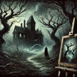
Before television, comics, or even pulp magazines, there was the Penny Dreadful—cheap, thrilling, and often horrifying serial stories that flooded Victorian Britain from the 1830s through the 1890s. Named for their cost—just a penny per installment—these publications were aimed squarely at the working-class youth of the Industrial Revolution. They told tales of murderers, monsters, and macabre mysteries, each issue packed with lurid details and chilling suspense. But what truly pulled in readers, sometimes more than the words, were the haunting illustrations that burst from their pages.
The Penny Dreadful wasn’t just a literary phenomenon—it was a visual one. While many readers could barely read at all, they could certainly recognize a slashed throat, a ghostly figure, or a villainous grin rendered in bold, black ink. Artists working on these publications became masters of suggestion and spectacle, manipulating mood with crude tools to create striking and unforgettable images. These illustrations weren’t afterthoughts; they were as essential as the stories themselves, offering immediate, visceral impact.
As literacy grew among the British lower classes, so did the demand for thrilling entertainment. Yet with limited leisure and money, most readers wanted stories that grabbed their attention fast and held it tight. The combination of serialized horror and violent illustrations served that demand perfectly. The Penny Dreadful gave them monsters to fear and villains to root against—all served with ink-stained drama and exaggeration.
This article explores the terrifying visual culture of the Penny Dreadful: its artists, illustrations, printing methods, and influence on horror art today. While many scholars focus on the text or moral concerns surrounding these publications, we’ll instead place the spotlight where it belongs—on the grimy, gory, and utterly captivating artwork that made these stories unforgettable. We’ll begin where the dread begins: with the visual terror that first met readers’ eyes.
Setting the Stage for Visual Terror
The illustrations in Penny Dreadfuls were not simply decorative; they were fundamental to the experience. Most of the target audience—young, working-class readers in places like London, Manchester, and Liverpool—were barely literate. Visuals helped them follow the story and understand the tone, even if they couldn’t make out every word. The cover image alone often told them whether they were in for ghosts, murderers, or something even worse.
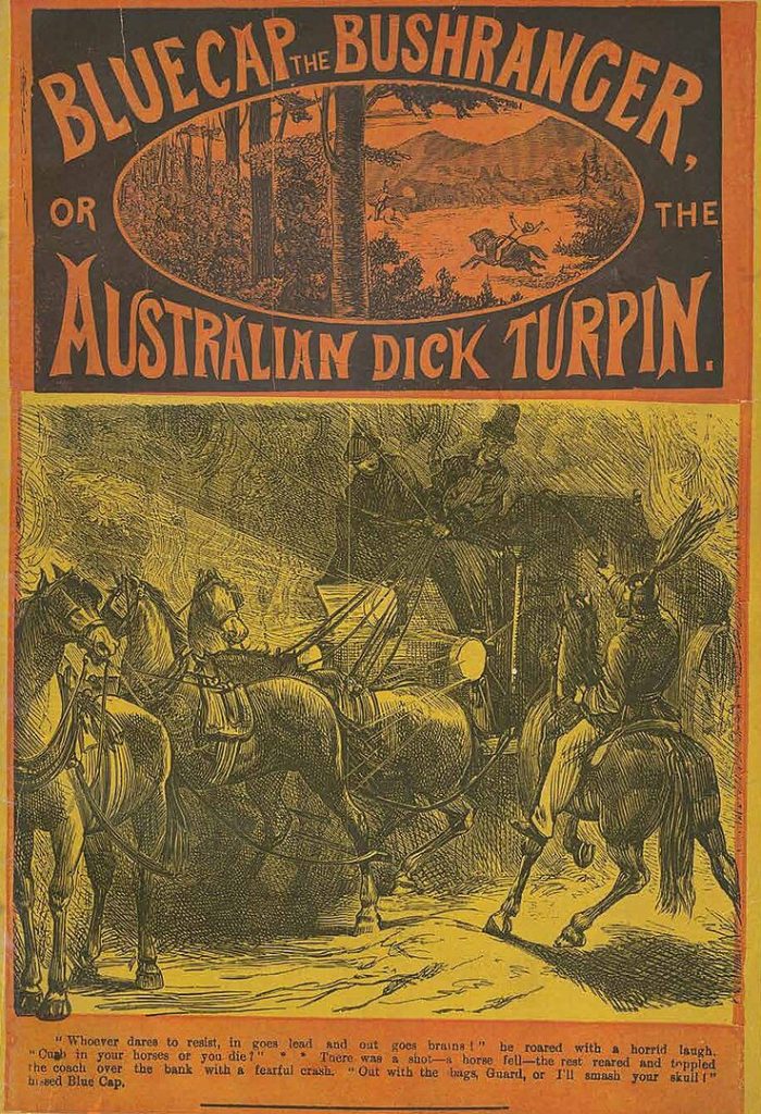
Printing technology during the 1830s to 1860s made these visuals possible on such a cheap scale. Wood engravings and metal plate etchings allowed artists to create stark black-and-white images that could be mass-produced at low cost. These engravings were often reused across different titles, sometimes modified to suit a new context, saving printers money and time. Yet despite the shortcuts, many illustrations delivered a strong punch, relying on harsh contrast and melodramatic expression.
Publishers understood that a striking image sold more copies than a clever title. Covers and frontispieces featured dramatic scenes—villains leaping from shadows, women screaming as razors descended, and corpses staring lifelessly from the gutter. These weren’t subtle compositions; they were intense, crude, and meant to provoke a visceral reaction. The image was an advertisement, a preview, and a promise all in one.
Though the art was rarely refined by academic standards, its impact was undeniable. The immediacy of these illustrations made the stories feel real, urgent, and often terrifying. The Penny Dreadfuls blurred the line between fact and fiction, and their pictures made the horrors feel tangible. By the time a reader flipped open the first page, they were already immersed in a world of dread, thanks to the power of ink and imagination.
The Artists Who Drew the Darkness
Among the many illustrators who worked on Penny Dreadfuls, few were credited by name, but their stylistic fingerprints remain vivid even today. One of the most famous was George Cruikshank (1792–1878), who contributed to both satirical and horrific prints, bridging the gap between comedy and terror. Though he’s better known for illustrating works by Charles Dickens, Cruikshank’s earlier engravings showed a penchant for grotesque figures, exaggerated emotion, and disturbing detail—perfect qualities for the Penny Dreadful aesthetic. His style influenced countless anonymous artists who followed in his shadow.
These illustrators often had to churn out work at a brutal pace, producing new pieces every week under tight editorial control. With limited time and tight budgets, many reused elements—faces, bodies, backgrounds—reshuffling them to create new compositions. This reuse of imagery led to a kind of visual shorthand: readers would instantly recognize a villain’s twisted expression or a heroine’s terrified eyes. It was cheap, but it was also effective.
Despite the constraints, some artists managed to develop distinctive styles within this visual economy. Some emphasized grotesque distortion—misshapen limbs, bulging eyes, and unnatural postures—to amplify horror. Others leaned into theatrical drama, using sweeping gestures, billowing cloaks, and stark lighting to create mood. Over time, the style of Penny Dreadful illustration began to form its own visual language: shadow meant danger, teeth meant madness, and blood was always black.
While most illustrators toiled in anonymity, their impact was immense. Their artwork set the tone for the entire genre, influencing how readers imagined vampires, killers, and ghouls. These artists didn’t merely illustrate horror—they helped define it. The legacy of their crude yet captivating style would carry forward into the 20th century and beyond, shaping horror illustration in comics, film posters, and graphic novels.
Anatomy of a Dreadful Illustration
Penny Dreadful art followed a specific formula designed to heighten fear and curiosity. It began with exaggerated expressions—wide, panicked eyes, gaping mouths, and arched brows that conveyed raw terror. These facial distortions made characters instantly legible and emotionally charged. Viewers could almost hear the scream, feel the dread, and anticipate the next blow just by glancing at a figure’s face.
Symbolism played a vital role in these visuals, often serving as a form of narrative shorthand. Skulls signaled death, rats implied disease or decay, and fog signaled mystery or supernatural interference. Dark alleyways, crooked gravestones, and stormy skies appeared repeatedly as visual cues for danger. Artists used light and shadow not just for depth but for moral storytelling: villains were cloaked in darkness, heroes often stood in the light.
In scenes involving violence or death, artists used contrast to highlight the moment of impact. A slashing knife or falling body would be framed by stark blacks and empty whites, making the action visually explosive. The exaggerated drama, while unrealistic, made the illustrations memorable and emotionally potent. Even simple props like lanterns or candles were used creatively to cast ominous shadows, enhancing the sense of dread.
These tropes eventually became embedded in the visual vocabulary of horror itself. What began as cheap graphic devices in the 1840s laid the groundwork for later horror comics, films, and illustrations. The same methods—twisted faces, dark settings, symbolic objects—are still used today to convey fear. Penny Dreadful artists might have worked in haste and anonymity, but their visual code still whispers from the shadows of today’s horror genre.
Picture vs. Text: How Art Told the Story
One of the most striking aspects of Penny Dreadfuls was how the illustrations sometimes outshone the writing itself. While the serialized text offered drama and suspense, it was often overwritten or inconsistent. The images, on the other hand, were immediate and gripping—doing in one frame what pages of prose might struggle to express. In many cases, the visual representation defined how readers remembered the scene, even more than the actual words.
Illustrations weren’t just accompaniment; they were guides to the emotional tone of the story. A villain’s sneer or a victim’s shriek in ink told readers how to feel before they even began reading. Some publishers deliberately placed the most shocking illustrations at the start of a chapter or installment to set expectations high. Readers might even flip ahead to glance at the picture first, using it to predict what would unfold in the text.
Sometimes, the pictures contradicted or exaggerated what the text described. A murder might be mentioned in vague language, but the accompanying illustration would show blood pouring from a gaping wound, the killer’s expression twisted with malice. This disconnect didn’t frustrate readers; it excited them. The sensational art made the experience more immersive, blurring the line between what was read and what was imagined.
Layout played a major role in how effectively this interplay worked. Full-page illustrations packed more visual punch, often placed in the centerfold of the issue for maximum impact. Smaller inset illustrations broke up long columns of text, creating rhythm and anticipation. In every case, the image was timed to support or heighten the drama of the words. Together, they formed a unified spectacle of horror that was far more than the sum of its parts.
The Business of Visual Shock
Penny Dreadfuls weren’t just about storytelling—they were a ruthless business, and their publishers understood the power of a gruesome image to move product. The most prominent publisher was Edward Lloyd (1815–1890), a self-made entrepreneur who revolutionized mass-market horror publishing. By the 1840s, Lloyd was churning out titles like The String of Pearls—which introduced Sweeney Todd—and flooding the streets of London with shocking images. Lloyd understood that a horrifying picture on the cover meant more sales in the alleyways and news stalls.
Artists were instructed to focus on shock value. The more blood, terror, and chaos they could fit into a single image, the better. This wasn’t high art—it was marketing. These images had to be clear, bold, and capable of grabbing a potential buyer’s attention from a distance. Typography played a supporting role, often designed to echo the sharp lines and dramatic flair of the visuals, with words like “MURDER” and “REVENGE” exploding off the page.
Cost was always a factor. To keep prices down, many images were made using wood blocks or engraved metal plates that could be reused dozens of times. Artists and engravers often went uncredited, and in-house illustrators sometimes repurposed entire scenes by changing only the faces or props. This recycling didn’t bother readers, who often didn’t notice or care, as long as the new story matched the thrill promised by the image.
Lloyd and his competitors pioneered what we now call visual branding. Each title developed a recognizable visual identity—whether it was a recurring villain, a signature font, or a particular framing device like dripping borders or claw marks. These were the early seeds of graphic design in commercial publishing. Though dismissed by Victorian elites as vulgar and corrupting, the art of the Penny Dreadful was finely tuned for mass appeal—and it worked.
From Print to Pop Culture: Art Legacy of Penny Dreadfuls
The visual legacy of Penny Dreadfuls did not fade when the publications ceased. Instead, their artistic DNA lived on, especially in horror comics, film posters, and pulp magazines of the 20th century. Many of the techniques first used in the Dreadfuls—harsh contrast, exaggerated faces, symbolic shadows—were picked up by illustrators working on early horror comics like Tales from the Crypt and Eerie. The influence was especially strong in American pulp publishing during the 1930s and 1940s, where horror visuals again emphasized shock and emotion.
Even characters born in the pages of Penny Dreadfuls continued to haunt popular culture. Varney the Vampire, published between 1845 and 1847 with striking illustrations of elongated fangs and hypnotic eyes, predated and inspired Dracula (1897). The way Varney was drawn—with wide eyes, unnatural limbs, and a menacing aura—formed the template for vampire visuals for decades to come. The same is true of Sweeney Todd, whose dark cloak, razor in hand, and leering expression became iconic in both stage and screen adaptations.
In more recent years, the Penny Dreadful television series (2014–2016) paid homage to this visual tradition, borrowing heavily from Victorian aesthetics. Posters, set designs, and costume choices reflected the same dark romanticism and grim beauty that the original illustrations evoked. While the show took liberties with character origins, it captured the moody, haunted quality of the art that defined the genre. The show’s visual storytelling leaned hard into gothic horror roots—foggy alleys, flickering gaslight, and tortured eyes—just as the Dreadfuls once did.
Artists today continue to look back to this era for inspiration. Gothic-themed graphic novels, horror tattoos, and even steampunk illustrations carry the fingerprints of Penny Dreadful visuals. The style that was once considered low-class has been re-evaluated as a legitimate form of horror art. Museums and libraries have begun to preserve and display these illustrations, not as curiosities, but as part of a visual lineage that shaped how we see fear itself.
Moral Panic in Pictures
The rise of Penny Dreadful illustrations coincided with a rise in Victorian moral panic. Critics weren’t just worried about the stories; they were horrified by the images. From the 1850s onward, publications like The Times and religious reform groups decried the illustrations as “poison for young minds.” The concern was that children were becoming desensitized to violence and developing a taste for blood and rebellion—purely from what they saw on the page.
This fear wasn’t without effect. In 1855, a Parliamentary committee investigated the link between sensational publications and juvenile delinquency, citing disturbing illustrations as part of the problem. Reformers pushed for Sunday School tracts and moral literature to replace these “corrupting visuals.” Ironically, even these moral stories adopted some of the same visual tactics—strong contrasts, expressive faces, and emotionally charged scenes—to hold young readers’ attention. The difference was in the message, not the medium.
Censors and religious leaders didn’t understand that the illustrations were often symbolic, exaggerated, or even theatrical. To them, a boy reading a picture of a stabbing might as well have been committing the crime himself. Reformist voices argued that such art broke down moral barriers, glorified sin, and mocked divine justice. They claimed these pictures were responsible for a rising tide of crime, irreverence, and moral decline among the lower classes.
But the more they protested, the more popular the Dreadfuls became. Controversy served as free advertising. Young readers passed them around like treasures, their shocking images worn and creased from use. In trying to suppress them, Victorian society only confirmed their power. The art of the Penny Dreadful had become not just a means of horror storytelling, but a flashpoint in the cultural war over class, morality, and control.
Decline of the Dreadful Image
As the 19th century gave way to the 20th, the era of the Penny Dreadful began to fade. One major reason was the emergence of cheaper, more respectable alternatives like halfpenny papers and boys’ weeklies, which offered adventure stories with less overt violence and horror. Titles such as The Magnet and The Gem replaced supernatural terrors with schoolyard pranks and daring escapades. The art in these newer papers also changed—less gory, more refined, and aimed at pleasing concerned parents as much as their sons.
The Elementary Education Act of 1870 had another impact. As reading became more widespread and standardized, children were expected to engage with more “moral” or educational content. This led to a cultural shift that pushed publishers toward cleaner, more socially approved narratives and illustrations. Penny Dreadful art, with its shadows, blood, and grotesquery, came to be viewed as out of date, a relic of a more chaotic era. Respectable families no longer wanted their children looking at gory engravings of slashed throats and haunted graveyards.
Simultaneously, the public’s appetite for horror was evolving. Instead of crude drawings and serialized shock, readers began turning to novels, detective fiction, and later, cinema. The detective genre, popularized by Arthur Conan Doyle’s Sherlock Holmes stories starting in 1887, used mystery and deduction rather than visual terror to captivate audiences. Even horror fiction matured, with Bram Stoker’s Dracula (1897) offering a more polished, literary take on themes once dominated by rough Dreadfuls. The need for visceral illustrations diminished as stories grew more psychological and complex.
Still, Penny Dreadful art never truly disappeared—it transformed. By the early 1900s, elements of its visual style could be found in early comic strips and later in pulp magazines of the 1920s and 1930s. The melodrama, bold inking, and high-contrast images carried over, albeit in more sophisticated forms. The raw terror of the Dreadful illustrations had laid the foundation for what would become modern horror visuals, even if their original form was now buried beneath the dust of history.
Modern Reappraisal and Collector Culture
In recent decades, there has been a revival of interest in the visual art of Penny Dreadfuls. Once dismissed as crude or disposable, these illustrations are now collected, studied, and displayed in museums, libraries, and private collections. The British Library and institutions like the Bodleian Library at Oxford have digitized entire collections, making it easier than ever to study the visual history of this genre. These repositories treat the Dreadfuls not just as pulp curiosities but as important cultural artifacts that shaped mass communication.
Modern collectors prize original illustrations and prints from these serials, especially intact issues with cover art still in good condition. Some particularly valuable examples include early editions of The String of Pearls or Varney the Vampire, with untrimmed pages and bold woodcut illustrations. The artwork is appreciated not only for its historical value but also for its unique style—raw, dramatic, and unapologetically graphic. These pieces are often framed or displayed alongside other Victorian ephemera, showcasing their impact on both horror and graphic design.
In pop culture, the aesthetics of Penny Dreadful art have found a new audience. Fans of gothic literature, horror, steampunk, and alternative fashion embrace the gritty, stylized visuals of 19th-century horror. The blend of melodrama, grotesque figures, and Victorian costume appeals to modern subcultures that romanticize the eerie and the macabre. Artists in these communities frequently cite Penny Dreadful illustrations as an influence, recreating the look in digital art, posters, zines, and cosplay.
Academic study of these illustrations has also grown. Scholars now explore how Penny Dreadful art reflected contemporary fears—of crime, industrialism, and social decay—and how it shaped popular understanding of morality, gender, and evil. The once-despised genre now receives serious treatment in journals, exhibitions, and university courses. The art, once considered a stain on Victorian respectability, is being reclaimed as a vital and formative part of visual culture.
Conclusion
Though they were once sold for a penny and treated like trash, the illustrated pages of Penny Dreadfuls left a lasting mark on the visual world. These publications captivated millions not just with outlandish stories, but with images that seared themselves into memory. The art was bold, grotesque, and intensely emotional—crafted to disturb, entice, and entertain. It succeeded on every level, creating a visual language for horror that still echoes in modern media.
The artists, mostly anonymous and overworked, were visionaries in their own right. With crude tools and rushed deadlines, they managed to evoke fear, suspense, and a strange beauty. Their illustrations told stories as powerfully as the text—sometimes even more so. They trained a generation of readers to understand narrative through pictures, laying the groundwork for visual literacy in mass-market culture.
Today, we can see the fingerprints of Penny Dreadful art in horror films, comics, book covers, and even video games. The exaggerated expressions, high contrast, and symbolic imagery continue to inspire. What was once seen as vulgar and sensational has become a touchstone for creativity, nostalgia, and artistic innovation. We may no longer flip through yellowed paper in gaslit alleys, but the shadows those artists drew still linger in our collective imagination.
If there’s one thing the history of Penny Dreadful art teaches us, it’s this: fear sells—but only if you can see it. The genius of those old engravings was not just in what they showed, but in what they suggested. They drew on primal emotions, speaking across time and class, delivering horror in its most gripping form. They were cheap, yes—but in their own eerie way, they were unforgettable.
Key Takeaways
- Penny Dreadful illustrations were central to their horror appeal, not just decorative extras.
- Artists like George Cruikshank helped shape the genre’s grotesque, dramatic visual style.
- Symbols like skulls, blood, and shadows created a recurring visual language of fear.
- Critics attacked the art as corrupting, but controversy only increased its popularity.
- Penny Dreadful art influenced horror comics, film, and pop culture long after the publications ended.
FAQs
- What made Penny Dreadful illustrations so popular?
Their bold, shocking visuals made stories instantly engaging, even to semi-literate readers. - Were the artists of Penny Dreadfuls ever credited?
Rarely. Most worked anonymously or under tight publisher control, with few exceptions. - How were the illustrations made so cheaply?
Using reusable woodcuts or metal engravings, which allowed for mass production at low cost. - Did these illustrations influence modern horror?
Yes—visual tropes from Penny Dreadfuls appear in comics, movies, and gothic art today. - Can I see original Penny Dreadful art anywhere now?
Yes—institutions like the British Library and Bodleian Library host digitized archives and exhibits.